
Latest Posts by itz-offline - Page 7


commission work
Art Help

I redid this list because broken links 💀
General Tips
Stretch your fingers and hands
Art is for fun
Never too late to start/improve
Using a tablet
Editing software: pictures & video
Moodboard resources
Comic pacing
Watercolor
Coloring
Color Theory (not children's hospital)
Resources: coloring things a different color
Gold
Dark Skin undertones
Dark Skin in pastel art
POC Blush tones
Eyes colors
Human Anatomy
POSE REFERENCES
Wizard Battle poses
Shoulders
Tips for practicing anatomy
Proportional Limbs
Skeletons
Hair Directions
Afro, 4C hair
Clothing
Long skirts
Traditional Chinese Hanfu (clothing reference)
CLOTHING REFERENCE
Sewing information
Animals
Horse -> Dragon
Snouts: dogs, cats, wolves, fox
Foot, paw, hoof
More
Drawing references sources
Art tutorial Masterlist
Another art tutorial Masterlist
Inspiration: father recreates son's art
Inspiration: Lights
ART BOOKS
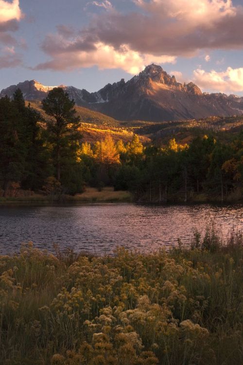
Plants/flowers: North America, Hawaii, Patagonia
![First Drawing Of 2023 :]](https://64.media.tumblr.com/e3caf75784259c8f738912365424c57e/a4e3a94605212970-0f/s500x750/3bd05ed512f4003ecaaea71a9c77795b3c1a1424.jpg)
first drawing of 2023 :]


Your art is so pretty!!!!!!! How do you pick colors and color!!!! All your works are so vibrant yet cohesive hhhh so nice to look at <33
thank you!! I made a little guide :> it's mostly about hair color picks but this is how I choose my colors in general!

i tend to stick to a similar value with all my colors! the only colors that get a higher saturation tend to be the highlights


and a way to make your colors pop is contrasting your warm and cool tones :> with yaoyao, I have a warm-tone base with a cool-tone shadow and kazuha's is a little more messy, but the bright teal pops in contrast with the red and warm tones.
this chart is helpful too if you're stuck on what kind of color scheme you'd like to go with!


I tend not to use pure white/black in my base color or lineart either my whites will either be warm/cool grays depending on the character! and I tend to have cool blue/purple blacks color has so much personality so I love adding lots of it :>
I'm physically incapable of base coloring as a solid color to save my life... it takes a while and most of it is intuitive at this point so it's a bit difficult to explain for bigger pieces, but I hope this helps!!
first drawing of 2023 :]
![[The Angel Of Time]](https://64.media.tumblr.com/0cb2670f22141b945cb3249cab4daf1c/a458052d5fcd4cde-d7/s500x750/94f51ca90acf66feae296bf5bc05d57c9dbb8298.png)
[The Angel of Time]


⭐ The Seven Mysteries of Kamome Academy from the Hanako-kun Museum ⭐
![[So Similar, Yet So Different]](https://64.media.tumblr.com/e7a09e5ec8fb735e97252197e42621bb/50dcf342cfc101de-99/s500x750/528238043132e247fa1b3b0c793dba82995a6484.png)
[So similar, yet so different]

Greetings, m'lord
I forgot I have to be active here so here’s my Twitter tutorial on how to draw folds I made a while back to help a friend!


How do you go about choosing colors? Do you have a palette or use filters? Every time I try nothing looks cohesive enough and I don't understand how gradient maps work or if I'm doing it right lol but I really like the colors you use and was wondering what you do!
i don't use a palette, but i do use gradient maps pretty often o:
a gradient map takes the values in your image and reassigns them along the new gradient you've chosen. here's an example below - left side is a grayscale sketch, right side is with the gradient map applied. you can see how the darkest values are mapped to the purple tones, and lightest values are mapped to the peach/yellow.

my cheap trick to unifying color schemes is to choose colors, render an image > flatten and duplicate > apply gradient map > adjust opacity until it harmonizes. (that's my method in procreate, but you can use gradient maps as separate adjustment layers in photoshop and CSP). i still end up doing corrections afterwards, but it's a useful trick nonetheless. hope that helps!

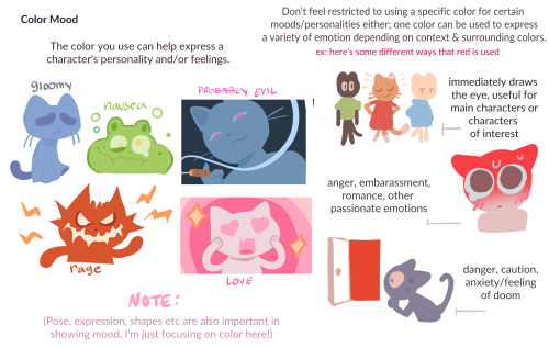

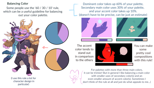
my color tips pdf is now available ! i had a lot of fun with this, i hope you enjoy ^^
BUY HERE or HERE

Wow, first post on Tumblr!!
A little Doodle for one of my OC, Alec or commonly known as 'Online'