Your Art Is So Pretty!!!!!!! How Do You Pick Colors And Color!!!! All Your Works Are So Vibrant Yet Cohesive
Your art is so pretty!!!!!!! How do you pick colors and color!!!! All your works are so vibrant yet cohesive hhhh so nice to look at <33
thank you!! I made a little guide :> it's mostly about hair color picks but this is how I choose my colors in general!

i tend to stick to a similar value with all my colors! the only colors that get a higher saturation tend to be the highlights


and a way to make your colors pop is contrasting your warm and cool tones :> with yaoyao, I have a warm-tone base with a cool-tone shadow and kazuha's is a little more messy, but the bright teal pops in contrast with the red and warm tones.
this chart is helpful too if you're stuck on what kind of color scheme you'd like to go with!


I tend not to use pure white/black in my base color or lineart either my whites will either be warm/cool grays depending on the character! and I tend to have cool blue/purple blacks color has so much personality so I love adding lots of it :>
I'm physically incapable of base coloring as a solid color to save my life... it takes a while and most of it is intuitive at this point so it's a bit difficult to explain for bigger pieces, but I hope this helps!!
More Posts from Itz-offline and Others


choose your fighter

Starting on a cotl fanfic, so heres the (possible) description. I’m thinking of naming it smth akin to ‘while death rests’, but I’d love suggestions bc I’m not rlly attached to it lol.
A lil more info: it’s a Lambert amnesia au! I love all the angst I could squeeze out of this idea so here I am. Doing it. :3

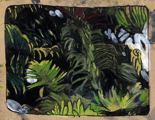
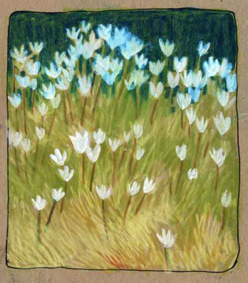

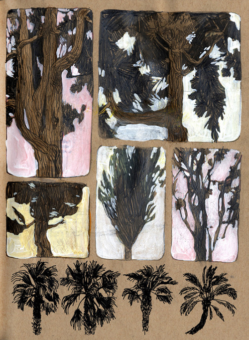
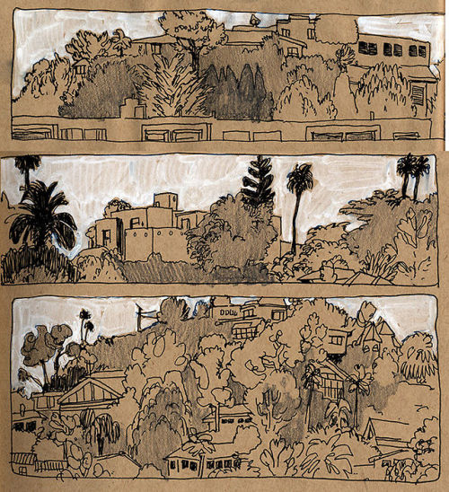
some more outside drawings! I went to LA for a while
(1)Learn the rules before you break them + Gather proper references

(2) Understand what you want to break and how


(3) Can't do it? Find someone who can

(4) It's going to look really bad for a while
(5) Have fun with it!

(1) -Yes, I am that kind of artist. Yet, not in the conventional way. I encourage people to go in guns blazing when it comes to drawing something new, then coming out analyzing what they know, and what they need to learn more of right away.
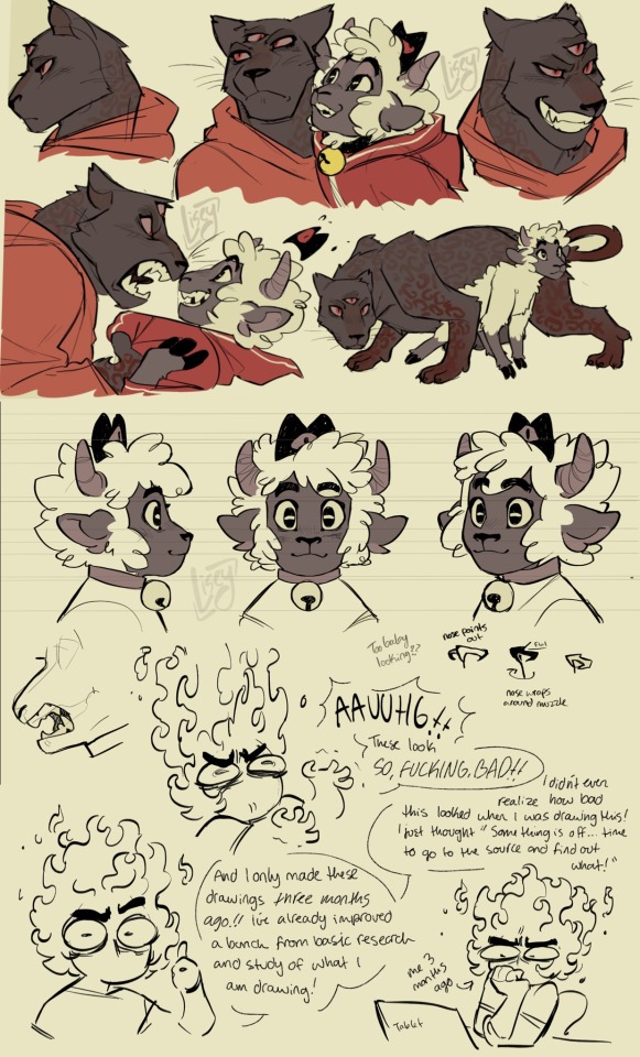
-Here, I broke down the anatomical pieces of Nour and Narinder's face with the same labels so you guys can understand this weird invisible pattern that I follow in my work. Doing this with any animal you're attempting to draw greatly improves your line confidence when drawing different face shapes. Also understanding the biological function for why animals look a certain way helps you keep consistency.
(3) Time to throw any artistic guilt you have for heavily referencing people's art OUT THE WINDOW and start ANALYZING PEOPLE'S WORK YOU WANT TO BE LIKE✨ I've always done this, having a reference of someone else's amazing work right next to my own drawing so I can try and understand how they make their magic work! No shame, no embarrassment, nada. Pure, unadulterated will and spite that I would be just as good as the artist who made me so motivated and happy with their work! I couldn't figure out how to make Nour's face both sheep-like, and humanly expressive, so I looked at a LOT of Zootopia and old Disney art for help!
(2) With how I draw narilamb, I'm still working on it (as you can see) but I wanted to break Narinder's face to be fluffier and slimmer, while Nour's face would be shorter and flatter. If you look at it for too long, it's absolutely going to look weird, in the way that if you look at Anna from Frozen for too long she starts looking really weird. The anatomy isn't meant to be correct or consistent, it's meant to convey the emotion and energy I want out of the characters in that moment. If you're able to properly get that across, then you don't need to think about how broken something looks, as long as your eye is happy enough to trick your brain into thinking what you're seeing is canny.
(4) Yeah, I hate this part too. It's going to look like shit at first. I can't even look at my art from a few months ago when I was figuring out their designs... God, so fucking ugly. If it weren't for the shittiness of those drawings, I would have never gotten here! Wading through the "trust the process" stage always really sucks, but it's absolutely worth the relief of when you finally get something to look right.
(5) Art is work, yes. It's stressful, it's long, it's straining, its draining, it's exclaiming, blah blah blah. But, I try to keep my art FUN. If I find my artwork becoming slow as I depressingly drag my pen over my tablet, I'm failing. You MUST keep spirit and life in your work. The spirit of emptiness or the life of sadness can have a very meaningful place in art, but those can only exist with keeping work light, easy, and fun! If you're stressing how a specific thing looks or how you can't get something to look right no matter what, FUCK IT. Draw something to bring the flavor back in your work! I'm kind of rambling, but just, HAVE FUN!✨️ Be messy, scream, laugh, slash canvases, throw paint, smash sculptures, tear apart books, GO CRAZY


Finally now that the comic is fully public on comicfury, I get to share it with all of you here, too <3
If you enjoyed, please consider supporting by buying a PDF of the comic on itch.io: https://tawnysoup.itch.io/home-in-the-woods
Misery x CPR x Reese's Puffs but it's Re-Op Team A6

movie poster
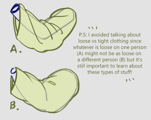
I forgot I have to be active here so here’s my Twitter tutorial on how to draw folds I made a while back to help a friend!


-
 tha-t liked this · 1 month ago
 -
 xihulu-he4tang liked this · 2 months ago
 -
 minatoful liked this · 4 months ago
 -
 wixonka liked this · 5 months ago
 -
 whitebalverines liked this · 8 months ago
 -
 matchaira liked this · 8 months ago
 -
 bookgobloblin reblogged this · 10 months ago
 -
bookgobloblin liked this · 10 months ago
-
 nainaihu1718 liked this · 10 months ago
 -
 tails-is-cool liked this · 10 months ago
 -
 icedcatoffe liked this · 11 months ago
 -
 yet-happy liked this · 11 months ago
 -
 4n1m3-g33k-p1g30n liked this · 11 months ago
 -
 jasluminary liked this · 1 year ago
 -
 lifetrader liked this · 1 year ago
 -
 ghosteii liked this · 1 year ago
 -
 sunfish59 liked this · 1 year ago
 -
 yurianthrax liked this · 1 year ago
 -
 michele81816 liked this · 1 year ago
 -
 hot-kururi liked this · 1 year ago
 -
 catcantnavigate liked this · 1 year ago
 -
 onionpug liked this · 1 year ago
 -
 jauladenoche liked this · 1 year ago
 -
 hancorona2109 liked this · 1 year ago
 -
 artorials101 reblogged this · 1 year ago
 -
 atelierdelecarousel liked this · 1 year ago
 -
 solarisarts reblogged this · 1 year ago
 -
 serablossom liked this · 1 year ago
 -
 stellar-rius liked this · 1 year ago
 -
 nopenpals liked this · 1 year ago
 -
 kiherame liked this · 1 year ago
 -
 amotleycrew liked this · 1 year ago
 -
 dumbster-time reblogged this · 1 year ago
 -
 bi-con liked this · 1 year ago
 -
 ut-reblogs reblogged this · 1 year ago
 -
 ut-girl666 liked this · 1 year ago
 -
 coconutwater27 liked this · 1 year ago
 -
 pinkexpertnerdghost liked this · 1 year ago
 -
 toaofconfusion liked this · 1 year ago
 -
 kumacheerio liked this · 1 year ago
 -
 ssimpatico liked this · 1 year ago
 -
 sstrawberrysalsa liked this · 1 year ago
 -
 cuppatwoj reblogged this · 1 year ago
 -
 cuppajj liked this · 1 year ago
