Finally Did A Walkthrough Of The Silk Robe I Did A While Ago! Hope It Helps!


Finally did a walkthrough of the silk robe I did a while ago! hope it helps!
More Tutorials! I Buy me a coffee?
More Posts from Arttuti and Others


So I got a lot of messages after my first post asking me to explain layers, so I have put together a cheat sheet of the different layer types. The quickest way to become awesome with layers is to know exactly what each one does. Once again, I’m no expert, and these are just my personal definitions, so please try these out for yourself! LONG POST BELOWWW THE LAYERS CHEAT SHEET PART ONE: 1. NORMAL: Aw yeah you know all about this layer its just your average layer 2 DISSOLVE: This mode “dissolves” some pixels, allowing the lower layer to show through. very pixel-y. Reducing opacity makes it dissolve more. ________ 3. DARKEN: Now the difference between darken and multiply are a little confusing, so I will explain them together. MULTIPLY is more of a glaze, while DARKEN favors the darks on all layers. So if you have a darken layer on, it tend to reduce/remove the lighter tones on the layer if there are darker tones below it, while darkening the darks. 4. MULTIPLY: A glaze that darkens the color of the layer below. It is great for shading. Reduces whites. 5. COLOR BURN: “Burns” the lower layer favoring a more saturated look. Marks made over white are not preserved. 6. LINEAR BURN: “Burns” the lower layer, with a little less saturation than color Burn. Also will preserve colors over white. 7. DARKER COLOR: I tend to avoid this puppy cause it does not darken on the RGB channel. (feel free to try him though!) ______ 8. LIGHTEN: Lightens the colors below. Favors lighter colors on lower layers. 9. SCREEN: Lightens the colors below, but much closer to the “glaze” analogy as above. Reduces blacks. 10. COLOR DODGE: Often used for magic-y effects, color dodge bumps up saturation and is very bright. 11. LINEAR DODGE: Much like color dodge, but less saturation. 12. LIGHTER COLOR: Once again, this is an outside RGB channel layer, so I don’t really use this. As you probably have noticed, the second two groups are opposites, so if you have a good handle on one, you probably know exactly what the second group does! I will do the remaining groups next week as they do not follow this pattern. Thanks! drawmaevedraw.tumblr.com EDIT: Part two here: Photoshop Layers Part Two!!


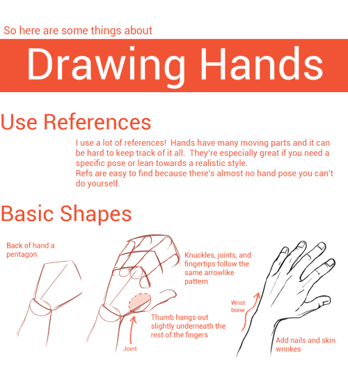
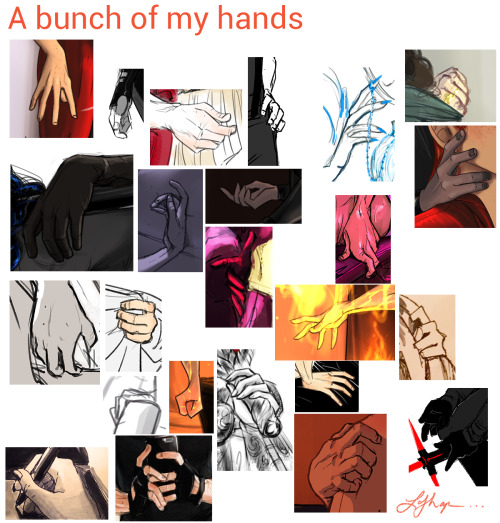
Hands
As I do with most things, I draw hands from a series of gesture strokes that insinuate the pose and shape I want. Something I personally find very appealing about hands are all the joints, bends, and crooked bits so I start with those and build the rounder, meaty bits from there.

In the first two steps here if you just look at the individual strokes I’ve drawn, you can see they’re just some curves, really, that sketch out the shape of the hand, and I’m focusing on the joints and knuckles. (The fingertips in the second one are actually rly unnecessary and ugly to me haha – that’s usually the kind of thing I’d just throw down in step 3.)
And again below, just starting w/ some curves and squigglies to show the joints and knuckles:


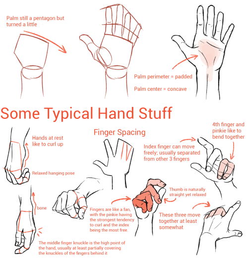
These hands are by no means realistic or fully proportional but drawing’s supposed to be fun and these are really fun! I’m like, really not about that whole “draw a box and then the little tubes and those are the fingers” thing. It’s too technical and so much life gets lost when you sketch that way. Maybe it’s helpful for a pose you’re uncertain about but then just look at a photo or your own hand to see how things work, y’know?
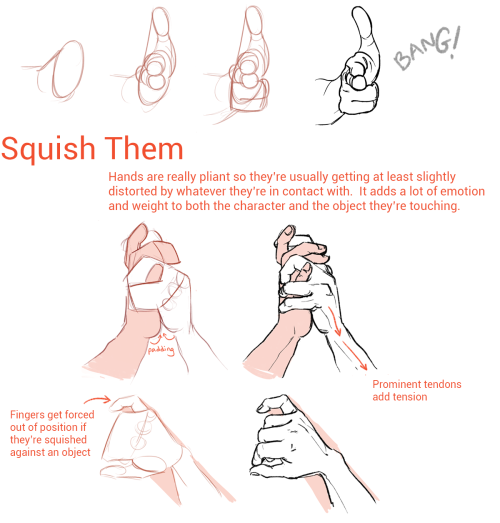
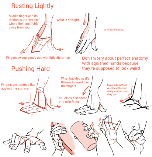
Something else I’m really about is using shading and line to emphasize the bends and stuff even after I’ve got the hand down:

The first image here you can tell the fingers are bent, but they also look lumpy imo. To stylize further, I add some thin lines for the joints and fingernails, and then shade for some extra depth + to pronounce the foreshortening etc. (Fingers are so ugly from this angle! But we gotta draw them like this sometimes…)
Some examples where these extra lines assist in conveying the shape:

And shading:

(Bottom right is the same pose as a previous example which I didn’t realize till now sorry haha)
Some general tips:
- Use asymmetry!!! When the joints don’t line up exactly right, or you’ve drawn two hands doing the same thing but idk one’s curled a little bit more or the right pinky sticks out but the left doesn’t – these little touches make the drawing more dynamic, even if the general pose/concept is flat.
- Thumbs are really cool? They’re like trapezoidal. The same tapering thing kinda happens where the hand meets the wrist. A hand is like a big thumb
- Two things that a lot of beginner artists get wrong: which side the thumb is on (…always double-check…I still double-check sometimes too), and drawing the fingers straight instead of slightly bent when trying to draw a relaxed hand. Relaxed fingers curl! And this is much easier to draw imo than perfectly tense fingers
- Study your own hands and think about their shape. Part of developing a style + comfort with drawing a particular thing is how you choose to simplify the form thru line. I explained above that I focus on the joints and knuckles and seek to simplify those with curves and squiggles but maybe you’re more interested in a different aspect. (Like, you can see I don’t draw palms v much…that’s cuz I like knuckles haha)
Hope this is helpful/feel free to ask followup questions!
Hi Fer! I simply love your blog and tutorials so much, but I was wondering on how you draw masculine bodies? My drawings have been female and slender men, and when I try... it just doesn't look right. So any tips can be really helpful because I want to try and draw different body shapes. Thank you so much! <3
easiest thing is probably to widen the shoulders and up the muscle mass! it really helps to study anatomy so you know which areas to exaggerate. a more muscular/masculine person will have a more defined sternocleidomastoid (in blue) and bigger traps (green); basically a thicker neck. playing with the shoulder to hip ratio will help as well. i guess if you want a super manly man just make him look like a dorito


-
 xsolar-ghost reblogged this · 2 months ago
 -
 theleslistuff liked this · 3 months ago
 -
 katiewolfgirl7 liked this · 1 year ago
 -
 shinjuhakutsuru liked this · 1 year ago
 -
 certified-monster-fucker liked this · 1 year ago
 -
 aderisudesu liked this · 1 year ago
 -
 iredara liked this · 2 years ago
 -
 mehnight15 liked this · 2 years ago
 -
 r0adkillriot liked this · 2 years ago
 -
 mystiqueinkrosette24 reblogged this · 3 years ago
 -
mystiqueinkrosette24 liked this · 3 years ago
-
 art-----999999 reblogged this · 3 years ago
 -
filefaves reblogged this · 3 years ago
-
 batmelons liked this · 3 years ago
 -
 archaic-botanist liked this · 3 years ago
 -
 stand-up-and-screamo liked this · 3 years ago
 -
 meltic-daze liked this · 3 years ago
 -
 my-poor-little-ghost-boy reblogged this · 3 years ago
 -
my-poor-little-ghost-boy liked this · 3 years ago
-
 reblogthatartyoulike reblogged this · 4 years ago
 -
 madzikdek liked this · 4 years ago
 -
 miniaturelightfun reblogged this · 4 years ago
 -
miniaturelightfun liked this · 4 years ago
-
 goodbutnotsafe reblogged this · 4 years ago
 -
 arrakeen reblogged this · 4 years ago
 -
r-yd liked this · 4 years ago
-
 loveallcute liked this · 4 years ago
 -
 pvjellyfish reblogged this · 4 years ago
 -
pvjellyfish liked this · 4 years ago
-
 kittyyoons reblogged this · 5 years ago
 -
 seelilium liked this · 5 years ago
