Some Tips About Dynamism:

Some tips about dynamism:
-Your sketches will always be dirty as fuck at the beginning. It’s normal and it’s okay. What you’re looking for is the right movement, intensity and direction, not drawing the next Mona Lisa.
-Try a lot of different posings, the first one will rarely be the right one. Some posings will feel better than others. You can then focus on the ones you like best and push/exaggerate them.
-Use!!! references!!! Analyze the action you want to draw! Look at what moves and when it moves (the hand moves faster than the elbow maybe? the hip rotate to follow the bust maybe? analyyyyze!)
More Posts from Arttuti and Others


How to do “extra” facial expressions!
Drawing basic facial expressions is not the hardest. Most people can draw a sad face, a happy face, angry etc., but making more multidimensional expressions is more of a challenge. I have gotten a lot of compliments on how I draw facial expressions, (specifically “angsty ones”) telling me that they are very dramatic and well… expressive! And there are actually only a few things I think about when I draw faces that take them to the next level, so I thought i’d illustrate them all here!
SUPER IMPORTANT TIP BEFORE WE START: Look at your own face when you draw faces. Even making the face when you are drawing (you don’t even have to look at it), will give you some sense of how the face muscles pull and where things fold and stretch, because you can feel it. You are the best reference when it comes to facial expressions!
Angles
Draw the head in an angle that matches the expressions you want to make. It is not a requirement, but is going to add to the effect.

Symmetry vs asymmetry
A face is rarely symmetric. Unless the face the character is making is 100 % relaxed or even dissociating, the eyebrows, mouth and facial muscles will have different placements of their respective side. This image shows the dramatic impact asymmetry has on a face:

That’s the difference between a smile and a smirk!

The first one’s like “oh yeah?” and the second is like “oH YEAH??”
The “balloon squishing principle”
This is something I did subconsciously, and I didn’t know about until I made this tutorial. And this principle goes hand in hand with an asymmetric face. Basically, if you squish one part of the face, you need to even out the empty space by “inflating” the other part of the face so that it doesn’t appear shrunken. The picture hopefully explains it:

Teeth
Don’t forget to add the gum when the mouth is open to its full potential!

Squinting and folding
Adding folds around the eyes when a character is squinting makes a HUGE difference. It makes a smile more genuine and a growl more intimidating. Adding folds to the face in general makes your characters more lifelike and ‘visually relatable’. Like, they look human, and less plastic or fake.


and so on..
Pupils and irises
The placement of the iris and pupil in relation to the eyelids is very important! The less of the white you see, the more relaxed the character is.

And then of course eyebrows and eyes go hand in hand!


Gestures, spitting, sweating…
Adding more elements than just a face is key to making the character actually look like they are feeling what you want them to feel. Just the tiniest sweat drop adds to their anxiety, spitting adds frustration to their rage, slouching shoulders, waving hands, a double chin, extreme angles, the list goes on! Add whatever and see what kind of impact it makes! Does it do the trick? Great! Add it!
Over exaggeration!!
Remember that you can almost always exaggerate more. Don’t be afraid to do draw “too much” because you’re just experimenting. See what works and what doesn’t. What do you like to exaggerate?


Now that you know some theory, it’s time to practice!
Practicing!!
The 25 Essential Expressions (a classic! I’ve done it multiple times)

And the one I do when I’m bored:
Fill a page with circles and fill them in with different expressions. Try and exaggerate as much as you can!


This is mostly for experimenting. They are quicker to draw than complete faces, but the same rules should apply!
And that’s about it!
I don’t know if I covered everything in this tutorial, since some things might be obvious for me, and this post perhaps only scratches the surface. So feel free to send me a message if you want an explanation about something more in depth! Thank you for reading! And now DRAW!!! ✨🎨
im sorry to ask, but i was wondering if you may show us how to draw abs please?
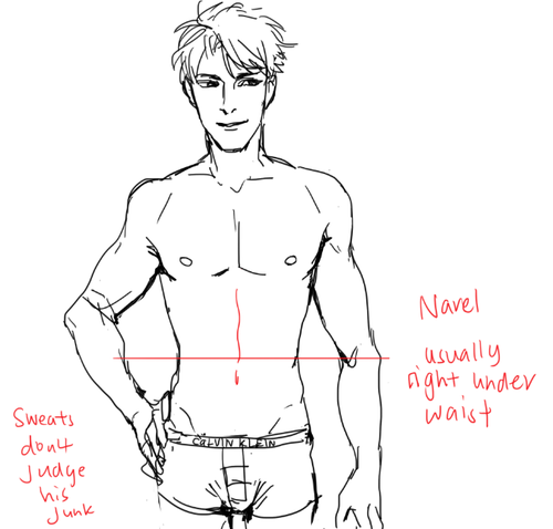
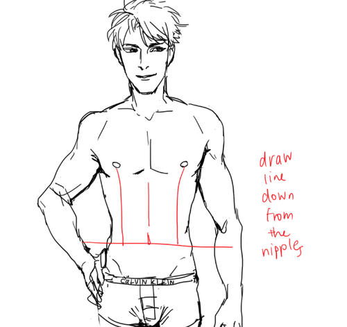
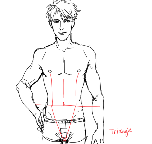
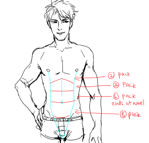
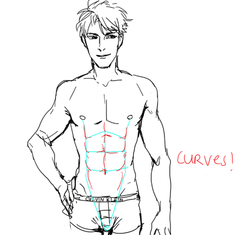
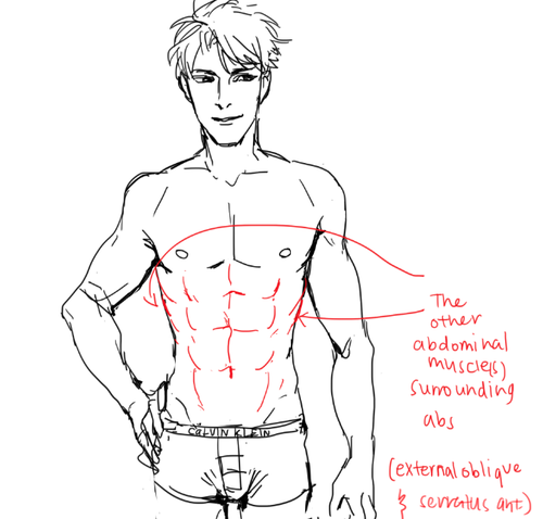
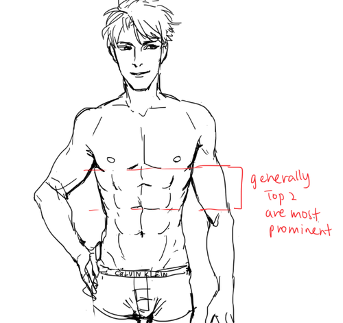
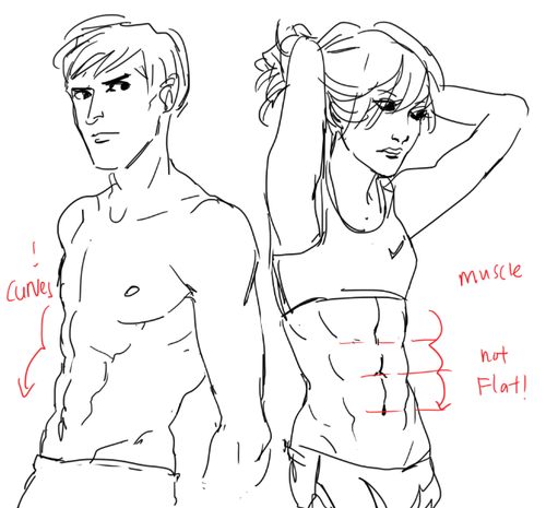
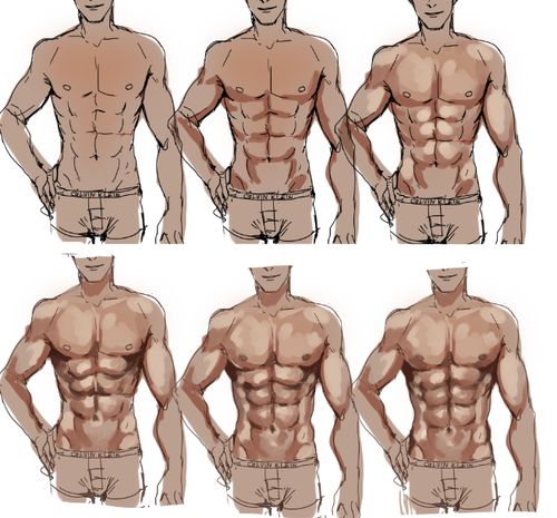
I STILL TAKE A LONG TIME TO DRAW OK looking abs HHahA SOBS AND LIES DOWN but yeah!! GO LOOK AND Some real life abs i promise you it’ll be ten times more helpful than my crude doodles!!
PLS TAKE THIS WITH A GRAIN OF ASALT AND Hope this helps u out a little!!


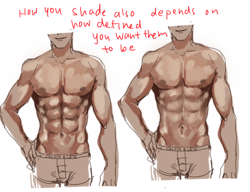
So here is that tutorial thingy i promised.
All of it is pretty basic stuff, no secret ingredients in there, still, i hope the way it’s put together is somehow comprehensible.
First tutorial posted up for Patreon Supporters is now available for everyone! Please read the tutorial carefully. If you have a question that is not in the tutorial I’ll be happy to answer it. Want me to make more tutorials and even video walkthroughs? Support me on Patreon!
Deviantart || Twitter || Webcomic || Commissions


well I just got here and all but I'd sort of like a tutorial on how you do shading and highlights? yours is really good, and I can't really shade or anything, so if you could explain how you do that, that might be cool? no pressure of course!
It’s been forever but I did this ajshaj
Quick notes:- I use Paint Tool SAI 2- some of the tools and layer names are in Russian but it all should still be understandable I hope
So here’s a tutorial on I do my simple coloring
There’s not much to it but maybe this can help someone


you're really good at painting clothes so! i was wondering if its not too much to ask, if you could do some quick tips/tricks or a short tutorial!! thank u and god bless
Aaah thank you! Well, first things first; learn from reference! You can google fabric reference or even just outfits and pay attention to the way the fabric swoops and curls around the form that its surrounding.

Here the fabric sweeps downwards, but comes up at a much tighter, sharper angle into his hand and bunches up within his palm. The material layers overtop of each other

This fabric is very loose and shimmery, and within the overlapping folds your shadows will be most prevalent to give it dimension of being layered.

Even with skin tight fabric there will always be creased, wrinkles, and layers where the material is pushed together. It is important to capture that! Whether the fabric is tight, or very loose. The tighter, the less wrinkle typically if it is pulled taught, while looser fabric will have more swooping lines of flow and tend to be thickly “banded” with spread out areas.

here is our mannequin torso for the purpose of visualization of the render process!

I start with the basic shape of what I want my clothes to be, and then i go from there to decide which way my fabric will be sweeping

now I block in colors, I always use a middle tone of the shade i want instead of the pure shade that I’m aiming for. The shade I’m aiming for I will use as a highlight to be where my lightsource is casting

I typically merge down at this point as I prefer to paint on one layer, and i start to blend and loosely figure out the way i’m going to further express the drape of my fabric

I refine and increase my brightness and darkness according to what i feel is needed to achieve my chosen contrast

refine, blend, and adjust as you need and to your personal preference!

that is how i usually go about painting fabric
![Robot(?) Leggings By Balenciaga. [Source]](https://64.media.tumblr.com/866ad6086243511f29ed053237711273/tumblr_mmzhe7J65h1rjgurvo1_540.jpg)
![Robot(?) Leggings By Balenciaga. [Source]](https://64.media.tumblr.com/98eca19ecc18c7cb3107797e67e17287/tumblr_mmzhe7J65h1rjgurvo5_540.jpg)
![Robot(?) Leggings By Balenciaga. [Source]](https://64.media.tumblr.com/6e1921bac17e73c7639905d8e00624bd/tumblr_mmzhe7J65h1rjgurvo3_500.jpg)
![Robot(?) Leggings By Balenciaga. [Source]](https://64.media.tumblr.com/831e8cd52fa1b1f7d901b3ec873e5394/tumblr_mmzhe7J65h1rjgurvo4_500.jpg)
-
 fablenaught reblogged this · 7 months ago
 -
 whinter-lisi liked this · 7 months ago
 -
 zizzani liked this · 1 year ago
 -
 artking-4 reblogged this · 1 year ago
 -
artking-4 reblogged this · 1 year ago
-
 petit-paresseux reblogged this · 1 year ago
 -
 fazzbearz liked this · 1 year ago
 -
 unknownnubroooo liked this · 2 years ago
 -
 mysrsface liked this · 2 years ago
 -
 caretaker-of-the-abyss reblogged this · 2 years ago
 -
 fluffy-little liked this · 2 years ago
 -
 catbennie liked this · 2 years ago
 -
 l4-t4nu liked this · 2 years ago
 -
 d-s-9 liked this · 2 years ago
 -
 maarplace liked this · 2 years ago
 -
 zmwiyz liked this · 2 years ago
 -
 braineatingamoeba1 liked this · 2 years ago
 -
 freshwinnerdream liked this · 2 years ago
 -
 noumios liked this · 2 years ago
 -
 zaves-blog liked this · 2 years ago
 -
 julezy-art liked this · 3 years ago
 -
 idlm-art reblogged this · 3 years ago
 -
 gingerbreadjonah liked this · 3 years ago
 -
 temporalvagabond liked this · 3 years ago
 -
 lumberjackofthelumberwoods liked this · 3 years ago
 -
 zrllosyn reblogged this · 3 years ago
 -
 myceliummallow reblogged this · 3 years ago
 -
 camphorcapstan liked this · 3 years ago
 -
 chaoticrystal reblogged this · 3 years ago
 -
chaoticrystal liked this · 3 years ago
-
 99redragons liked this · 3 years ago
 -
 lunar-insanity liked this · 3 years ago
 -
 blackfirewolf liked this · 3 years ago
 -
 hearth4days liked this · 3 years ago
 -
 immaplatypus reblogged this · 3 years ago
 -
immaplatypus liked this · 3 years ago
-
 jjburrito21 reblogged this · 3 years ago
 -
 effervescentgem liked this · 3 years ago
 -
 fuzzydreams515 liked this · 3 years ago
 -
 pyro-media liked this · 3 years ago
 -
 ninjahaku21art liked this · 3 years ago
 -
 tuturialreblog reblogged this · 3 years ago
 -
 frog-thief liked this · 3 years ago
 -
liazerxd-blog liked this · 3 years ago
-
 sooskie liked this · 3 years ago
 -
 inspolon reblogged this · 3 years ago
