Just When You Thought You Knew Everything About Boobs… NSFW?
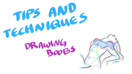
Just when you thought you knew everything about boobs… NSFW?


My darling friend Chizzi mentioned that there are a lot of booby tutorials out there are just predrawn boobs with the artist going HEY LOOK! HERE ARE SOME BOOBS! but not many that actually talk about the anatomical structure, and where to put the lines. I was like, “Hey, I can probably whip something up.“ And so I spent my thanksgiving making this.
Proportions probably aren’t exact, but I did my best. I also didn’t explore the various body types, but perhaps I could do a separate tutorial someday. I hope you find this tutorial useful :)
All photo references used in the tutorial were found on The Drawing Script. Credits to each photo belong to their respective owners.
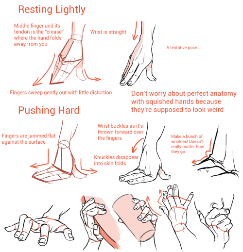
More Posts from Arttuti and Others


Step-by-step by Joana Neves
Due to popular demand, I am sharing a step-by-step on how I render faces (though in this case I rendered a whole bust, with a focus on the face). I don’t believe this qualifies as a tutorial, but hopefully it will allow you to roughly understand how I draw and render things, and maybe help you a little bit. Remember that everyone has a different way to work, and what works for me may not work for you and that’s exactly why I wouldn’t call this a tutorial.
I am thinking of doing a similar one for faces with makeup, but I can’t tell exactly when. Anyway, if anyone is interested in that, I will be glad to know! Share your thoughts with me.
I hope you like this and as usual, thank you for the support!
Hey just thought I'd let you know you have some of the best artwork I've ever seen! Congrats! Especially Chirrut, he's amazing in your style! I was also wondering if you had any advice on how to draw heads and eyes? They're one of my two biggest struggles and I'd love it if I could get your advice. Anything helps. Thank you and I hope you have a fantastic day!
*_* Thanks a bunch askdh and thanks for taking the time to write me! I had a lot of fun working on Chirrut ;;;
Hmmm I usually think it’s not useful to explain how I make eyes or noses, since the way to draw them changes depending on the pose… My advice would be practicing with ¾ heads. That view always force you to work volumetric shapes and also give a lot more of information. Also, I think it’s much more easy since you have more landmarks to help you.
I would also say consulting anatomy to identify the landmarks on the face (zygomatic and nasal bone , superciliary arch, mandible…) and practice on photos. Using references for drawing is not bad and drawing over photos when you need information of a face is a lot of fun. Is not necessary to draw all the bones, but knowing where the volumes and principal shapes are can help you learn. I.E:

I love that photo because it’s SO SO easy to see the volumetry of the face; just the line of the jaw gives you a lot of informacion about it. And it makes it easy to identify the elements and principal shapes of the head:

(I broke his nose, I’m sorry, but I made this quickly (??)) the point is, take your time to study the lines and understand the anatomy.Also:

that triangle is very helpful too and could help you placing the principal elements. The lines that make him look like he’s crying (?) are the relation between the eyes and the mouth and are very helpful when placing it.
Again, this is only a way to learn and understand how to build a face. That is always the key, even if you use a cartoon style. Rules can be broken, but I think it’s important to understand them first. It could help you make your style more solid.
And well, once you’ve studied it from photos, trying it on your own (even if you have references, that’s ok) and practice, practice u3u
Hope this helps and hope it’s not too technical ;;;

(If you haven't answered this before) how do you do shading?
i havent !! and. i cant say this is gonna be any help but heres some of the things i try to keep in mind when im shading stuff

so youve got your flats on your initial drawing, the thing thats getting the business

then youve got find out where the light is coming from ! your light source is gonna determine where all the highlights and shadows are cast, and while it doesnt have to be EXACT, its generally a good rule to keep it pretty consistent through the drawing - sometimes youll probably have to deal with multiple sources, and each ones gonna be casting its own light and shadow ( and color by extension )

the intensity and sharpness of your shadows generally also reflects the brightness or closeness of the light ! basically if you wanna make something look BRIGHT, you gotta make sure the shadows are dark enough to get the idea across

so the actual shading part - the way i shade is by getting a brush on a very low opacity, picking the color i want for shadows and then layering the strokes over and over until i get about the darkness i want ( because im LAZY and i dont actually work with complex backgrounds a bunch, i can usually get away with drawing the shadows directly on the locked flat colors layer so theres nothing to clean up after )

afterwards i clean it up a little if i need to, add highlights while keeping in mind where the light is coming from, and start on the Detail Work ( it also might be helpful to keep in mind that highlights dont always go on the EDGE of things, but rather where the curve of something is - where the light would catch. this can help add a little depth and make flat things look rounded out ! )

and THEN its basically me zooming into the drawing at least 200%, putting another layer over the top of everything, and going over the outlines with a tiny brush so the harsh black is mostly gone ! there shouldnt be anything along the edge thats darker than the darkest part of the shadow ( with exceptions like the eyes and nostrils )
and thats mostly it ! i picked red for the shadow color, but picking your shading ( and flats ! ) based on the colors in your background can go a LONG way into making it seem like your character is actually in the environment

reflective light is also an important thing to keep in mind when choosing shadows and highlights - light and color doesnt always just hit an object and stay there, and even in the shade there could be light bouncing back from stuff like water or grass creating smaller, subtle highlights along the edges of things close by
not everything reflects the same way either ! something like a piece of wood is going to react differently than say, a metal ball

so you get your light source, basic highlights and shadows, not bad ! but then theres ALSO the light reflecting from the rest of the environment along the edge of the ball, and then finally the color from both the dragon and the ball reflecting a bit on each other
honestly though these arent RULES of drawing and more just guidelines i work with sometimes, and maybe your style of shading and highlighting looks completely different than this and thats ok !! - im still figuring a bunch of stuff out about light and reflections myself, and the great thing about art is that you can do whatever the hell you want with it

Heres a google drive folder filled with art book pdfs, if anyone has some others that you'd like me to add to it thats missing, please let me know and send me the link

So I got a lot of messages after my first post asking me to explain layers, so I have put together a cheat sheet of the different layer types. The quickest way to become awesome with layers is to know exactly what each one does. Once again, I’m no expert, and these are just my personal definitions, so please try these out for yourself! LONG POST BELOWWW THE LAYERS CHEAT SHEET PART ONE: 1. NORMAL: Aw yeah you know all about this layer its just your average layer 2 DISSOLVE: This mode “dissolves” some pixels, allowing the lower layer to show through. very pixel-y. Reducing opacity makes it dissolve more. ________ 3. DARKEN: Now the difference between darken and multiply are a little confusing, so I will explain them together. MULTIPLY is more of a glaze, while DARKEN favors the darks on all layers. So if you have a darken layer on, it tend to reduce/remove the lighter tones on the layer if there are darker tones below it, while darkening the darks. 4. MULTIPLY: A glaze that darkens the color of the layer below. It is great for shading. Reduces whites. 5. COLOR BURN: “Burns” the lower layer favoring a more saturated look. Marks made over white are not preserved. 6. LINEAR BURN: “Burns” the lower layer, with a little less saturation than color Burn. Also will preserve colors over white. 7. DARKER COLOR: I tend to avoid this puppy cause it does not darken on the RGB channel. (feel free to try him though!) ______ 8. LIGHTEN: Lightens the colors below. Favors lighter colors on lower layers. 9. SCREEN: Lightens the colors below, but much closer to the “glaze” analogy as above. Reduces blacks. 10. COLOR DODGE: Often used for magic-y effects, color dodge bumps up saturation and is very bright. 11. LINEAR DODGE: Much like color dodge, but less saturation. 12. LIGHTER COLOR: Once again, this is an outside RGB channel layer, so I don’t really use this. As you probably have noticed, the second two groups are opposites, so if you have a good handle on one, you probably know exactly what the second group does! I will do the remaining groups next week as they do not follow this pattern. Thanks! drawmaevedraw.tumblr.com EDIT: Part two here: Photoshop Layers Part Two!!


Sorry if someone has already asked this but can you show us a colouring tutorial please?

ya take a babi

color da babi

make a fuckin uhhh multiply/shade layer then u take ur fuckin sai marker brush
pick a shading color or something

cel shade that motherfucker
but be messy with it, literally just go fucking ham, dont be too precise and don’t make it look so clean
ysee that residue there? yea man, it looks really messy but it also kinda looks like a painting right

make a screen/luminosity layer on top of the multiply layer
then ya pick a lighting color

then u do the same thing as earlier

bam you got,,, a child
this is the simple n easy way i do it, i got more complicated ways but hewe u go
OH YEAH HERE’S MY PEN SETTINGS


-
 chxrismacrown liked this · 2 weeks ago
 -
 nezjazz reblogged this · 2 weeks ago
 -
 jeongsonc liked this · 2 weeks ago
 -
 skullywullypully reblogged this · 1 month ago
 -
skullywullypully liked this · 1 month ago
-
 sirzenithknight9 reblogged this · 2 months ago
 -
 pixelatedpsyche liked this · 2 months ago
 -
 arbiterary liked this · 3 months ago
 -
 filth-man-hates-capitalism liked this · 3 months ago
 -
 ghostlychai liked this · 3 months ago
 -
 swaggaty liked this · 3 months ago
 -
 reponute liked this · 3 months ago
 -
 stroodlenoodles reblogged this · 4 months ago
 -
stroodlenoodles liked this · 4 months ago
-
 mayonesfr liked this · 5 months ago
 -
some-art-and-stuff reblogged this · 6 months ago
-
 diangelodork liked this · 6 months ago
 -
 1singulargrape reblogged this · 7 months ago
 -
1singulargrape liked this · 7 months ago
-
 writerwithacat reblogged this · 7 months ago
 -
 isolophilian liked this · 7 months ago
 -
 patchwork-passions liked this · 8 months ago
 -
 aki-nyans-going-all-out liked this · 8 months ago
 -
 spinestoat liked this · 8 months ago
 -
 krispytteobokki liked this · 8 months ago
 -
 sapphoscorner reblogged this · 8 months ago
 -
sapphoscorner liked this · 8 months ago
-
 thesavagesnakeplant reblogged this · 8 months ago
 -
 handypolymath liked this · 8 months ago
 -
 forbiddenrituals liked this · 8 months ago
 -
 underscore-blu3q liked this · 9 months ago
 -
 talyawnchstr liked this · 9 months ago
 -
thesavagesnakeplant liked this · 9 months ago
-
 cyberpilate reblogged this · 9 months ago
 -
 sharkyflovver liked this · 10 months ago
 -
 prashakuz liked this · 11 months ago
 -
 artking-4 reblogged this · 11 months ago
 -
 kinchi420-gg liked this · 1 year ago
 -
 mousybitch liked this · 1 year ago
 -
 chocolatejellybean reblogged this · 1 year ago
 -
 spidergirlll reblogged this · 1 year ago
 -
 moonlitstarrynights liked this · 1 year ago
 -
 letourswordsdecide liked this · 1 year ago
 -
 2econd2ight2eers liked this · 1 year ago
 -
 twadi-gurl reblogged this · 1 year ago
 -
 soaringbatssky liked this · 1 year ago
