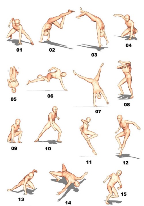
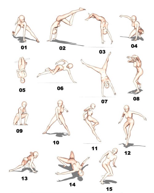
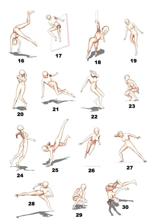
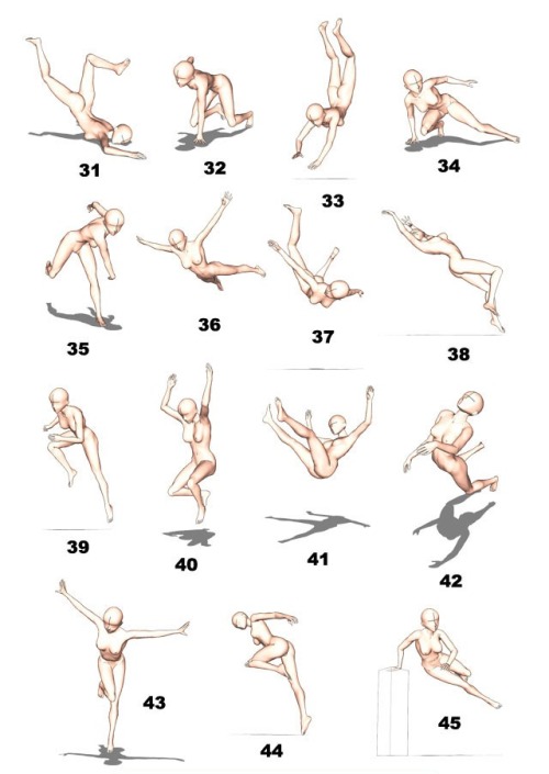
Kung Fu Poses (from How To Draw Fighting Poses)

Kung Fu Poses (from How To Draw Fighting Poses)
Artist: NeekoNoir
More Posts from Arttuti and Others
I share my secret tips on how I draw detailed illustrations effortlessly! P-please check it out…!


Thought about doing a very simple step by step since I had some WIP pics laying around ( ͡° ͜ʖ ͡°) Most of the time I start working on a drawing by laying down simple shadows and highlights in black & white - it’s one of the easiest ways to see how they affect the scene (and my favorite too). I don’t like worrying about too many things at once, so taking little steps is very helpful to avoid ruining the whole image at the very beginning~ commissions | instagram - deviantart - twitter - paigeeworld - facebook


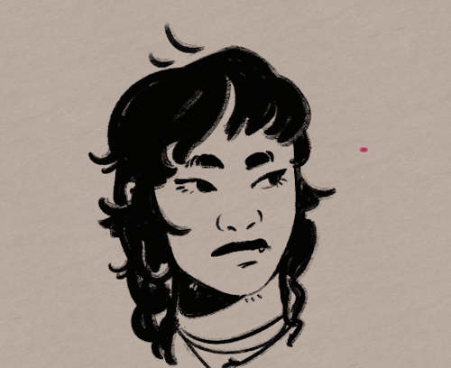
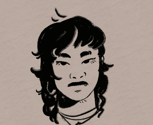
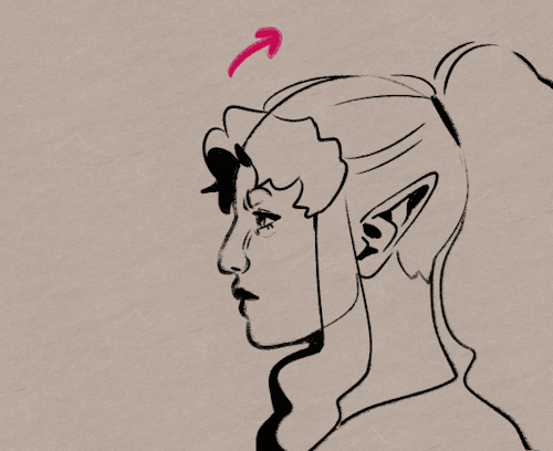
Not sure if I've asked this, butt in regards to your last picture you uploaded and all of your drawings, how do you know where to line up the head/cranium with the rest of the spine in cases where the head is turned or posed?
well that is simple, the head ideally sits in the middle of the spine…

positioning the head is not the difficult part, in most cases ‘artists’ don’t need to make things ‘look’ right but make it ‘feel’ right. specially when drawing idealized and/or from imagination altering proportions and poses is rather common ⁽ˢᵘᵖᵉʳʰᵉʳᵒ ᶜᵒᵐᶦᶜ ᵃʳᵗᶦˢᵗˢ ᶠᵒʳ ᵉˣᵃᵐᵖᶫᵉ⁾

the easiest way⁽ᶦᶰ ᵐʸ ᵒᵖᶦᶰᶦᵒᶰ⁾ is to use the shoulders. Most of the time when drawing poses i will actually place the shoulders first and then draw the head. Maybe try ‘gesture drawing’ as exercise.
Your art is so good !!! How do you color the skin its soo smooth
Thank you very much Anon ( ̄ε ̄@)hehehe!!Well I have some shots of one of my recent drawings so I’ll try to explain it a little bit hhahahah


Basically what I do is: 1. Put on base color2. Add some light shadows (They don’t even have to look very smooth, like the images above) 3. Then I start adding some darker shades of color and different skin tones to give it the correct shape, at this point I start adding some brighter tones, so yeah, they usually look very messy at this point. My brushstrokes also look like crosses or some sort on this step I think (I do it like that ‘cuz I think it’s easier to merge the colors later, at least for me hehehe) 4. Aaaand at the end, to merge the colors and make them look smoother I use a soft brush with low opacity to add some light shadows and brighter tones on bigger areas, I also try to use almost the same tones I used on the step three so it can merge nicely.So yeah, I think that’s about it (〜 ̄△ ̄)〜I hope I helped you out with that <3
I compiled this a while ago but I was just looking for references and found the file so...
Best places to find reference photos:
Body types, poses, and anatomy:
http://reference.sketchdaily.net/en
https://www.posemaniacs.com/
https://quickposes.com/en
https://www.characterdesigns.com/#home-section
https://www.adorkastock.com/sketch/
https://line-of-action.com/practice-tools/figure-drawing/
https://www.proko.com/browse/tools?af=242
Giant anatomy reference tutorials Pinterest board:
https://www.pinterest.com/deedee1232/body-reference/
General:
https://unsplash.com/
https://pixabay.com/
https://www.pexels.com/
https://stocksnap.io/
https://www.freeimages.com/
https://kaboompics.com/
https://commons.wikimedia.org/wiki/Main_Page
https://morguefile.com/
https://www.flickr.com/
https://www.dreamstime.com/
https://pmp-art.com/
https://www.freepik.com/
https://photobash.co/
https://picjumbo.com/
https://burst.shopify.com/
https://magdeleine.co/
https://wordpress.org/openverse/
Historical:
https://nos.twnsnd.co/
How I Animate

The Technique:
I draw the frames and then I use the liquify tool to push the lines into the next frame and redraw them where I need to. This allows me to keep the lines consistent, but gives me the control of frame by frame animation bc I am still making each frame manually! I also use 3d models as reference to help me with the angles! Super important to use reference while you animate (and with art in general), if youre no good handling 3d models then act it out and record yourself!

The Theory:
i think most people are at least loosely familiar with the 12 principles of animation (if youre not, heres a 2.5 minute video showcasing them!), but may not necessarily know how to employ them. the main 3 i tend to focus on when I animate is rhythm, telegraphing, and inertia so ill cover those there 👍
1. Timing & Rhythm
Timing is how you space out your frames both in how long an individual frame is held for, and also when you drawn an inbetween of two frames you can favour one frame slightly more than the other instead of drawing the exact average of the cels, giving the favoured cel more timing weight.

Left line has the cels evenly spaced out on the timeline, right holds the first cel for longer and the second cel slightly favours the last frame. It creates a more interesting rhythm to the animation! Rhythm is how I think of animation timing. Theres a beat like a song to every animation I make, and creating an interesting beat is what makes an animation fun to watch (for me, anyway):

2. Anticipation / Telegraphing

Before I animate a big change in movement, I like to telegraph that its coming. Usually this is doing a little counter movement in the opposite direction, but thats not the only way to telegraph a motion, e.g. eye movement can telegraph a head turn!

3. Follow-through / Overshoot / Inertia


Unless the movement is mechanical, it wont come to a hard stop and will have some level of bounce or easing out to it. How much "bounce" you add will have a big impact on how the animation feels, but a very subtle bounce will add a natural feeling to the end of a motion.

Secondary animations will use a lot of this, note that the head and the hand have a small amount of continuous motion (primary animation), and then the hair has a lot of bounce and inertia (secondary animation which reacts to the primary animation). Note the different amounts applied to the braid vs the sideburn vs the bangs
anyway! I hope this was insightful ❤️ if you like my art you can commission me by the by :)


-
 jammicuart liked this · 2 years ago
 -
 fools-fortune liked this · 4 years ago
 -
 evanwhosjusthere reblogged this · 4 years ago
 -
 blacklight-diamond liked this · 5 years ago
 -
 cordonianredruby liked this · 6 years ago
 -
 passivelocat liked this · 6 years ago
 -
 gaasaku-fanfests reblogged this · 6 years ago
 -
 screaminglamps liked this · 7 years ago
 -
 pivotmasterecho liked this · 7 years ago
 -
 daienkaixoxentei liked this · 7 years ago
 -
 arislukewarmiced-coffee liked this · 7 years ago
 -
 kuryama liked this · 7 years ago
 -
 stylinsoulmatess reblogged this · 7 years ago
 -
 skittles1016 liked this · 7 years ago
 -
 enigma-spirit liked this · 7 years ago
 -
 sinisterbud liked this · 7 years ago
 -
 iseeinpurple reblogged this · 7 years ago
 -
 noyaboya liked this · 7 years ago
 -
 nexomify liked this · 7 years ago
 -
 bunnygays liked this · 7 years ago
 -
 anhtique liked this · 7 years ago
 -
 thefangirlingtimes liked this · 7 years ago
 -
 radiant-spark-art-dump-blog reblogged this · 7 years ago
 -
 xxrollingisthepandaspowerxx reblogged this · 7 years ago
 -
xxrollingisthepandaspowerxx liked this · 7 years ago
-
 iceboyjayx liked this · 7 years ago
 -
 das-the-drop-bear liked this · 7 years ago
 -
 venusla liked this · 7 years ago
 -
arttuti reblogged this · 7 years ago
-
 capndrafts0n-blog liked this · 7 years ago
 -
 nvdiabolik liked this · 7 years ago
 -
 gakime liked this · 8 years ago
 -
 artinspirationdump reblogged this · 8 years ago
 -
 phoebemcln-blog reblogged this · 8 years ago
 -
 collegeshitandotherthingstoknow reblogged this · 8 years ago
 -
 feliciamjackson liked this · 8 years ago
 -
 stardust-speedway6 liked this · 8 years ago
 -
 seedafuturemusic liked this · 8 years ago
 -
 jayie-the-gayie liked this · 8 years ago
