I Have Two Questions! First: Have You Ever Thought Of Doing A Tarot Card Suit For Your Characters? I
I have two questions! First: have you ever thought of doing a tarot card suit for your characters? I think it'd work really well for them! And two: help me how do I draw legs
@gravitality
Hi!! I’ve absolutely been thinking about that, yeah, in fact I recently talked about that to my boyfriend just recently. It’ll likely happen after october! And to answer your second question! I made a thing on legs that i hope you’ll find useful!!
So. I’ve already explained basics on legs here, but I don’t think it hurts to go through some extra details to help you understand legs some more.

The very basic thing is to imagine legs as teardrops. Again, this has already been covered in said tutorial above, but I figured it’s still good to mention even the most basic thing that I know of. I still highly recommend you check it out to get in more detail and to see some other examples and practices that you do. But basically, think of legs in the shapes of teardrops, when it comes to shape. If you need a simple stick-figure to connect the legs in the first place, make sure that they bend at the knees a bit so that the legs don’t come off as stiff and unnatural.

As you can see, this method works perfectly for realistic legs as it does for stylistic ones. Remember to use these as a guideline, never to be the exact base of the legs you will be drawing. If you draw traditionally, remember not to draw these guides too hard, or they will be hard to erase/do freestyle!

But how do you actually draw out the legs without drawing them perfectly straight, as shown to the left? The trick is to add volume to them, and how you do that can be winged to your own liking. The idea is to think in curves. As no leg is perfectly straight. You may make these curves minimal if you don’t want them to be curvy, but keep in mind, still, that not even your own bones are perfectly straight, so it is highly recommended that you make them bend, at least a little.

It all depends on how you draw them as well. Say you put your legs together, as shown in this picture, what happens to the fat and muscle? Naturally, they press together, much like how thighs squish on the surface when you sit down (I’m sure most people know what I’m talking about). Make sure this shows in your art! This is very important to keep in mind, because it makes it all look more natural and believable. Try to cross your legs or stand up and sit down again for real-life examples!


The same applies for stretching your legs, more or less, except they appear to become more ‘hollow’ and slimmer. They become less soft to the touch, too, and might show. Try stretching your legs and feel where the muscles tense and where it feels ‘hollow’. This is very helpful with your art.

Many leg tutorials talk about legs without mentioning the behind. It requires a tutorial on it’s own, in all honesty, but this is the most simplest way to draw it connecting to the legs. Remember that it comes in many different shapes, and this is just a super basic guide! Two circles overlapping, while following the line and flow of the legs. Remember the muscle/fat as mentioned above!

Okay, so we got the basics of leg shapes figured out? What if you want o draw them in a certain pose, or with a certain silhouette, but perhaps do not have the reference for it? Or you want to blend your style into it? The key is to not shy away from doodling the form. Make mess, draw lightly and don’t care about the anatomy. That way you’ll get everything down without it appearing stiff. You can clean up the sketch later, always, and if you can, use a reference after you have drawn your pose, to correct your drawing.

Remember that the hips do a lot to the pose of the legs! Make sure they are in flow with your legs, so that it can look more natural. Remembers that hips ‘rotate’ with the spine.

I’ve talked about this method before when it comes to posing, and the same applies for the legs. One way to make legs appear ‘steady’ is to picture them standing in a line, and one of those legs need not to stray from the lines too much, making it steady. If you want a dynamic pose despite the steady pose, you can always have the other leg stray from the line, since it only matters that one leg is steady. This method can create good, casual poses without making them appear boring. (also notice how the teardrop shapes are used here, despite the highly stylized legs)

Do you want a highly dynamic pose, or them to appear unsteady, then skip the line entirely and make both legs aim away from it completely. As you can see, the legs appear more moving, in action, as if they’re fighting, falling, or dancing. As you can imagine, this is not a pose that one could stay steady on, suggesting that it’s taken mid-movement. More about posing and this ‘line’ method is talked about in this tutorial.
Hope this helped you, if you have any questions let me know, and if you’d like to check out all my tutorials they can be found here!
More Posts from Arttuti and Others


I share my secret tips on how I draw detailed illustrations effortlessly! P-please check it out…!


So I got a lot of messages after my first post asking me to explain layers, so I have put together a cheat sheet of the different layer types. The quickest way to become awesome with layers is to know exactly what each one does. Once again, I’m no expert, and these are just my personal definitions, so please try these out for yourself! LONG POST BELOWWW THE LAYERS CHEAT SHEET PART ONE: 1. NORMAL: Aw yeah you know all about this layer its just your average layer 2 DISSOLVE: This mode “dissolves” some pixels, allowing the lower layer to show through. very pixel-y. Reducing opacity makes it dissolve more. ________ 3. DARKEN: Now the difference between darken and multiply are a little confusing, so I will explain them together. MULTIPLY is more of a glaze, while DARKEN favors the darks on all layers. So if you have a darken layer on, it tend to reduce/remove the lighter tones on the layer if there are darker tones below it, while darkening the darks. 4. MULTIPLY: A glaze that darkens the color of the layer below. It is great for shading. Reduces whites. 5. COLOR BURN: “Burns” the lower layer favoring a more saturated look. Marks made over white are not preserved. 6. LINEAR BURN: “Burns” the lower layer, with a little less saturation than color Burn. Also will preserve colors over white. 7. DARKER COLOR: I tend to avoid this puppy cause it does not darken on the RGB channel. (feel free to try him though!) ______ 8. LIGHTEN: Lightens the colors below. Favors lighter colors on lower layers. 9. SCREEN: Lightens the colors below, but much closer to the “glaze” analogy as above. Reduces blacks. 10. COLOR DODGE: Often used for magic-y effects, color dodge bumps up saturation and is very bright. 11. LINEAR DODGE: Much like color dodge, but less saturation. 12. LIGHTER COLOR: Once again, this is an outside RGB channel layer, so I don’t really use this. As you probably have noticed, the second two groups are opposites, so if you have a good handle on one, you probably know exactly what the second group does! I will do the remaining groups next week as they do not follow this pattern. Thanks! drawmaevedraw.tumblr.com EDIT: Part two here: Photoshop Layers Part Two!!


Kimono drawing guide ½, by Kaoruko Maya (tumblr, pixiv, site). Booklet is available in pdf for ¥ 900 here.
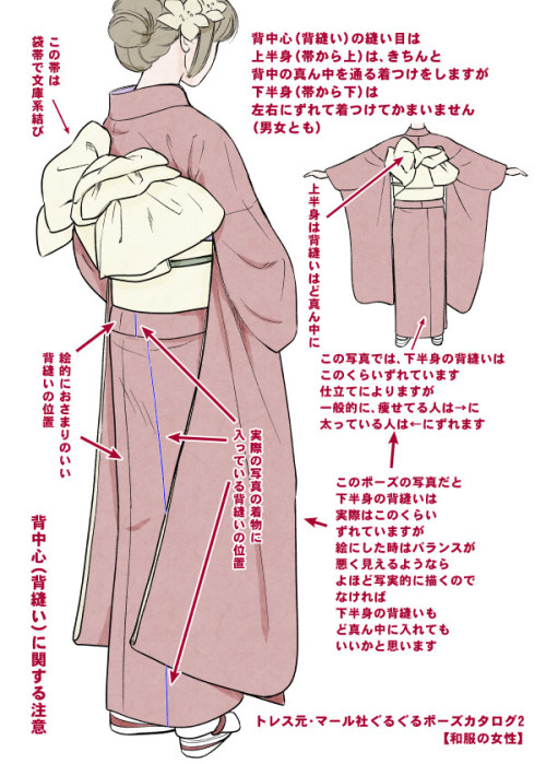
Here you can see:
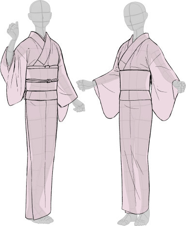
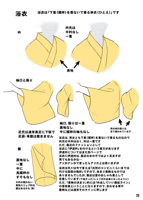
female kimono and yukata (note how the juban underwear peeks when in kimono + how belts differ)
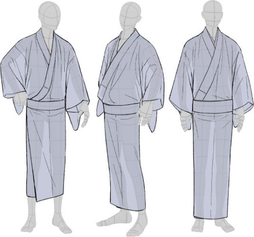
male yukata and kimono (note how the juban underwear peeks when in kimono)
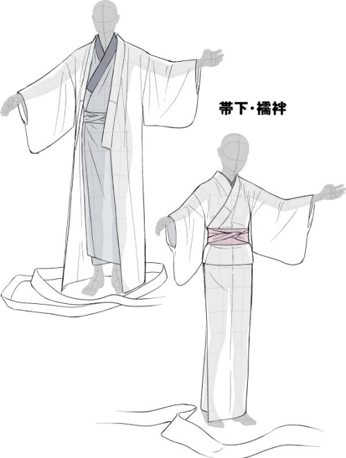
dressing up: male (kimono is not closed yet) and female (kimono closed with datejime belt and ready to put on obi)
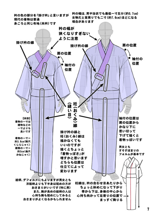
differences between female and male kimono once dressed (note how the collars and belts set)
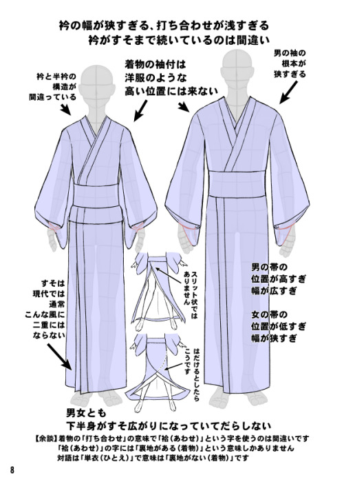
common drawing mistakes (compare with previous picture: shoulders lines are too defined, there is a double hem, collars are narrow, belt is not at the right place etc)
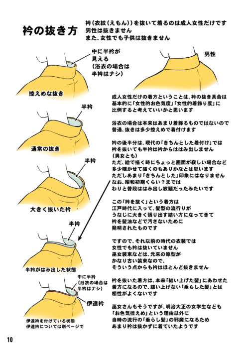
women back collar (the lower the sexier) and men back collar (close to the nape)
back and sleeves differences between men and women
collars and sleeves and view of how kimono drapes around body
Furisode back (long sleeves kimono) and formal furisode obi knot example


-
 donuts-multifandom-hellhole reblogged this · 1 week ago
 -
donuts-multifandom-hellhole liked this · 1 week ago
-
 jesterpanic reblogged this · 1 month ago
 -
 the-awesomeness-of-randomness liked this · 2 months ago
 -
 tryingtolearnartsob reblogged this · 2 months ago
 -
 stars-follow-the-sky liked this · 3 months ago
 -
 krunchycrispy liked this · 4 months ago
 -
 spinderscaster liked this · 6 months ago
 -
 wanderingquill reblogged this · 6 months ago
 -
 purehatred12 liked this · 8 months ago
 -
 great-wolfskin reblogged this · 8 months ago
 -
 napxsoil reblogged this · 8 months ago
 -
napxsoil liked this · 8 months ago
-
 writerjabberwockies reblogged this · 8 months ago
 -
 artking-4 reblogged this · 11 months ago
 -
artking-4 reblogged this · 11 months ago
-
 batsoutlow liked this · 1 year ago
 -
 adamdarkless liked this · 1 year ago
 -
 fomikrai liked this · 1 year ago
 -
 hydrangeahelper reblogged this · 1 year ago
 -
 fritaqtibedbeanc liked this · 1 year ago
 -
 acmatazimne liked this · 1 year ago
 -
 delightfulkingtyphoon liked this · 1 year ago
 -
 ewtalpihelpround liked this · 1 year ago
 -
 friendshapedstranger liked this · 1 year ago
 -
friendshapedstranger reblogged this · 1 year ago
-
 akiralightshiraoka0 reblogged this · 1 year ago
 -
 sucelus1 liked this · 1 year ago
 -
 reflectre reblogged this · 1 year ago
 -
 sylphthedragon liked this · 1 year ago
 -
 sunlaire liked this · 1 year ago
 -
 laukareferencepile reblogged this · 1 year ago
 -
kung-pow7 liked this · 1 year ago
