Do You Have Like, A Coloring/lighting Tutorial? I'm New To Digital Art And Your Latest Lighting Exercise
Do you have like, a coloring/lighting tutorial? I'm new to digital art and your latest lighting exercise looks.... so good???


More Posts from Arttuti and Others
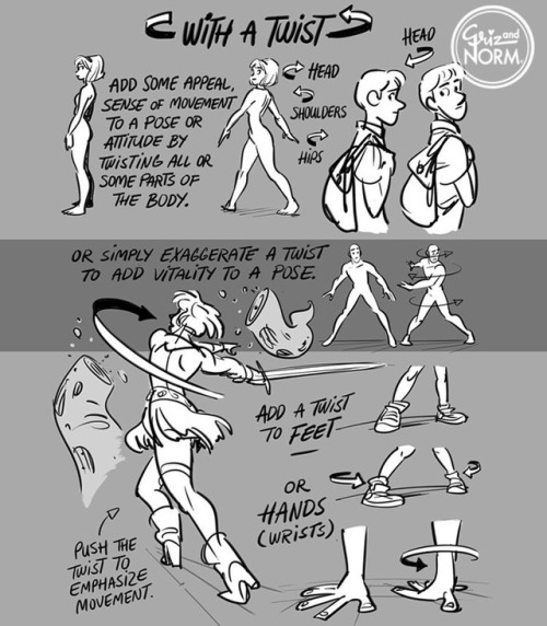
Tuesday Tips - With a Twist! Add some vitality to a pose by twisting parts of the body. A little or a lot. Give it a shot. #Norm #100tuesdaytips #WithATwist #grizandnorm #arttips #arttutorial
(If you haven't answered this before) how do you do shading?
i havent !! and. i cant say this is gonna be any help but heres some of the things i try to keep in mind when im shading stuff

so youve got your flats on your initial drawing, the thing thats getting the business

then youve got find out where the light is coming from ! your light source is gonna determine where all the highlights and shadows are cast, and while it doesnt have to be EXACT, its generally a good rule to keep it pretty consistent through the drawing - sometimes youll probably have to deal with multiple sources, and each ones gonna be casting its own light and shadow ( and color by extension )

the intensity and sharpness of your shadows generally also reflects the brightness or closeness of the light ! basically if you wanna make something look BRIGHT, you gotta make sure the shadows are dark enough to get the idea across

so the actual shading part - the way i shade is by getting a brush on a very low opacity, picking the color i want for shadows and then layering the strokes over and over until i get about the darkness i want ( because im LAZY and i dont actually work with complex backgrounds a bunch, i can usually get away with drawing the shadows directly on the locked flat colors layer so theres nothing to clean up after )

afterwards i clean it up a little if i need to, add highlights while keeping in mind where the light is coming from, and start on the Detail Work ( it also might be helpful to keep in mind that highlights dont always go on the EDGE of things, but rather where the curve of something is - where the light would catch. this can help add a little depth and make flat things look rounded out ! )

and THEN its basically me zooming into the drawing at least 200%, putting another layer over the top of everything, and going over the outlines with a tiny brush so the harsh black is mostly gone ! there shouldnt be anything along the edge thats darker than the darkest part of the shadow ( with exceptions like the eyes and nostrils )
and thats mostly it ! i picked red for the shadow color, but picking your shading ( and flats ! ) based on the colors in your background can go a LONG way into making it seem like your character is actually in the environment

reflective light is also an important thing to keep in mind when choosing shadows and highlights - light and color doesnt always just hit an object and stay there, and even in the shade there could be light bouncing back from stuff like water or grass creating smaller, subtle highlights along the edges of things close by
not everything reflects the same way either ! something like a piece of wood is going to react differently than say, a metal ball

so you get your light source, basic highlights and shadows, not bad ! but then theres ALSO the light reflecting from the rest of the environment along the edge of the ball, and then finally the color from both the dragon and the ball reflecting a bit on each other
honestly though these arent RULES of drawing and more just guidelines i work with sometimes, and maybe your style of shading and highlighting looks completely different than this and thats ok !! - im still figuring a bunch of stuff out about light and reflections myself, and the great thing about art is that you can do whatever the hell you want with it


Obviously, I’m not the best with drawing hands. But that basic shape helped me with drawing hands best. (Circle works for me too but not as good as that ‘fan shape’ my professor taught our class).
Don’t forget to keep practicing and using real life references–It’s the best way to draw good hands! Take your time drawing them! Don’t rush (unless you really wanna) It’s not a competition.
Got questions? Feel free to ask!

Stumbled across your art recently, and I totally admire your work! As a complete noob to the digital art scene, I'd just like to ask whether you have any tips on colour picking (like for skin tones, under varied/dramatic lighting and such!). I have a ton of other things I want to ask, but I'll limit myself to one question and then try to google the rest, haha/ Thanks for sharing your art with us! ^^
ahh thank you so much! ♥ welcome to the digial art scene friend, i hope you enjoy your stay and ctrl + z
now onto your question! (if you don’t know what layer and layer modes are and how they generally work you should probably google that before you continue reading)
we all perceive colour differently (thx science) and i trust my intuition a lot when it comes to colour picking because of that, and also because i feel like you can make pretty much every colour combination work within the right context. context is key! but still, remember that all of this is about how i perceive colour, so you might not agree with everything i say.

here’s a quick rundown of terms you’ll see around a lot in reference to colours and shading: the hue, which is the ‘colour’ itself, the saturation aka the intensity, and the brightness [or value] which describes how dark or bright we perceive a colour to be.
rule of thumb: when you shade don’t just add black (or white) to your base colours, that will make your drawings boring and lifeless. use different hues and saturation!
now first things first: which skin colour does the character have?

you’ll mostly be navigating in the red to yellow spectrum for the skin tone. so when i pick the base colours i usually start with the skin and adjust the rest of the colours accordingly. if you’re not sure where to begin it might help if you first determine the values (brightness) of the base colours in grayscale.
and here are a few colour variations—i stuck to the approximate values but played around with a lot of different hues and levels of saturation.
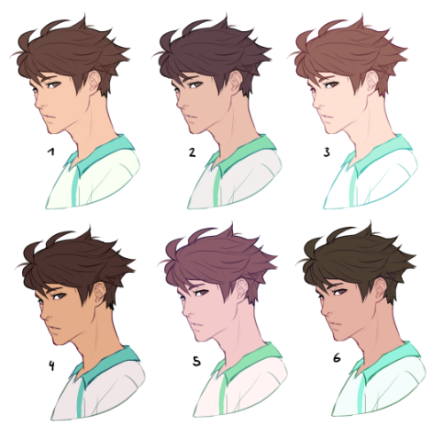
now compare 3 and 5: you’ll notice that 3 is very bright and leans towards orange hues, whereas 5 has a pinkish tint.

on the left i gave 5 the hair colour of 3 and in my opinion the pink hue of the skin doesn’t go well with the orange undertone of the hair. you’ll have to experiment a lot to find out which combinations work for you.
ctrl + u is your biggest friend (or image >> adjustments >> hue/saturation in photoshop, the shortcut works in sai and clip studio paint too). play with the sliders and see what happens. i do that a lot myself, because it’s easier to coordinate the colours like that afterwards instead of trying to manually pick perfectly matching ones right away.
for further adjustments i like to use an extra semi-transparent layer on top of everything with just a single colour to add atmospheric light. this unifies the colours and makes them more harmonious, if that’s what you’re looking for. this is about as far as i’d go if i didn’t want to shade the drawing.

if i do want to shade, especially with high contrasts and dramatic light, i darken the base by just adding an additional black layer, here set to 40% opacity. of course you could add a colour layer like the ones i mentioned previously too.


to create an impression of dramatic light you need a high contrast between light and dark areas (1). if i want additional visual intrest i often add secondary light which falls onto the main shadow areas. here i picked a faint greenish blue to balance out the yellow (2). and since light is at least partially reflected when it hits a surface you should add a faint glow that goes across the shadow/light border. i uses a mid-brown with a very soft brush on a layer set to overlay here (3).
for this shading style i like to use the layer mode colour dodge with lowered opacity + fill settings. for some layer modes opacity and fill do the exact same thing (e.g. for multiply or screen). however for colour dodge there’s a big difference:

a lowered opacity merely alters the transparency of the entire layer. that looks pretty awful sometimes, because the bright orange affects the dark of the hair much more intensely than the already brighter skin. but when you lower the fill percentage you primarily lower the amount of light that falls onto darker colours. so the layer’s opacity setting treats every colour equally whereas the fill setting takes their values into consideration. it might be hard to understand if you don’t try it out yourself, so just play around to get a feel for how it works!
and to summarise, here’s a process gif:

colour is an extremely big topic and i’ve only barely scratched the surface but i hope that still helped you out a little! the fastest way to learn is always to try things yourself, so grab a sketch and experiment. 👍


Comic Pages Storyboard Tutorial
OKAY SO! @biazerod asked me a little help on storyboarding and i decided to make this tutorial…i’m not a professionist. so don’t take these as golden rules…just advices! and as always sorry for the english FIRST THING FIRST! the storyboard part is the most important phase in a comic page ! you can spend an entire day storyboarding! because it’s the structure, the essence of the page! here’s some tips : 1- a page can start from 1 panel/frame (called splash page!) until how many f*cking panels you can fit ! (some pages , especially in french comics/bd can reach 24 panels/frames!) Exaple of splash pages:


(these are from the green lantern,DC and the newest Thor ,marvel ) Splash pages are a priority of American comics, you rarely can find them in french Bd ! they represent a scene of impact! a fight! a revelation! be careful! use it only one if two times on a range of 50 pages! cuz it cut the narration! instead in french bd you find this :


first one is from Blacksad 2# and second one is from Atar Gull see how high the number of the frames is?? the number of frames is very important in a page because it decide the narration time! :D also it all depends on the kind of ‘’direction’’ you want to use on your comic! so be really careful when you decide the number of the frame! LET’S PASS ON THE CREATION! 1- when you have a page that contains more than 3 Frames ALWAYS. ALWAYS HAVE AN ESTABLISHING SHOT!

the establishing shot is fundamental! BECAUSE READERS CAN UNDERSTAND WHERE THE CHARACTERS ARE! DON’T DO A COMIC PAGE FULL OF FACES !

DON’T DO THIS! LET THE CHARACTER BREATH! LET THE READER BREATH! PLAY WITH YOUR CAMERA! YOU HAVE THE POWER! in a comic page, is important to put the camera far away from the character most of the time! play with the different shots!

(found this on google) WATCH MOVIES AND TV SHOWS. lot of them can help you so much you have no idea! a comic artist and a director do the same job when creating a story 2- Candy eye this is a tricky trick that can help you with the audience! when a character is saying something important or you have to introduce them , USE THE CANDY EYE DUDE.

the candy eye is , basically, a bust shot where you show the character,their features , usually with a cool or a funny expression ( or of course it depends from the situation) and believe me WORKS 10/10 with the audience ;) 3- HIGHLIGHTS THE IMPORTANT SCENE IN THE PAGE!

FINAL TIPS: - when you’re doing dinamic poses try and try again! the first one isn’t always the best! -USE REFERENCES. -A STORYBOARD PAGE CAN REQUIRE EVEN 4 HRS IF NOT AN ENTIRE DAY IF NOT AN ENTIRE WEEK. REMEMBER THAT THE STORYBOARD IS THE ESSENCE. AND THE REST IS DECORATION. - IMAGINE THE SEQUENCE! NOT THE SINGLE PAGES. THINK IN SEQUENCES! imagine what would happen after the page you are creating! connect the various pages NOT THE SINGLES FRAMES ! YOU’RE CREATING A STORY! NOT A SINGLE ILLUSTRATION! -AGAIN DON’T DO PAGE OF FACES. most important thing:

if the page you’re creating it stresses you! STOP. continue it when you are in a better mood ,dude. our job requires lot of time and effort, but it should be the job we love. so don’t stress yourself and keep calm. hope this is useful. don’t take this as golden rules, this is just the way i work :)
Hi. :3 I love your art and you're totally awesome! I just had a quick question. I saw your post about hair tips on Dean and Cas, and I was wondering if you had one for Sam. Thank you, it means a lot. ^.^
Sure no problem! Just part it slightly to the right and have the hair flow down from that line. Don’t forget his killer sideburns lol


-
 spectrummoonwaves liked this · 10 months ago
 -
 nervousscissorsgoopthing liked this · 11 months ago
 -
 greenfoxinfoxy liked this · 1 year ago
 -
 ilovemakingprompts reblogged this · 1 year ago
 -
 ketothehero liked this · 1 year ago
 -
 eyed-knife liked this · 1 year ago
 -
 letterfromajax liked this · 2 years ago
 -
 lupuslimara liked this · 2 years ago
 -
 senshilegionnaire reblogged this · 3 years ago
 -
 tarpeellistatavaraa reblogged this · 3 years ago
 -
 angry-child liked this · 3 years ago
 -
 sxpths liked this · 3 years ago
 -
 kittymooya liked this · 3 years ago
 -
 kintsugi-rabbit reblogged this · 3 years ago
 -
 demoruu liked this · 3 years ago
 -
 ladyjenniemarie liked this · 3 years ago
 -
 yaizaworld10 liked this · 3 years ago
 -
 elegyofemptiness42 reblogged this · 3 years ago
 -
elegyofemptiness42 liked this · 3 years ago
-
 savageontheside liked this · 3 years ago
 -
 emmabirb8 reblogged this · 3 years ago
 -
 thakillingmoon reblogged this · 3 years ago
 -
 jackolanternsummers liked this · 3 years ago
 -
 florals-cardigan reblogged this · 3 years ago
 -
florals-cardigan liked this · 3 years ago
-
 professorndear liked this · 3 years ago
 -
 stargazerlillian reblogged this · 3 years ago
 -
stargazerlillian liked this · 3 years ago
-
 nyxnoxxx liked this · 3 years ago
 -
 artdumppile reblogged this · 3 years ago
 -
 androgynosaurus liked this · 3 years ago
 -
 spooky-bean liked this · 3 years ago
 -
 the-fancy-cookie liked this · 3 years ago
 -
 wiggie-stuff liked this · 4 years ago
 -
 opalboba liked this · 4 years ago
 -
 elizabeth-fudge liked this · 4 years ago
 -
 yinminelan4-blog liked this · 4 years ago
 -
 barbara-gittings-blog liked this · 4 years ago
 -
 fuzzypatrolfancowboy liked this · 4 years ago
 -
 missdeadinside liked this · 4 years ago
 -
 greenwingspino liked this · 5 years ago
 -
 cry-stals liked this · 5 years ago
 -
 shadescootalo liked this · 5 years ago
 -
 wingddings liked this · 5 years ago
 -
 low-po1y-princess reblogged this · 5 years ago
 -
low-po1y-princess liked this · 5 years ago
-
 cthulus-trophy-twink liked this · 5 years ago
 -
 goregutz-moved liked this · 5 years ago
