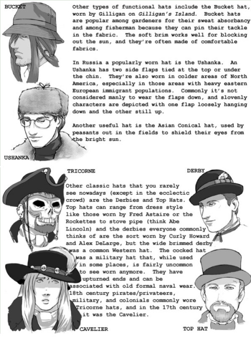
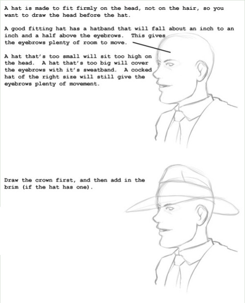
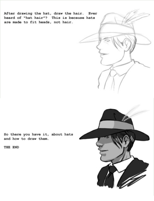
Lips Tutorials Row 1 To 4 Row 5: Left Right Row 6: Left, Middle Right Bottom Image


Lips Tutorials Row 1 to 4 Row 5: Left Right Row 6: Left, Middle Right Bottom Image
More Posts from Arttuti and Others


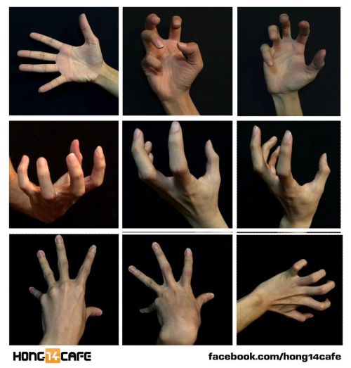
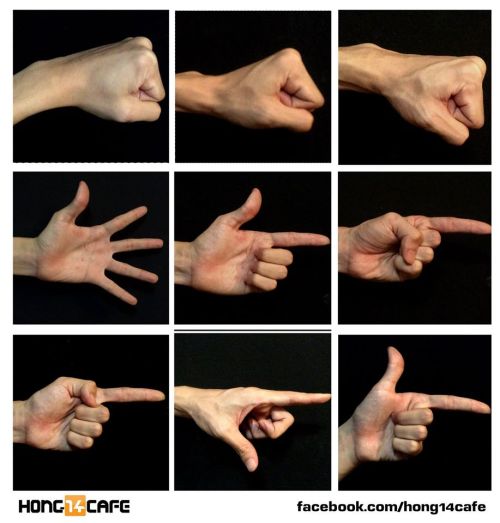
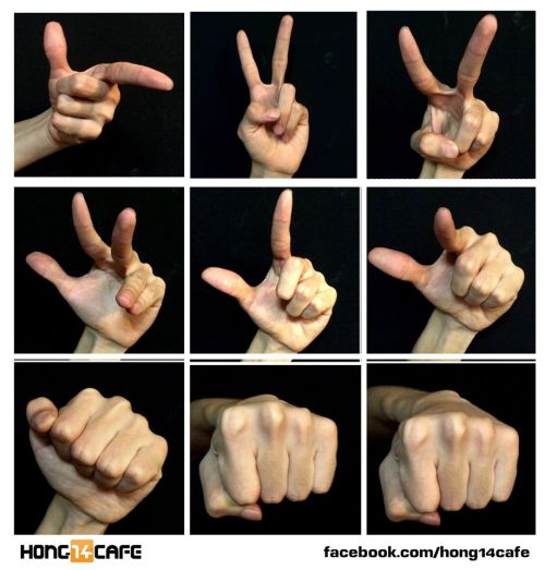
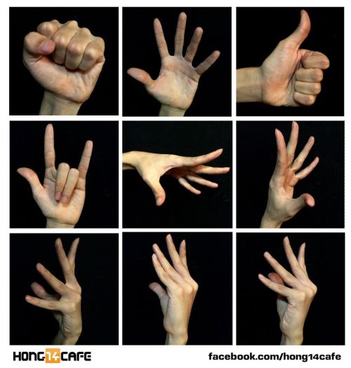
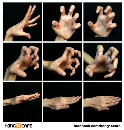
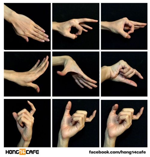
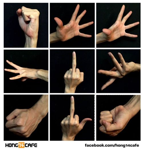
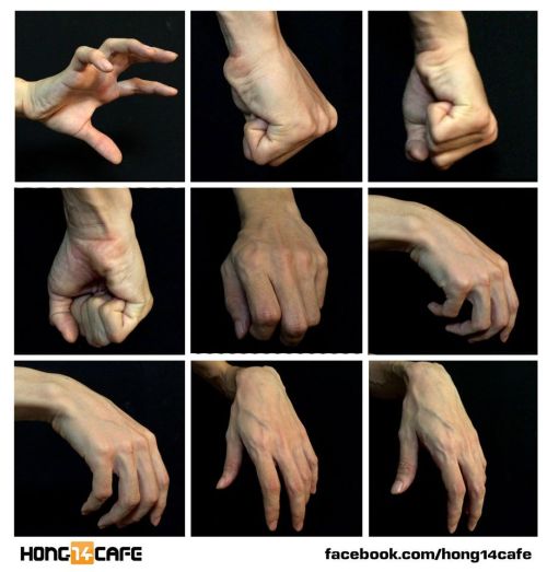
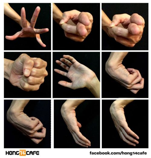
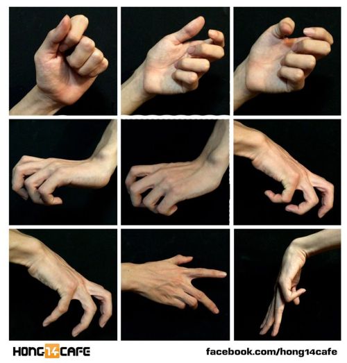
Fantastic hands references by the website Hong14cafe.
Hong14cafe: Facebook | Forum


Anonymous said: Thanks for your tutorials, they are so simple to understand even for someone quite dumb about arts (me)! If you’ll have time and mood, can you, please, create tutorial for making lineart. I’m fairy bad at that.
Thank you! That’s really great to hear that! :D If you browse my gallery you’ll notice that lineart isn’t something I use often (so that’s why I digged in my old drawings a bit to get some examples u_u) Anyway, I think there are more competent and skillful people out there whom you can ask about it but this is what I do. Just study other artists’ art, it’s helpful. Try to use different brushes and see what works best. Also things I think are important: ⁎ use bigger canvas (mistakes are less visible) ⁎ don’t use smal brushes with smooth but very defined edges because the lines will seem very jerky and ragged ⁎ vary thickness of your lines to make everything more dynamic but try to make it natural (it’s a little bit like calligraphy) ⁎ practice! lines will be smooth and flowy if you make your hand confident: - draw traditionaly - excercise with drawing straight lines and curves - make quick, long strokes instead of drawing short lines (they’ll look sketchy) or doing painfully precise, slow moves - don’t zoom in too much - turn off the stabiliser (at least sometimes)) (Aaaand… you can always use vector drawing tools as a last resort :))

So I got a lot of messages after my first post asking me to explain layers, so I have put together a cheat sheet of the different layer types. The quickest way to become awesome with layers is to know exactly what each one does. Once again, I’m no expert, and these are just my personal definitions, so please try these out for yourself! LONG POST BELOWWW THE LAYERS CHEAT SHEET PART ONE: 1. NORMAL: Aw yeah you know all about this layer its just your average layer 2 DISSOLVE: This mode “dissolves” some pixels, allowing the lower layer to show through. very pixel-y. Reducing opacity makes it dissolve more. ________ 3. DARKEN: Now the difference between darken and multiply are a little confusing, so I will explain them together. MULTIPLY is more of a glaze, while DARKEN favors the darks on all layers. So if you have a darken layer on, it tend to reduce/remove the lighter tones on the layer if there are darker tones below it, while darkening the darks. 4. MULTIPLY: A glaze that darkens the color of the layer below. It is great for shading. Reduces whites. 5. COLOR BURN: “Burns” the lower layer favoring a more saturated look. Marks made over white are not preserved. 6. LINEAR BURN: “Burns” the lower layer, with a little less saturation than color Burn. Also will preserve colors over white. 7. DARKER COLOR: I tend to avoid this puppy cause it does not darken on the RGB channel. (feel free to try him though!) ______ 8. LIGHTEN: Lightens the colors below. Favors lighter colors on lower layers. 9. SCREEN: Lightens the colors below, but much closer to the “glaze” analogy as above. Reduces blacks. 10. COLOR DODGE: Often used for magic-y effects, color dodge bumps up saturation and is very bright. 11. LINEAR DODGE: Much like color dodge, but less saturation. 12. LIGHTER COLOR: Once again, this is an outside RGB channel layer, so I don’t really use this. As you probably have noticed, the second two groups are opposites, so if you have a good handle on one, you probably know exactly what the second group does! I will do the remaining groups next week as they do not follow this pattern. Thanks! drawmaevedraw.tumblr.com EDIT: Part two here: Photoshop Layers Part Two!!
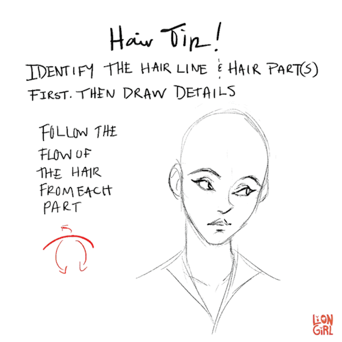

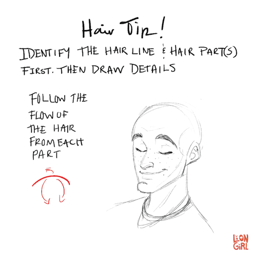

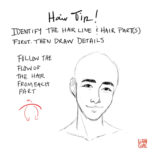
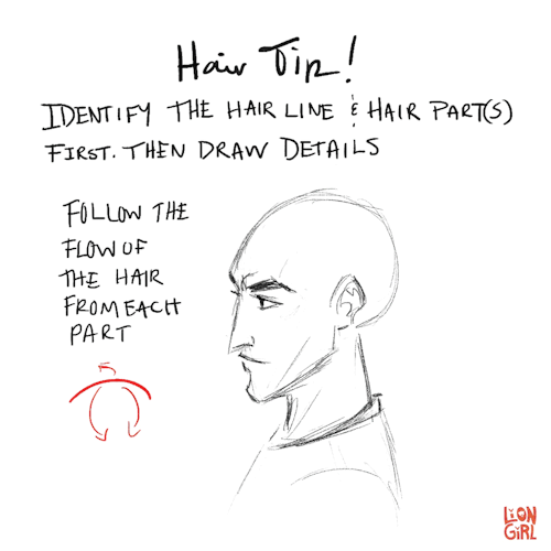
Hair Tip #1 - When drawing hair, start with the hairline and hair part(s). Then keep the flow and volume in mind while you add details!
I’m not the best at drawing or painting hair, but someone on instagram requested that I make a post about it so hopefully this will help someone! This is the first of 3 tips I’m going to share.
Your art is so good !!! How do you color the skin its soo smooth
Thank you very much Anon ( ̄ε ̄@)hehehe!!Well I have some shots of one of my recent drawings so I’ll try to explain it a little bit hhahahah


Basically what I do is: 1. Put on base color2. Add some light shadows (They don’t even have to look very smooth, like the images above) 3. Then I start adding some darker shades of color and different skin tones to give it the correct shape, at this point I start adding some brighter tones, so yeah, they usually look very messy at this point. My brushstrokes also look like crosses or some sort on this step I think (I do it like that ‘cuz I think it’s easier to merge the colors later, at least for me hehehe) 4. Aaaand at the end, to merge the colors and make them look smoother I use a soft brush with low opacity to add some light shadows and brighter tones on bigger areas, I also try to use almost the same tones I used on the step three so it can merge nicely.So yeah, I think that’s about it (〜 ̄△ ̄)〜I hope I helped you out with that <3
can you show us your painting steps?
I start with a base of sketchy lines (on grey so i can see the lines better)

2. Then I put down a base skin tones

3. From there I create a new layer and start adding shadows/highlights/other tones (i call them roughs)

4. I add some overlay/soft light layers to help me figure out the mood (I change this A LOT)

5. Then I work on refining/ smoothing

6. My final steps are all cleaning up/adding details/texturesHere’s the finished work!


-
 majasblr reblogged this · 3 months ago
 -
 artking-4 reblogged this · 3 months ago
 -
 creepywolf15 liked this · 9 months ago
 -
 oceanfalls-skyblue liked this · 10 months ago
 -
 panko-in-ur-manko liked this · 10 months ago
 -
 rumble-pak liked this · 11 months ago
 -
artking-4 reblogged this · 1 year ago
-
 scrapbox-in-the-attic reblogged this · 1 year ago
 -
artking-4 reblogged this · 1 year ago
-
 cluelesswonder reblogged this · 1 year ago
 -
 ofdeadtefire liked this · 1 year ago
 -
 watchtheironthrone liked this · 1 year ago
 -
 doom1993ytp liked this · 1 year ago
 -
 yaolmao liked this · 2 years ago
 -
 vixenvill liked this · 2 years ago
 -
 carasresources reblogged this · 2 years ago
 -
 pixellangel liked this · 2 years ago
 -
 godforbidding liked this · 2 years ago
 -
 thatfatalbino liked this · 2 years ago
 -
 landfishies liked this · 2 years ago
 -
 katiewolfgirl7 liked this · 2 years ago
 -
 racnarath liked this · 2 years ago
 -
 lucylagopus liked this · 2 years ago
 -
 sobsloudly-19yo liked this · 3 years ago
 -
 mayorpotato liked this · 3 years ago
 -
 oglendh liked this · 3 years ago
 -
 ishouldbeoverthis liked this · 3 years ago
 -
 tricky-sphinx reblogged this · 3 years ago
 -
tricky-sphinx liked this · 3 years ago
-
 artista1210 liked this · 3 years ago
 -
 crowdoesart21 reblogged this · 3 years ago
 -
 martialwriter liked this · 3 years ago
 -
 dohorwarmautumn liked this · 3 years ago
 -
 lenci7world3 liked this · 3 years ago
 -
 for-yknow-future-refrence reblogged this · 3 years ago
 -
 polinokisblog liked this · 3 years ago
 -
 twmblr reblogged this · 3 years ago
 -
 bigpeachgiver-blog1 liked this · 3 years ago
 -
 handydandyartrefs reblogged this · 3 years ago
 -
 kitchensinkclusterfuck reblogged this · 3 years ago
