The Creator's Guide To Comics Devices Is OPEN!!! Comicsdevices.com

The Creator's Guide to Comics Devices is OPEN!!! comicsdevices.com
An online library of visual-narrative devices that are used in the medium of comics and other sequential art.
Happy Halloween! I'm really excited to be finally launching* what is maybe one of my most ambitious, largest work yet. This online library is the next phase of a research project that began in May 2020, when I first mused on how comics as a field doesn't have a resource that catalogues devices used in the medium. Like, theatre has devices, so does literature, and film! So why shouldn't comics? I always had an interest in comics studies and analysis. I love reading, making and thinking comics. However most of my knowledge was intuitive - I learned comics from osmosis and experience. This is true for many of my peers. Speaking about comics as a creator is hard, because we don't have a robust system of language. When we had to speak, many of us tend to reach for the language developed for film by film practitioners. If there is language specific to comics, it's either scattered in multiple blogs or hidden away in academic journals. The Comics Devices library is meant to aggregate everything and everybody into a single hub! After exploring some multiple resources, alongside some original, independent research, here is the first edition! * The Comics Devices project is still a work-in-progress! It's not final, nor will it ever be. This is why I am seeking contributors to help build this library. Translations, comics examples, etc. There is a lot of work to do! If you are interested, reply to this newsletter or submit an expression of interest on this page. Have fun everyone!! (Now time for me to melt x_x)
More Posts from Synth-ab and Others


POV girl u put in jail is ripping you apart verbally and also raving about sea sponges
New edit !!
I put a lot of work into this one and tried some new things !
Occasionally forget people genuinely think capitalism is thousands of years old

...that your audience won't hate.
This is a method I started using when NFTs were on the rise - thieves would have to put actual work into getting rid of the mark - and one that I am now grateful for with the arrival of AI. Why? Because anyone who tries to train an AI on my work will end up with random, disruptive color blobs.
I can't say for sure it'll stop theft entirely, but it WILL make your images annoying for databases to incorporate, and add an extra layer of inconvenience for thieves. So as far as I'm concerned, that's a win/win.
I'll be showing the steps in CSP, but it should all be pretty easy to replicate in Photoshop.
Now: let's use the above image as our new signature file. I set mine to be 2500 x 1000 pixels when I'm just starting out.
Note that your text should not have a lot of anti-aliasing, so using a paint brush to start isn't going to work well with this method. Just use the standard G-Pen if you're doing this by hand, or, just use the text tool and whichever font you prefer.
Once that's done, take your magic wand tool, and select all the black. Here are the magic wand settings I'm using to make the selections:

All selected?

Good.
Now, find a brush with a scattering/tone scraping effect. I use one like this.

You can theoretically use any colors you want for this next part, but I'd recommend pastels as they tend to blend better.
Either way, let's add some color to the text.

Once that's finished,
You're going to want to go to Layer Property, and Border Effect

You'll be given an option of choosing color and thickness. Choose black, and go for at least a 5 in thickness. Adjust per your own preferences.

Now create a layer beneath your sig layer, and merge the sig down onto the blank layer.


This effectively 'locks in' the border effect, which is exactly what we want.
Hooray, you've finished your watermark!

Now let's place that bad boy into your finished piece.

You'll get the best mileage out of a mark if you can place it over a spot that isn't black of white, since you'll get better blending options that way. My preference is for Overlay.


From here, I'll adjust the opacity to around 20-25, depending on the image.

If you don't have a spot to use overlay, however, there's a couple other options. For white, there's Linear Burn, which imho doesn't look as good, but it still works in a pinch.

And for lots of black, you have Linear Light

Either way, you're in business!
As a note, I know it's a bummer for some people to "ruin" their work with watermarks, which is part of the reason I developed this mark in particular. Its disruption is about as minimal as I can make it while still being effective.
There's other methods, too, of course! But this is the one I use, and the one I can speak on. Hope it helps some of you!
Some art posting tips for the artists migrating over here, as a Certified Tumblr Artist Veteran™️ who's never stopped posting here in a decade:
1. Don't add links under all of your posts
It means they won't show up in search results or tags, it's better to have the one pinned post with links at the top of your blog or links in your description. Alternatively like I do, you can keep links out of posts when you're just posting your art on its own, then only add them to posts that are specifically calling to visit another site (e.g. you're promoting a Kickstarter)
2. You don't need to use really specific tags like on Instagram, and the first 20 ones you use are the ones that count
I remember a few years back it was passed around that the key to getting attention on Instagram was using alternating niche tags, but now some artists just do it everywhere when it won't really do you any favours here.
The first 20 tags you use are the ones that appear in search results, the best general tags to use are #art and #artists on tumblr then after that use ones more specific to you such as say, #illustration or #digital art (also notice these have spaces between the words as tags mostly do on this website)
3. Keep your posts pretty and clean looking
A lot of users can be particular about what they have on their blog because they're trying to keep it clean and aesthetic looking, if your posts are overall pleasing to the eye including the description I've found people are more likely to reblog your posts. That means avoiding massive paragraphs with needless hashtags in the description, and uploading high-quality photosets of your work that shows off the pretty details of your artworks!
As a general rule if you have a bunch of sketches or similar images they'll do much better as a photo set than posting them all individually, unlike on other social media posts do better with quality over quantity, and your post won't "expire" after like 24 hours - people will keep reblogging a post for years here especially artworks.
4. Submit to blogs
One downside for a new artist posting here is there's no algorithm to show you to random strangers to get a momentum going, and it can be hard starting off from nothing because of this. However, if you search around you'll find that there are quite a few art curation blogs here who will be happy to either reblog your art or take submissions and post your art on your behalf with links back to your blog. Just be sure it's a blog that's actively looking for artists and not a random user that you're pestering to promote your work, they usually indicate in their description that they're accepting submissions.
Some examples: @artistalley @sosuperawesome @littlealienproducts @art @supersonicart
You may even find yourself drawing the attention of the Tumblr staff who run multiple art promotion blogs and often feature artists on the Tumblr Radar (it's a little spotlight section visible both on mobile and desktop that features your post to the whole userbase, and it's very exciting getting an email that you've been selected! :D)
5. Read the tags under your posts
Due to an old habit that the website collectively held onto from the days where replies hadn't been added to posts yet, a lot of people use the tags to basically ramble their thoughts under a post they're reblogging.
What does this have to do with artists? Well a lot of people will think out loud in the tags about your art and you can read them all under your post, I find it really supportive and endearing and it's one of my favourite things about posting here!
6. Customise your blog on desktop
Something that new users who only use Tumblr on mobile might not notice is that your blog actually has its own webpage on desktop outside of the app with the URL "yourusernamehere(dot)tumblr(dot)com"
You can actually customise this page in HTML and there's a lot of premade layouts called "themes" either available for free or buyable in marketplaces - this can be a pretty accessible and cheap alternative to a custom portfolio website if you don't have one!
I hope some of this is useful, good luck with getting your art in front of new eyes! 💫
Got myself back into BOTW, now Link is one of my favourite doofus. I'm hyped for Tears of the Kingdom !!


Just wanted to ask, please forgive me if you've already answred this, what program do you use? Your art fucks HARD and like. I was looking at your art of the two moths over the city they die in and I was hit with the wave of "oh that looks really fucking fun actually." Like i know my art program can't do some of those effects and like, I'd love to try fucking about with them.
hi there, thank you! all my art is done in procreate and paint tool sai
because you mentioned that drawing in particular i thought it would be fun to break it down and show ppl what exactly went into each part of it so check this out

sketch & lineart - the brushes come from georgbrush.club and the urban sketcher is my most commonly used lineart brush, it has a nice irregular shape. the square brush is nice for big blocky sketches.
the cityscape was REALLY hard but basically I got a photo of the skyline of florence, traced some basic building shapes, then bullshitted the rest using the vertical symmetry/mirror tool to cut down on the amount of work (so i only had to sketch one half of the city). then for lineart I turned off vertical symmetry, turned on the two-point perspective tool, and got this:

the rose windows were made using the radial symmetry tool.
I didn't like it being so flat, so I used the liquify tool to make a kind of fish-eye effect (limited success tbh). I liked how it looked but the buildings in front needed something to cover them up to make the liquification less obvious...

first pass colours. I felt they were very washed out, aside from the sun which i loved. I use the spectra brush (default procreate) for skyscapes a lot, I love the texture. Although the clouds were filled in using the lasso selection tool, I softened the edges using the square pencil again and added texture using true grit sampler grainy brushes. The translucency effect comes from my setting the brush as an eraser. The sun rays come from the radial symmetry tool.
Blocking in the moths' colours was done with the urban sketcher again.

Something people may not have noticed is the labyrinth hidden in the sky! yeah I had a bunch of versions where it was more obvious but I found that it clashed a bit and was too busy, so I made it subtle. But yes. I searched for "royalty free labyrinth" and picked one.
The toner grit brush is one you've seen before if you've looked at any art on tumblr lately (this is such a popular brush) and it's from the true grit fast grit set. The pointillism brush is from the true grit free sampler pack, like my grain brushes.
I added shadows to the moths, increased saturation overall, and changed the clouds to a translucent blue (you can even see in the sun where I forgot to block in the sun itself because the clouds over it used to be opaque lol). Moon rays were drawn using the radial symmetry tool but this time with rotational symmetry off. I also moved the moon down closer to the moths because I felt that it was a bit far away, and this served to visually divide the drawing into three equal parts, so I chose to lean into that and divide the sky colours too, to show passing time, or an endless moment - morning, evening, night, etc.
And then the oroborous, I tried a few different effects on it because I wanted it to be very clearly separate from the main scene - I settled on a dot matrix newsprint texture, using procreate's onboard tool, and some heavy chromatic aberration. This is because the oroborous isn't real, it's purely symbolic and the moths' demise started when they became photographers so I liked the print media aspect there as well. The story itself is about grief without closure, cyclical violence, and sunk cost fallacy, while everyone explores an endless labyrinth, so an oroborous fits I think
what makes art fun to me is thinking up ways I can tell a story using just a single image. and sure a lot of it will be lost to an audience who isn't familiar with the characters or backstory but i want to leave enough in there that even complete strangers to my work will be able to construct a narrative about what's happening here, rather than it just being a cool image. that's my goal.
Finally I exported it to sai on my pc to give it a once-over. this is really important because the retina display on an ipad is oversaturated on purpose, to make everything look amazing and vibrant. but what this means is that on other screens, your work might look washed out. it's especially bad at displaying yellows! so i look at it in sai on my pc and i make minor adjustments, in this case I actually added another multiply layer on the moths and an overlay on their non-shadowed parts to increase the contrast there.
finally if you've read this far, I played a little trick with the caption of the drawing. yeah, THEY die... but only one of those moths is a theythem pronoun haver... the other has to survive. he isn't given a choice in the matter.
BADABING BADABOOM
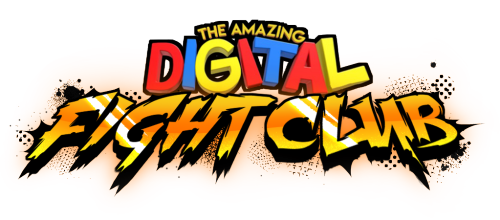
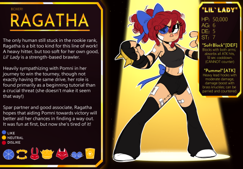
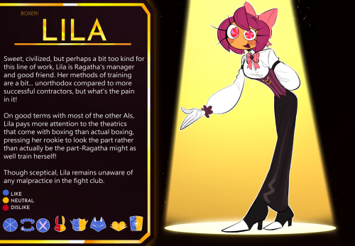
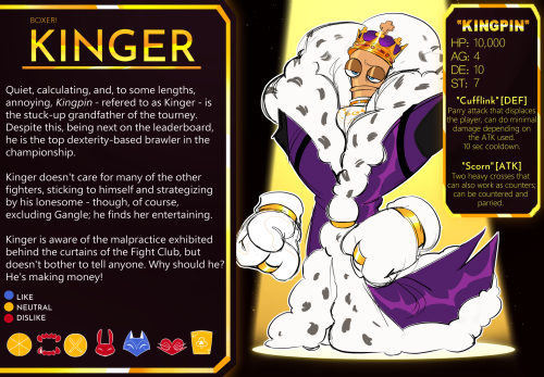
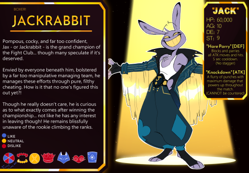
BOXER AU MASTERPOST
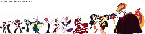
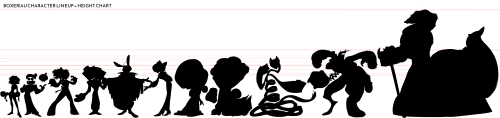
INFO CARDS + LINEUP
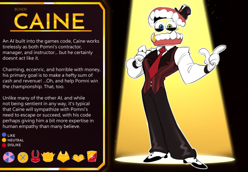
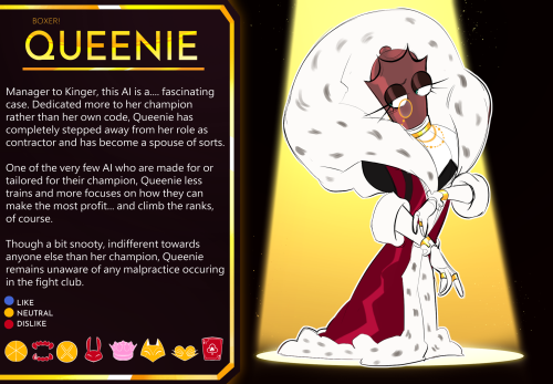
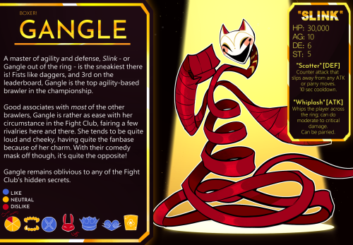
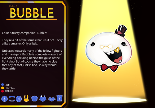
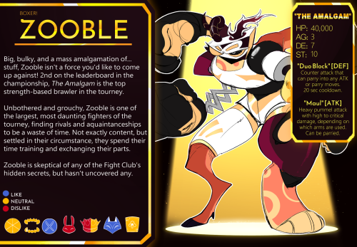
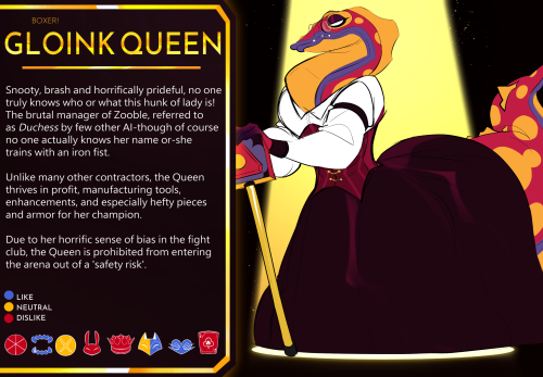
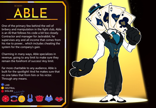
AI Manager Cards + Bubble
Official Works:
Official poster
Character Card Template
Little Blips:
(Showtime) After a fight
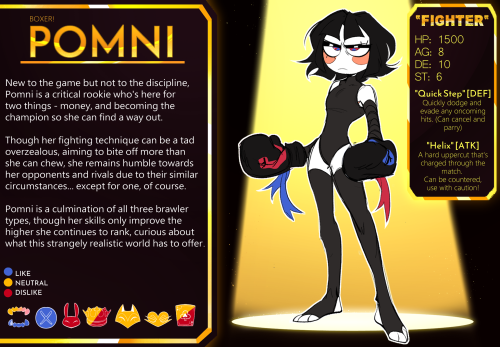
(Boxer Pomni) First design
BOUNDARIES + Q/A
“Can I draw fanart/OCs in this AU?”
Of course you can!! I’d love to see any and everything you do! There’s complete creative liberty when it comes to that, as long as it’s fun!! Though, please don’t send any OCs in my ask box, they can easily get eaten! Please just tag me in a post so I can see!
“Is it allowed to write fanfics?”
YES! I’d love to see what you all come up with!! Please please send any fan work to me!
“Can I create NSFW for this AU?”
I don’t mind, but please keep in mind that I’m a minor! If you do anything, please keep it to yourself or privately! I should not be able to see it at all, so do not send it to me or post it publicly. Please regulate your space properly!
“Can we make ships for your AU?”
Absolutely!! Though keep in mind that some are canon to the au and some are not! That doesn’t mean it isn’t allowed!!
(More will be added in the future the further I get into development! Keep an eye out!)
-
 reference-book reblogged this · 1 week ago
 -
 puff-the-bunny liked this · 1 week ago
 -
 cydneyg2021 liked this · 1 week ago
 -
 minknip reblogged this · 1 week ago
 -
minknip liked this · 1 week ago
-
 shiisiln reblogged this · 1 week ago
 -
 octowasabi liked this · 2 weeks ago
 -
 hiante reblogged this · 2 weeks ago
 -
 omegajor liked this · 2 weeks ago
 -
 buzzingaround reblogged this · 2 weeks ago
 -
 feebeeks liked this · 3 weeks ago
 -
 refblog99 reblogged this · 1 month ago
 -
 darkvale liked this · 1 month ago
 -
 radioriseblogs reblogged this · 1 month ago
 -
radioriseblogs liked this · 1 month ago
-
 too-short-to-be-a-stormtrooper liked this · 1 month ago
 -
 loveheartschains liked this · 1 month ago
 -
 orchid-purple liked this · 1 month ago
 -
 ro2a1yn reblogged this · 1 month ago
 -
 kirbysreturntodreamlanddx reblogged this · 1 month ago
 -
 graeydelight liked this · 1 month ago
 -
 crapblog3000 reblogged this · 1 month ago
 -
 moonchildsisan liked this · 1 month ago
 -
 izumi-yami liked this · 1 month ago
 -
 drakizora liked this · 1 month ago
 -
 akifukashinshu reblogged this · 1 month ago
 -
 snubmoth liked this · 1 month ago
 -
 slingbees liked this · 1 month ago
 -
 qapleulium reblogged this · 1 month ago
 -
 shapeshifting-entity liked this · 1 month ago
 -
fashionscreamsworld reblogged this · 1 month ago
-
fashionscreamsworld liked this · 1 month ago
-
 critdeeznuts liked this · 1 month ago
 -
 lyrakae reblogged this · 1 month ago
 -
lyrakae liked this · 1 month ago
-
 beepfish liked this · 2 months ago
 -
 ranzaisuno liked this · 2 months ago
 -
 byrd-micro-comics-archive reblogged this · 2 months ago
 -
 sykloni liked this · 2 months ago
 -
 togetogetogepi reblogged this · 2 months ago
 -
 xsolar-ghost reblogged this · 2 months ago
 -
 artking-4 reblogged this · 2 months ago
 -
 archive-of-sorts reblogged this · 2 months ago
 -
 colonelcaroldanvers reblogged this · 2 months ago
 -
 stephguzdoodles liked this · 2 months ago
 -
 avloki-pal liked this · 2 months ago
 -
 colors-echo liked this · 2 months ago
 -
 rakottkel25 reblogged this · 2 months ago
Eternal Lurker, finally here - they/them - art only account : @synth-art - 🔵blueskye account : synthab.bsky.social
154 posts