Konstantin Datz: Braille Rubik’s Cube (2010) Cub De Rubik Per The Blind
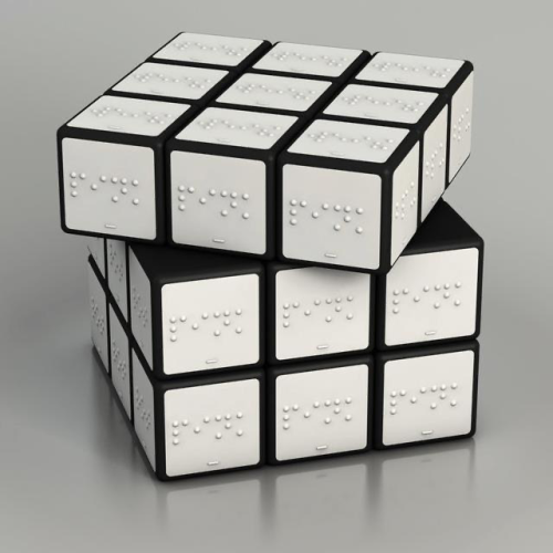
Konstantin Datz: Braille Rubik’s Cube (2010) Cub de Rubik per The Blind
More Posts from Sunemiime and Others


Jens Lausen

#bureauborsche http://ift.tt/2fo5mRd

Tink is one of Europe’s fastest growing fintech, which aims to bring “financial happiness” to their users. The powerful tool let’s individuals make smart financial decisions and empowers them to be more in control of their spending and finances. However, people associate financial management as something boring, too complex, and time consuming. In response, Tink, commissioned Kurppa Hosk to help them develop a new brand design and strategy that echoes the simplicity and intuitive smartness of the service. The brief was to manifest Tink’s ambition of bringing financial happiness to millions at all touchpoints. Kurppa Hosk went ahead to develop a streamlined look and feel that is atypical for a financial player and represents Tink’s business as a whole.
The new visual identity goes beyond just a logotype, and is more of a scheme composed of a number of core elements that come together to create a distinctive visual language that makes the Tink brand instantly recognizable and sets it apart from the rest of the fintech landscape. The new design is comprised of a new logo, typeface (Lota Bespoke), illustrations, colors, imagery, and completely new apps for Android and iOS. Surreal illustrations by Martin Nicolaussen, come to life throughout the app, emulating the various features and walkthroughs in a fun and inviting way

Photo http://ift.tt/2ABBHPf

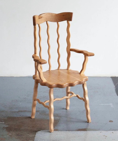
Nervous Chair https://ift.tt/33sI1wr -> Telegram Design Bot

Spring 1883 Art Fair, Utopian Slumps Melbourne 2014 more here
-
 thexoelove reblogged this · 2 weeks ago
 -
 rico-stone reblogged this · 2 weeks ago
 -
 godisofthelotus reblogged this · 2 weeks ago
 -
godisofthelotus liked this · 2 weeks ago
-
 kamynski reblogged this · 2 weeks ago
 -
 54321dcba reblogged this · 2 weeks ago
 -
 venomousdior reblogged this · 2 weeks ago
 -
 9teenninety5 reblogged this · 3 weeks ago
 -
 thecolorofdelusion reblogged this · 3 weeks ago
 -
 samostosam liked this · 3 weeks ago
 -
venomousdior liked this · 3 weeks ago
-
 samoodbrana reblogged this · 3 weeks ago
 -
 bbypisces69 reblogged this · 3 weeks ago
 -
 m3ybuz reblogged this · 3 weeks ago
 -
 dicedbyher reblogged this · 3 weeks ago
 -
 trillermag liked this · 3 weeks ago
 -
 yther reblogged this · 3 weeks ago
 -
yther liked this · 3 weeks ago
-
 theeabstract liked this · 3 weeks ago
 -
 crnizodijak reblogged this · 3 weeks ago
 -
crnizodijak liked this · 3 weeks ago
-
 slumsaintt reblogged this · 3 weeks ago
 -
 ui-alcoholic liked this · 1 month ago
 -
 talk-2-me-niice liked this · 1 month ago
 -
 flackaszn reblogged this · 1 month ago
 -
 chinawalls liked this · 1 month ago
 -
 slimstar liked this · 1 month ago
 -
 evilponyland liked this · 1 month ago
 -
 yungvtrilla reblogged this · 1 month ago
 -
 wakeuppierre reblogged this · 1 month ago
 -
wakeuppierre liked this · 1 month ago
-
slumsaintt reblogged this · 1 month ago
-
 qinre liked this · 2 months ago
 -
bigmember905 liked this · 2 months ago
-
 burberrycheck reblogged this · 2 months ago
 -
burberrycheck liked this · 2 months ago
-
 thewomanofrevelation reblogged this · 2 months ago
 -
 polarcreep reblogged this · 2 months ago
 -
 sigatos liked this · 2 months ago
 -
 pillvoid reblogged this · 2 months ago
 -
 pasteleriasilvestre reblogged this · 4 months ago
 -
 manicmagpie reblogged this · 4 months ago
 -
 platre-egouttoir reblogged this · 4 months ago
 -
 hyper-angelic reblogged this · 4 months ago
 -
hyper-angelic liked this · 5 months ago
-
 lostinmoominvalley liked this · 6 months ago
 -
 nianna reblogged this · 6 months ago