✧ pink Frames


✧ pink frames
f2u! reblogs very appreciated! ↳ self indulgent!!
More Posts from Strawbummie and Others
˚₊‧꒰ა 𝖋2𝖚 rentry frames of mine ! 🕸️
made these on the plane 🪽


all graphics are made by @thefallennyxe and are free to use as long as a reblog and like is shown.!


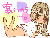
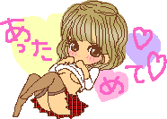
none of these are mine !! all are made by himinette on picsart !


"How do I make shiny buttons?"
i hear you call, but dont worry--this (not-so-)simple tutorial will answer the basic questions you have and provide at least 78% of what you need to make them! (with a tl:dr at the start)
☆ TL:DR~
this gets long, so if you semi know what youre doing, heres a super simple explanation.
open any art program, create canvas size 100x18.
download & export basic layers provided below in the non-tldr version to the canvas.
download & export shine layer provided below onto your canvas above all other layers.
with that shine, move it either 10px forward or backwards, making sure to change the layer order to match up with how you want the animation to be for easy mass-saving. turn clipping on for every shiny layer in advance.
make new layer above 3, add text that says whatever you want your button to say in a readable font & size.
adjust for size.
mess around with the colors of the button with clipping, & create layer from canvas once youre done.
save layer 20x. make first shiny frame visible, save, make it invisible. make second shiny frame visible.. etc. until all frames complete.
dump them into ezgifs gif maker, delay time: 10, tick dont stack frames.
export to filegarden, catbox, etc. & use on rentry.
...aaaand youre done! huh.. you didnt get all of that? feel free to read through the long version below, then!
☆ Too Short, Long Read~
okay, you clicked this far..so im guessing you
want
to
learn ! 🍾🎉
[pt: want to learn!]

☆ Basic questions~
Q: what do i make buttons on?
A: most programs! if youre dedicated enough, you could make them through flipaclip or microsoft powerpoint..okay maybe not the second one, but my point stands! i use ibis paint to make mine, buuuuut im at least 2% sure the process is the same across most platforms.
Q: what are buttons made for?
A: décor! to be fancy, or cool, or cute, or emo, or.. meh, theyre to express yourself. theyre similar to the old online/offline decor you rarely see nowadays, existing to serve as an aesthetic expression of the soul without taking up too much space (psst--this is also why theyre so small!)
Q: can anyone make buttons?
A: if you have basic knowledge of how to use a phone or computer, then youre about as ready as anyone else!
☆ How to make buttons~
when making them, you have to keep things in mind.. buttons are small ! weeell.. realistically, you can make them as big as youd like, but they wont look that great for decor. some people use bigger canvases to make their buttons and then resize them, but i like to use a standard size of 100x18 to make sure i have enough room for adjustments if they need to be smaller.
so, you have your canvas.. what next? well, the not-so-fun part. because of how small the canvas is, your lines are going to be overly pixelated if you try to draw them normally. you could technically use a 1px size brush and figure out the border by yourself through the straight ruler tool, but it's a lot easier to set up layers through any pixel art app.
anyway, i dont want anyone to go through the horrors of setting up base layers like i did, so here are the base layers for a 100x18 button:


well, you surely know how to save things, so lets skip that step!
the layer order is:
base coloring -> bottom shading -> top shading -> border
.. huh? you dont know how to layer stuff? well, leave it to me to explain~! (skip ahead if you know this already..)
on all well-made art programs, youll have layers. you probably already know what they are--if you have one layer one color, you can make a new layer on top in an entirely different color without impacting the layer below in any way. if you then delete that top layer, the bottom layer will stay just as it was before.
if you move that top layer below the bottom one.. the roles switch, and the once-dominant layer will be obscured by the newly-dominant one! just think of it like..rising up the leaderboard of your favorite game, where people only focus on the highest winner instead of their competitors. anyway, that metaphor is only useful for full-block layers, what are you meant to compare something like this to?! go easy on me.. picture frame analogies are outdated, okay?
heres a simple visual explanation:


you press and hold the lines to move a layer up or down. on something other than ibis, just holding down the layer itself and moving it usually works fine.
if you've done that correctly, your canvas should look like this:

so you have--hey, no, wait. no, you cant skip the steps above and just download the button to edit it, itll turn out ugly and be almost impossible to recolor properly, so dont even think about it!
now that you have your base layers, here comes the worst part.. the shiny layer. it sounds haunting, and that's because..!!
it is..
[pt: it is..]

the shiny layer.. has three separate parts to it!! adding the layer, duplicating and moving around the layers.. and making sure they're in the right order. gyahh.. even giving them titles is making me shake like crazy!! but it isnt too bad, and afterwards you dont really have to do it again.. unless youre making bigger buttons.. but even then it isnt too difficult to adjust.
heres the layer:

it looks so pure and harmless..but dont let it fool you! export it to your canvas on the highest layer, and change the opacity to 40%--this will make it more see-through instead of a blinding white light. have you managed it? the opacity bar is the one at the bottom of the layers menu, click around until you get to 40%, or hold it down and move it there.. but the first one is more fun!
okay, throwing aside the fun for now, this part is.. annoying. its annoying, but you only really have to do it once. or.. maybe its easy, and im just dreading explaining it.
you have your shiny layer, yes? good. duplicate it, and move it below the original shiny layer. why? because this is where the shine animation comes in. take that bottom layer, and move it across to the left by 10 pixels.
you should now have something like this:

do you understand that? okay, good. repeat this process until the left side has been complete. by the end of it, you should have something like this:

your layer order should have the one on the utmost left layered below all the rest, keep that in mind!
okay, head to the top layer and duplicate it again, this time moving it to the right.. by 10px. do not move this layer below. you probably understand where this is headed.. continue this process until the entire right side is also covered in shiny layers.
like this:

yeah, i get it, its ugly.. trust the process, okay? now, with that part out of the way, you should have seventeen layers. turn on clipping for every single one of them. huuuuh..?! you dont know what clipping is..?? thats okay, let me explain!
clipping makes it so that a layer can only access the layer beneath it. if you have a messy mis-matched blob of paint on a canvas, and you decide that the left side could do with a different color.. instead of painting directly over it and risking ruining the precious shape, youd make a new layer, turn on clipping and freely change the colour with not a worry in the world!!
but.. what does that have to do with shiny layers..? well, because of how things are set up at the moment, if we finish decorating this button and export all the layers as is.. the shiny layers will hang off the side of the button. even though its barely noticeable, now that ive pointed it out youre likely going to be able to pick it up on any future buttons you see that dont use clipping. sorry~
anyway, on ibis, this is the clipping button:

see that arrow? yup, thats what we need! click on each shiny layer, and turn that arrow blue on every single one! only for the shiny layers though--not the base ones! also, turn each shiny layer invisible by clicking on the eye next to the layer. we dont need them at the moment.
at the end of this step, you should have:
17-18 layers
13 shiny layers, with the layer order starting from the left at the bottom to the right at the top
all shiny layers clipped
all shiny layers invisible
if youve checked off all boxes on that list.. good job! youve done the most difficult part, so lets move on to the fun stuff~!
☆ Decorating buttons~
yes..yes..! the time has come to decorate your glorious button, you must be so excited! if youre still with me after those awful steps that is..
choosing a font is the worst part, to be honest. youd assume it to be super duper easy..but it isnt! theres few fonts that look cool on small buttons, since they kinda need to be readable to do what theyre supposed to do..but with the help of free font websites, you can do anything!
head to layer three and create a new layer off of it. click the text tool, and add whatever you want your button to say, in the font you like..and make sure to keep the font size small enough so that it stays on the actual button. you can add a "stroke" to your text, which borders it and makes it look like its slightly sunken into the button for a cool effect!

hm..hm..dont you think the button and the text..dont match up? well, thats where size adjustment comes in! depending on your text, youll have to--
wait,
wait,
wait!!!!!
[pt: wait, wait, wait!!!!!]
before you do anything else, back up your current file!! save as, duplicate file--anything!! this way, if you want to make a longer button, you dont have to go through the process again, you can just open that biggest button template and adjust as needed for the next one (just remember to duplicate the file again before you adjust it..or else youll have to start from scratch)
with your duplicated file, you can now edit freely! your art program, no matter what it is, should have a "lasso" tool you can use to wrap around certain areas of your canvas. this lasso tool should only work on the layer youre currently on, so keep this in mind! head to your border layer, and lasso however much you need to shorten. then, using the movement tool, move it across to the left.
you should end up with something kinda similar to this:

kinda messy, right? well, we can fix that easily through trimming the canvas. on a non-ibis platform, you should have a cropping tool that either extends or shortens the canvas, you can use it to..well..shorten the canvas!
after you do this, you should have two stray pixels in the top and bottom right corners. gently erase these strays away, making sure not to touch anything inside of the border. its like putting a picture frame over a painting--anything you no longer want is washed away, and you can hide any mistakes behind it no sweat! (yeah..okay..i know i said they were outdated..but c'mon!)

heres the fun part:
☆ Coloring~
do you remember earlier, when i mentioned clipping, and how you can add color without taking away from the shape..? well, thats actually important here!
when you make a new layer above one of the base layers, you can turn on the "clipping" option and paint over it, allowing for recolors! see.. how else would you have been able to recolor it so in-depthly if youd just downloaded and edited the button itself without the layers..? (pretty easily, if you know what youre doing.. but shh..)
there are some rules i like to personally follow for my buttons, but you dont have to follow them..take some guidance--from catsblessing~!
the bottom coloring should be a darker color to the base one, to show shadows
the top coloring should be a lighter color to the base one, to show.. light!
the border coloring should be dark enough to show over the bottom coloring, but light enough so that it doesnt completely mess up the top coloring (though, if you care enough you could also do different colors for the top and bottom of the border)
the stroke of the text should match the color of the border
you got that?! no? hmm..hmm..! thats okay. moving on,
when youre done messing with the colors of your button, you need to make a new layer from canvas. what does that mean..? it means it combines every visible layer from your canvas into one layer, without you having to actually combine anything! you can do this from the same menu as duplicating a layer, but on anything other than ibis.. ahh.. id be stumped. i guess you could save it as a png and then reopen that png on top of your already existing layers. yeah..yeah..! that would work!
well, with your new layer, you need..to get ready..
for more annoying stuff;;

do you remember those shiny layers from earlier..? ya, this is where they come in. your holy grail of layers needs to be positioned right underneath the first shiny layer, so that the shiny layer clips onto it
like this:

does it do that? good! turn the shiny layer invisible again for a second, and save that holy grail of layers 20 times, baby! yup, 20 times! yup, every single time to make a button! yup, you can delete the pngs after the button has been fully exported! make sure to save it as a transparent png, otherwise youll have stray background pixels!
have you saved it 20 times? good! turn that first shiny layer on again, and save it as a png. turn that shiny layer off again, head to the one above, and save it as a png! no matter what, your shiny layers should be clipping onto your holy grail, so if they arent then something has gone wrong along the way.
ya, you need to do this for every single shiny layer. once youve done that, you need to import your pngs to a gif maker--like ezgif! start from the bottom, the 20 layers first and then the shiny layers from left to right. your button can be whichever speed you want it to be, but mine are usually 10fps.
if youre using ezgif, change the delay time to 10, and turn on the "dont stack frames" option, and then you hit
make
a
gif!!
[pt: make a gif!!]
if all goes well, then you shouldve ended up with a fully functional button, like this:

isnt it beautiful..? what should i do with it..?
oh, right. what should you do with your button now, huh..? well, a lot of different things!! you can use them for rentry pages, carrd pages.. uhh.. decor on older sketchy forums.. tbh, i just like making them, idk what people tend to actually do with them..

anyway, if this was useful to you, then im glad i could help!! and if this wasnt useful, or you got stuck along the way..my askbox is open for any other questions!
okay, catsblessing out--! meow meow~


transparent text pngs
sourced from pinterest, no credit needed


Gyaru Pixel Set 💗


𝖿rᥲmᥱs mᥲძᥱ mᥡ mᥱ ^-^ gᥣ᥆ᥕ ᑲᥲᥴkgr᥆ᥙᥒძ ᥣіkᥱ 𝗍һᥱ grᥱᥡ ᥆ᥒᥱ ᥆ᥒ mᥡ ⍴іᥒ𝗍ᥱrᥱs𝗍 𝖿᥆r ᥲᥣᥣ ᥴ᥆ᥣ᥆rs. 𝖿2ᥙ, ᥴrᥱძs ᥲ⍴⍴rᥱᥴіᥲ𝗍ᥱძ ᑲᥙ𝗍 ᥒ᥆𝗍 ᥒᥱᥴᥱssᥲrᥡ, ⍴ᥣz ᥣіkᥱ ᥲᥒძ rᥱᑲᥣ᥆g і𝖿 ᥙsіᥒg :D


───⠀windows error pngs
all sourced from pinterest no need to credit me ,, f2u feel free to repost anywhere


HANKCON 101
- Why did they make you look so goofy and give you that weird voice? - CyberLife androids are designed to work harmoniously with humans. Both my appearance and voice were specifically designed to facilitate my integration. - Well, they fucked up.
[Inspo: ♡, ♡, ♡, ♡, ♡]
-
 everlovings reblogged this · 2 weeks ago
 -
 snuffbambi liked this · 2 weeks ago
 -
 sandy-weeds-milky-ways reblogged this · 2 weeks ago
 -
sandy-weeds-milky-ways liked this · 2 weeks ago
-
 snowcoveredreverie liked this · 2 weeks ago
 -
 ethereasugar liked this · 2 weeks ago
 -
 y0shikitty liked this · 2 weeks ago
 -
 garnishrenders liked this · 2 weeks ago
 -
 strawbummie reblogged this · 2 weeks ago
 -
strawbummie liked this · 2 weeks ago
-
 nyune liked this · 2 weeks ago
 -
 transgenderguest666 liked this · 2 weeks ago
 -
 the-whimsy-storage reblogged this · 2 weeks ago
 -
 literally-just-there liked this · 2 weeks ago
 -
 crittermoth liked this · 2 weeks ago
 -
 groovymoeable liked this · 2 weeks ago
 -
 coppereko liked this · 2 weeks ago
 -
 adorbshina liked this · 2 weeks ago
 -
 strawberry-her liked this · 2 weeks ago
 -
 paraparanormal liked this · 2 weeks ago
 -
 mengyounie liked this · 2 weeks ago
 -
 kwunibun liked this · 2 weeks ago
 -
 sndro reblogged this · 2 weeks ago
 -
sndro liked this · 2 weeks ago
-
 samwiuel reblogged this · 2 weeks ago
 -
 duskstarskies reblogged this · 3 weeks ago
 -
 m-nxii liked this · 3 weeks ago
 -
sanri00723 liked this · 3 weeks ago
-
 ryufngz liked this · 3 weeks ago
 -
v3lv3tine liked this · 3 weeks ago
-
 elowhinn liked this · 3 weeks ago
 -
 sleeppydani3 liked this · 3 weeks ago
 -
 tsubakiari liked this · 3 weeks ago
 -
 jemlovespngs reblogged this · 3 weeks ago
 -
 divinesoulsblog liked this · 3 weeks ago
 -
 momento-mori-archives liked this · 3 weeks ago
 -
 inkyblink liked this · 3 weeks ago
 -
 sepulcritio liked this · 3 weeks ago
 -
 blondmelon liked this · 3 weeks ago
 -
 unheavenlysoul liked this · 3 weeks ago
 -
 chrrysnstfrz liked this · 3 weeks ago
 -
 pussx liked this · 3 weeks ago
 -
 heart--rot liked this · 3 weeks ago
 -
 wrefn liked this · 3 weeks ago
 -
 stnpid liked this · 3 weeks ago
 -
 dreaminglouu reblogged this · 3 weeks ago
 -
 pixeldotexe liked this · 3 weeks ago
 -
 mrfangtastic liked this · 3 weeks ago
 -
 favouritekiss liked this · 3 weeks ago
 -
 seasideradio reblogged this · 3 weeks ago
