They Say It Anyway

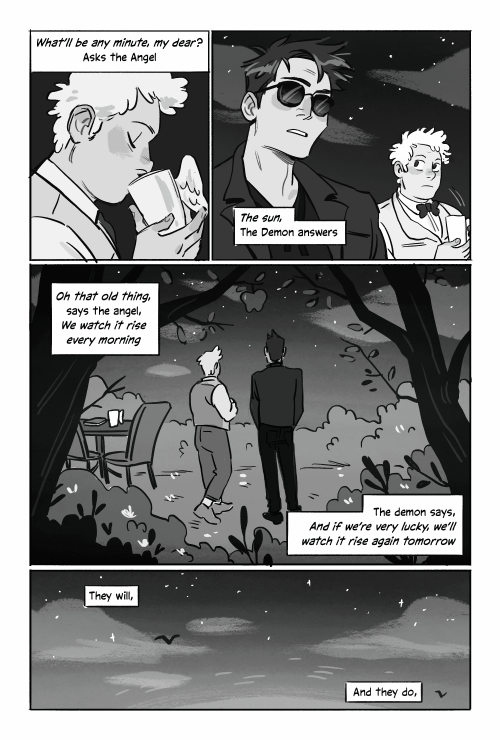
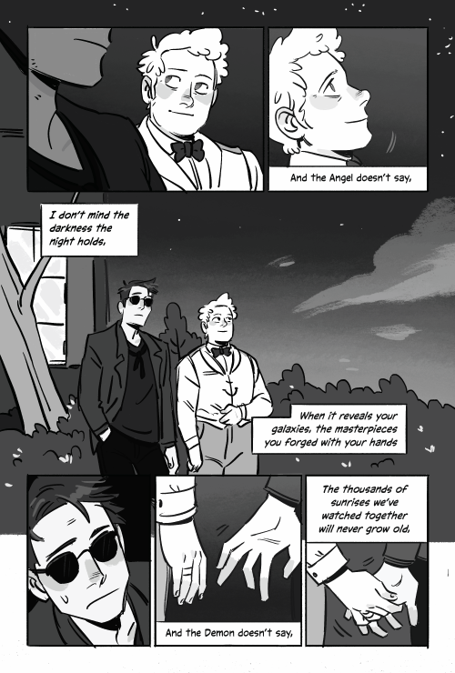

They say it anyway
More Posts from Lousnaps and Others
Good Omens deleted scene – Aziraphale saves a baby.
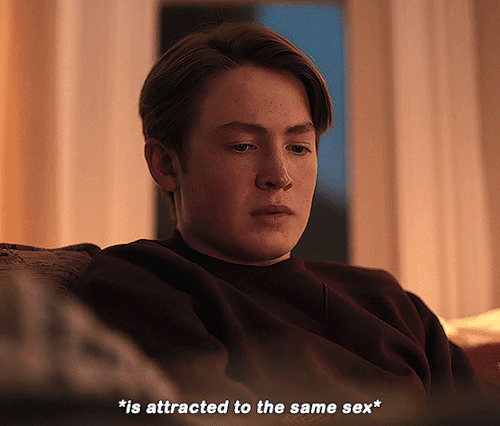
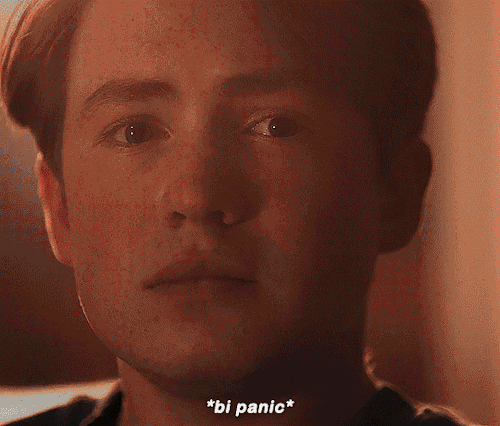

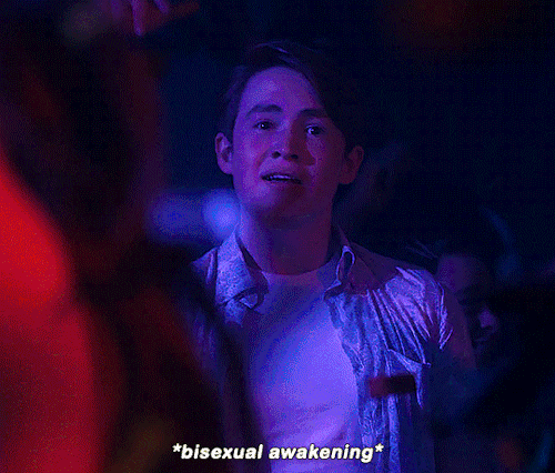
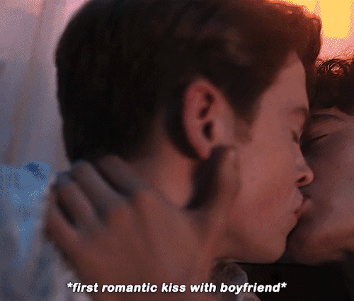
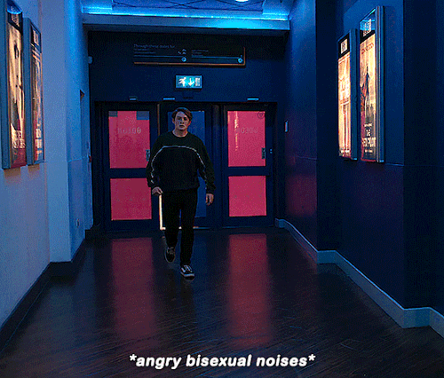
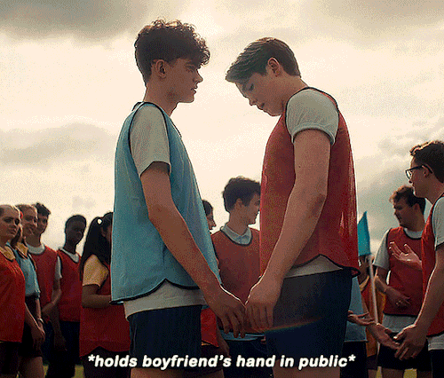
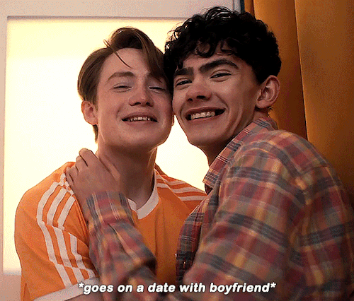
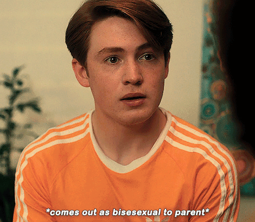
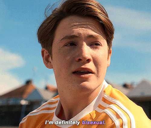
#nick’s bisexual journey


Good omens and the Forbidden book epilogue part 2: House cup ceremony
Part 3

Epilogue part 1


A secret letter
(A love letter to the series today, on the final episode on BBC)
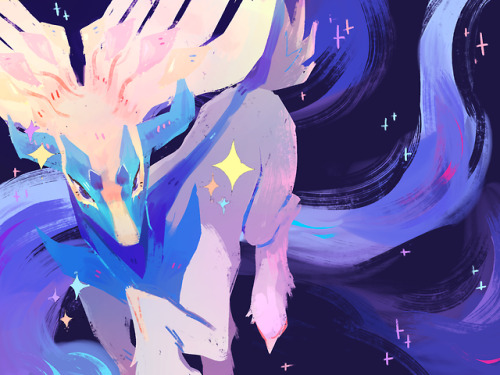
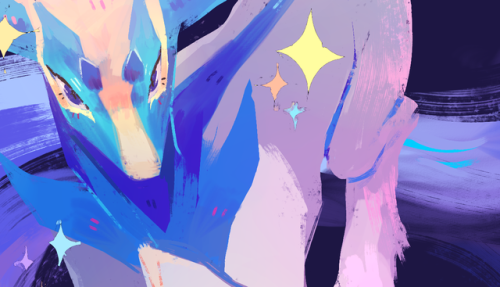
Xerneas


i see a lot of stuff i’d forgotten about when i dig through my old drawings, but i definitely didn’t expect to have forgotten about an entire 80 page zine… 🧍

cozy camping commission ^_^
sweet dreams are made of this 🏃
sorry if this has been asked before, but i wanted to ask about your lineart! the weight and line economy are just so nice, i get stars in my eyes looking at your lineart and doodles. could i ask what your approach to lineart is and what tips you might offer?

Wow I love these questions - Line is so interesting!!! It's a really big topic so I feel like any tips I give will be just barely scratching the surface. It's like deceptively simple...any given line drawing is essentially taking all the information we glean from seeing something irl ie light, shadow, dimension, texture, perspective, etc and boiling it down to the simplest possible visual information.
I think most commonly my line is informed by light source so like. thicker more continuous lines face away from the light and thinner more broken lines towards. and a lot of my spot blacks r simply cast shadows.

here's a more extreme example

BUT like everything to do with art there's no hard and fast rules. I use blacks when I think it'll be effective or interesting and I leave them out when I don't need em. umm couple things I find myself doing a lot... using spot blacks to make the separation between characters clearer. I like casting shadow in between characters so its easy to separate and read their silhouettes even when they're mashed together.

u can go even further to purposely create a silhouette like

to draw attention to a finger or tongue LOL. There's some comic book artists who are absolute masters at this type of stylization. Alex toth and his spiritual successor Chris samnee come to mind for me right away.

(toth)


(samnee)
I feel like I'm also often using line weight to separate planes receding in space

im naturally a really heavy handed and scribbly drawer(...?) draftsman. and im nearsighted so when i see things i percieve and break it down into big shapes over thin contours. so stuff like spot blacks and shadows came easy to me, the tricky part was making the rest of the lines lighter when they needed to be so the blacks could actually have impact LOLL. a lot of effective visual communication is about balancing contrasts. like I had to really train myself to press less hard on the pen. I think this is actually really evident if u go back in my archive to older sketches LOL


I actually feel like a lot of how I trained my hand to tackle line weights was thru stuff like hand lettering where you rly have to focus on being sensitive to that kind of thing.. contrasting strokes etc.

also exercises like figure drawing will have you flexing those muscles constantly


I'm starting to just regurgitate lessons from freshman year of art school so I'll stop here with the demos but yeah...I hope this was helpful!? I love line!!! I want to get even better at line work so I can feel confident posting work that's only line no color or value... I'll leave you with a bunch of artists who I think have particularly expressive and beautiful linework (not including toth and samnee who I already mentioned and who's work I love so much). You can probably learn much more from them than you can from me...!

Charles dana gibson LOL


Matias bergara


tonci zonjic

naoki urasawa

Daniel warren johnson


shiyoon kim


michel breton
also yoji shinkawa, tomer hanuka, leo romero, I feel like I'm gonna post this and think of so many more. there's so many good artists...!

baby Peter & his two dads
-
 ineffablementalillness liked this · 1 week ago
 -
 callmemossbrain liked this · 1 week ago
 -
 letsgonateablog liked this · 1 week ago
 -
 ilia-k liked this · 1 week ago
 -
 twixted-spoon liked this · 1 week ago
 -
 milkywayskyy liked this · 1 week ago
 -
 parksandrecklessactions liked this · 1 week ago
 -
 madmasterspage liked this · 1 week ago
 -
 inksicle liked this · 1 week ago
 -
 han13 liked this · 1 week ago
 -
 virtualhumanoidfarmhoagie liked this · 1 week ago
 -
 uneducated-author liked this · 1 week ago
 -
 alexffier liked this · 1 week ago
 -
 redwinevinegar47 liked this · 1 week ago
 -
 maccaccino reblogged this · 1 week ago
 -
maccaccino reblogged this · 1 week ago
-
maccaccino liked this · 1 week ago
-
 geraldmood liked this · 1 week ago
 -
 dorian-g-r-ay liked this · 1 week ago
 -
 dsabian reblogged this · 1 week ago
 -
 p4nicaker liked this · 1 week ago
 -
 gorfouu liked this · 1 week ago
 -
 lucky-shot-art-dump liked this · 1 week ago
 -
 nice-and-accurate-ramblings reblogged this · 1 week ago
 -
 crissy-coo liked this · 1 week ago
 -
 poisonapple83 liked this · 1 week ago
 -
 hotshotrot liked this · 1 week ago
 -
 personwholoveschocolate liked this · 1 week ago
 -
 fufuchan24 liked this · 1 week ago
 -
 vilicusreads reblogged this · 1 week ago
 -
vilicusreads liked this · 1 week ago
-
 tickety-voom liked this · 1 week ago
 -
 ipomoealb0 liked this · 1 week ago
 -
 cyberpunk-degeneracy liked this · 1 week ago
 -
 twistedeveryway reblogged this · 1 week ago
 -
 amanejune reblogged this · 1 week ago
 -
 under-a-shady-ash-tree liked this · 1 week ago
 -
 dexirotten liked this · 1 week ago
 -
 tanpopocha liked this · 1 week ago
 -
 jupitermoon23 liked this · 1 week ago
 -
 correctsewingmachine liked this · 1 week ago
 -
 heckin-hecuba reblogged this · 1 week ago
 -
heckin-hecuba liked this · 1 week ago
-
 sparkly-key liked this · 1 week ago
 -
 agateacorn liked this · 1 week ago
 -
 thebestovna liked this · 1 week ago
 -
 cassifer221b liked this · 1 week ago
 -
 crunchypudding liked this · 1 week ago
 -
 lizzie-v liked this · 1 week ago
