HOLY FREE ART PROGRAMS BATMAN
HOLY FREE ART PROGRAMS BATMAN
I’ve had this list sitting around for a while (in case I ever want to try something new) and I thought I’d share it, because why the hell not, everybody loves free stuff. I’ve only used a couple, so for all I know these could be complete shit. BUT YOU NEVER KNOW, RIGHT?
*= available for both windows and mac os
GIMP * - Does a lot of the same stuff as Photoshop.
FireAlpaca * - Similar to Paint Tool Sai, so it’s a good alternative for Mac users.
Autodesk Sketchbook Copic Edition * - Simulates the look of copic markers.
MyPaint * - Basic stuff, nothing fancy.
Pinta * - Drawing program modeled after paint.NET.
Inkscape * - Vector/drawing program meant to be similar to Illustrator.
ArtRage * - Digital painting program; you can get the trimmed down version for free or buy the full version with more features.
Sumo Paint * - In-browser drawing app.
DAZ Studio * - Some sort of 3D model poser thing.
Pencil * - Software for animating.
SketchUp * - Tool for making 3D models. Looks handy for stuff like architectural drawings.
Blender * - Pretty popular 3D software.
escape motions * - Some browser apps, fun to fiddle with when you’re bored (the fluid fire simulation is pretty cool imo).
Twistedbrush (Pixarra) - Seems to be meant for replicating the look of traditional media.
Pixia/Phierha - A popular program in Japan, according to the website.
Krita - This was originally made for Linux and it looks like the developers haven’t ironed out all of the kinks in the Windows installer.
Artweaver - Another trimmed down free thing if you don’t want to buy the full program.
paint.NET - Pretty basic kit, probably good for simple stuff.
Project Dogwaffle - I’m not sure what this one is all about because I couldn’t stop laughing at the terrible website.
Speedy Painter - Lightweight digital painting program.
mtPaint - Originally made for pixel art; simple enough to run on older computers.
Chasys Draw IES - Supposed to be some sort of drawing+image editor thing.
PaintRibbon - Seems to be another plain old basic image editor.
DrawPlus - Looks like it’s made for graphic design and vector stuff.
SmoothDraw - I’m guessing this is a basic thing for people who don’t want to bother with complicated stuff.
More Posts from Itsmeif and Others
Skull Oil Painting 💀 Still Life from Start to Finish

By Pavel Sokov
Setup and Preparation Stages
Before I start a painting, I like to come up with a couple of thumbnails to nail down the composition. I do these from imagination usually. So in these ones, I played with the placement of the skull, the direction of the lighting, and the orientation of the canvas. After coming up with these 4 thumbnail sketches, I got kind of a better idea of what I actually want from my painting.
Also, it sort of helps to have a thumbnail completed to use as reference when I start my painting because if I don’t have anything to look at it’s possible that when I start from scratch on my canvas, my subject will end up too big, or even worse, run off the page or something.

Composition is a bit of a feeling thing along with some guidelines. It’s not like stiff rules that you must follow. So having said that, I think I like sketch 1 and 3 the most.
You know, since the color temperature plays such a big role, I digitally painted this sketch with some invented color before actually making the setup, just to give an idea of what kind of mood this painting would be. And it also gave me an opportunity to plan some of the painting methods and steps that I’ll use in the actual painting process.


Okay, so with the sketches in mind, let’s put together the setup that I will paint from today.
Execution of the painting
So a big challenge to overcome here with this skull is that I want to paint it in the dark for a more dramatic and moody atmosphere since it’s Halloween and all, but at the same time, I want myself and my easel to be in the light so I can see and we can make this video.
Sadly, the candle doesn’t provide a strong enough light during the day, so we’re going to use a warm lamp instead.
Since we don’t want to burn the house down though by lighting that black box on fire, I think our candle shouldn’t be lit at the beginning stages of the painting.

I’m using a portable paintbox today that makes it convenient for me to paint anywhere I go.
For my brushes, I plan to use a lot of bristles because I want to load this painting up with a lot of thick paint, but I also packed a few softer brushes to get some soft edges in there too.
As my painting surface today, I am using an 11×14 linen panel. It’s actually one of my favorite sizes for life paintings.
I paint with a few different brands of oil paint, but there’s no need to name them or be concerned with what they are. What’s really important about that is that they’re professional grade and they’re not the student grade which are very difficult to paint with. It just doesn’t work, it’s like toothpaste, so just don’t even get it.
Okay, let’s squeeze out our paint. And don’t be afraid to use a lot. For the longest time, I’ve been so shy with squeezing out my paint. It’s been taking me years to paint thicket and thicker, and I gotta tell you, if you can skip all these years of being shy and just get straight into it and load up a lot of paint, it will save you a lot of trouble.
On my palette today we have:
Titanium White, Warm White, Cadmium Yellow Light, Cadmium Yellow Medium, Cadmium Yellow Orange,Yellow Ochre,Transparent Yellow Oxide, Cadmium Red, Transparent Red Oxide, Transparent Brown Oxide, Raw Umber, Alizarin Crimson, and Cobalt Blue.

Underpainting and Drawing Stage
The very first thing I like to do when starting a painting is to tint the canvas. But you have to select your tinting color wisely, because it’s going to provide the underlying temperature to the whole piece. I often let this initial tint show through all the way to the end of the painting, particularly in the shadows.

In this case we have a very warm light on our subject so we can expect our painting to be pretty warm. I’m going to tint this canvas with that in mind by using something really warm like transparent red oxide, and I will mix it with a bit of Cadmium Yellow Medium in the area where the candle will go because later, all this warm underpainting should give this skull a nice inner glow. I am diluting my paint with gamsol here when I do my initial washes, because makes the paint behave like a watercolor, which is perfect for making a stain.
Drawing the Lay-in
Okay, so now that our canvas is tinted, we can start to draw our linear lay-in on top of our stain. My favorite tool to do that with is actually a hard bristle brush. The reason why is that those stiff hairs, they allow me to get nice straight lines which are the exact type of lines that I find helpful at this stage to simplify the contours of everything that I’m drawing and to find those big shapes.
Don’t worry, we’re going to complicate these lines later when we go to paint them!
As you draw your lay-in, don’t forget to focus on the big shapes and the proportions of what you’re drawing. Don’t get carried away on details and things like that because it’s way too early at this stage. Simplify everything to its most basic elements. Find the big shapes and don’t mind the secondary forms for now. It also kind of helps to keep your horizon line in mind when you draw your lay-in. For example, in my case, I’m sitting below the skull and looking up at it.

You have to ask yourself, are you looking up at the your set-up, or are you looking down at it? And, whatever the answer is, you have to design your lines with that in mind.
So if you’re noticing that your drawing is off at this stage, don’t be shy to move lines around until you get it right. Trust me, you’re gonna be saving yourself a lot of headaches if you fix things at this early stage than if you try to fix them later on when you have a lot of opaque paint down on your painting.
So right now I’m filling in the dark shapes on my underpainting because I find that it helps me see my mistakes better when I fill in the big dark shapes. With these dark shapes filled in, it’s much easier to judge the distances on your drawing.
Opaque Painting Stage
At this point I often like to take a kneadable eraser, or more often a napkin, and rub out the lightest areas. This helps me establish the light source a lot sooner before I even lay down the opaque paint. Just make sure to do this before your stain is dry, or else you won’t be able to do it anymore. You usually have about 10 minutes max depending on your surface before your wash dries, so be careful.
My goal here is to establish the big values, shapes and color temperatures as soon as I can, so to do that, I am going to cover the entire skull with some opaque paint, aiming primarily to tell the story of the lighting that’s hitting our skull. I am thinking a lot about color temperature. Our primary light is warm, so I’m mindful that my the parts that are in the light are going to stay warm. Often times, students want to lighten an area, so they grab a bunch of white. White is actually the coldest color, so the result of that is that the value of the area goes up and it does become lighter, but at the same time, the temperature goes a lot colder.

This is actually great if your subject is in a cold light, like maybe a North lighting window. But in our case, our subject is in a warm light, so that’s no good for us. When you want to lighten an area that’s in the light, consider using a color to lighten that area. In this case, to lighten my mixtures, I’m going to include some cadmium yellow medium, cadmium yellow, and transparent yellow oxide in my light mixtures to keep it warm. But conversely, if you want to darken an area, a lot of students reach for the black to darken things, and that creates a cold mixture as well. Try darkening a shadow with a warm dark. Something like transparent red oxide, transparent brown oxide, or alizarin crimson.
While you’re putting down that initial opaque paint, a good principle to work by is to paint the lights thicker and the shadows a little bit thinner. So that means you can’t be afraid to lay down some serious paint in the lights. If you keep the shadows more thin and flat, then the lights are going to feel more luminous in comparison. And I also love to let my warm underpainting show through in places in the shadows.
When you have dramatic lighting like this, you are bound to see a lot of contrast. Let’s make sense of all of it this way:
Since most of our subject is lit, make sure that the amount of values you use in lights is higher than in the shadows. In other terms, make the shadows more flat and have less values, like you could make the shadows just one value so that it looks a lot simpler than your halftones and your lights. As a result, the shadows will have less information in it than the parts that are lit.
I am thinking of the skull as an egg, with the closest part receiving the most light, and the parts farther away receiving the least amount of light. If the underlying “egg” of the skull reads well, then you are gonna be in good shape!

Our halftones are the most chromatic and the most information-dense parts. So in our case they are going to be the warmest parts of the skull. The lightest lights are pretty washed out, but they’re still warm.
Finishing Stage
To see the finishing touches make sure to watch the video below.
Size comparison site!
FOR ARTISTS AND WRITERS WHO NEED IT IT’S AMAZING

I know some of you need this! (you don’t need to have giant or tiny characters either. it’s a great ref for everyone!)
Alright time for some honesty thats going to make my follower count go down but I don't care. Hate me. But a post I read made me realize I need to bring this up.
I complain a lot about Donny Cates and his comics because its the best way to reach agreements on here. This whole run is concidered terrible so I'm going to be honest. I don't say the things I like about the comics because I'm afraid of conflict over it. However, I've already been questioned once for this and I will be questioned again so its time to come clean and be hated. I buy the comics. Which apparently is a sin in this fandom and I will only ever be judged for it.
Know why I do it? Because there are elements I like along with the elements I hate. And I just need to get that off my chest because I don't want to feel bad for it. I get enraged easily and will go off on rants, but I'm also pleased easily. So its time for me to list a few things not all that I actually like about these comics and I will be fine when my follower count drops. (Also a Silver Surfer note)
Dylan and Normies dynamic is really fun and I love them. Sleepers added protective behavior of Dylan just makes it all the better because imagine him trying his best to babysit Dylan and Normie and it all goes to shit two seconds later. I love it.
Grendel dragon. MMMMMMMM. I love this dragon and he's beautiful and also part of Beowolf I just love him.
Darkness. I don't know how to explain this other than a couple dsrk twists are enjoyable. Sure he added too many but still I would love it if it was just one or two twists. Like if it was only the cancer involving Venom trying to keep Eddie... Thats a dark bump in the road J can get behind.
And to Ryan Stegman... ART IS A YEEEEEES
Just Dylan in general I mean hes my son and he's great.
Them covers are sometimes great. Though the varients are what I live for.
Follower count: 359
Waiting for that to drop.


Somewhat belated entry for day 14 of @symbruary - Favorite fanworks!
If I tried to do a pic for all of the amazing, wonderful fics I’ve read, I would never get anything else done ever :’D So I tried to narrow it down to the ones that have stuck with me for months and months after first reading them. Been meaning to draw fanart for these for ages, so this was a great opportunity!
FYI before clicking links: all of these are Mature/Explicit
Dust to Dust by amaronith, kitausuret (@kitausuret, @amaronith)
Slow-burn SymbiOT3 fic that I absolutely adore. I love how it takes Eddie and Flash a while to even see each other face to face! There’s so much drama and fun dialogue, and Andi is an absolute gem. The plot itself is super interesting, and I can’t wait to see how it interweaves with Flash and Eddie getting to know each other better.
I think I’m starting to like you by softgrungeprophet (@softgrungeprophet)
Yet another SymbiOT3, this is the first in the Peachy series! The series as a whole is wonderful, and the character development for all three is beautiful. Especially Flash coming to terms with gender identity stuff! The series always gives me such a warm cozy feeling reading it.
How I Met my Brother and Regretted Everything by Prince_of_Trash (@princess-of-peachtrees)
To be completely 100% honest, I did not care at all about Carnage as a character before reading this fic. Now I fucking love him and his rat-bastard self. AND RED, OH MY GOD RED. This fic has one of my favorite characterizations of Sleeper, and is an absolutely hysterical ride. Even with the funny setup, tho, it still does a great job of hammering home the sadder scenes with amazing skill.
The Dangers of Investigative Journalism by NecroFaix (@fictionplumis)
SymbiOT3, but this time with Movie!Eddie! The characterizations in this fic are fantastic, and I especially love how much it delves into Flash’s head (the angst is delicious). The pacing is phenomenal, and the progression of Eddie and Flash’s relationship feels incredibly natural in a way that makes me feel for them and their beloved goo alien when anything goes wrong.
All of these are fics that I love to go back to for inspiration, or just a fun time! I highly recommend checking out all of these wonderful authors and their other works as well!
Obviously there are also fantastic artists in our fandom ( @d-erm, @owlapinart, and @freedomconvicted to name a few!) I’d list them all but others have wonderfully done that already, so I suggest perusing the rec lists I’ve reblogged because we have so many incredible people providing quality Venom content <3
Some notes I put together for my CDA Class. Just stuff that I use. Take with grain of salt.
Echo, Maximilien, Zenyatta, and Bob go on a double date. Bob and Max just brag about Zen and Echo to any and everyone that is within earshot. Zen and Echo just can't believe that is how they see them.
Echo: This is my date, Max.
Zenyatta: *gasp* Echo, while I greatly believe in extending olive branches, I must ask if you are aware he is allied with Talon?
Bob: *taps Zen’s shoulder*
Zen: *looks over*
Bob: *signing* I’m still with Deadlock.
Zen: Well–yes, but Talon and Deadlock are very different–
Bob: *signing* We burned down the clubhouse of a rival motorcycle gang last week.
Zen: I–Really?
Bob: *shrug and nod*
Echo: *looping her arm around Maximilien’s* He promised me he won’t try anything. Won’t you, Max?
Maximilien: I assure you I will be on my best behavior–I’m not working, after all. Let us agree to make this experience… neutral ground, shall we say?
Zenyatta: Hmmmm
Maximilien: I can’t tell you how long I’ve been stuck surrounded by organics. We should take time for ourselves. Plot against the sweaty meatsacks…
Echo: *elbows him*
Maximilien: Kidding, ma colombe, I’m kidding.
Zenyatta: Admittedly the company of the other Omnics on the watchpoint can be…
Echo: Like babysitting?
Zenyatta: I admire their eagerness to grow and learn, but perhaps time among synthetic peers is due.
I’d say Zen is the gushier one than Bob, honestly. Bob deeply admires Zen but is also a bit more shy and reserved and doesn’t want to embarrass him. Bob is really excited to find out that Echo also knows ASL (You pick up all kinds of stuff from satellites, it turns out).


Inside of a giant mechanical flying fish. Cozy but comfortable Added in a few stills by request from: @smirkingravens
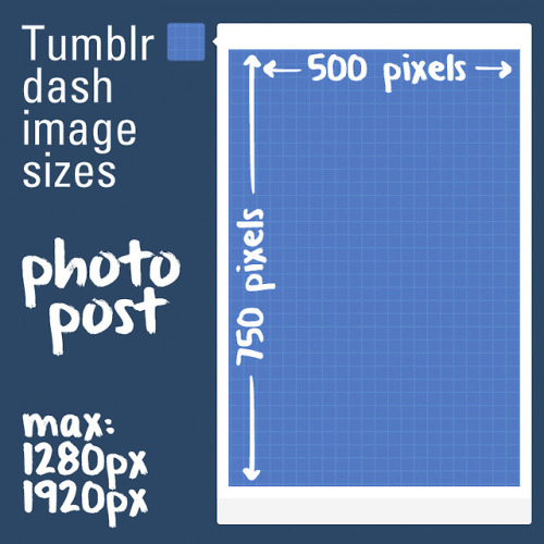
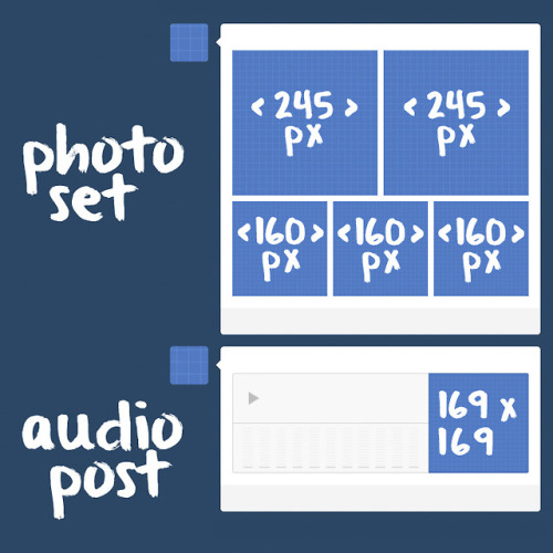

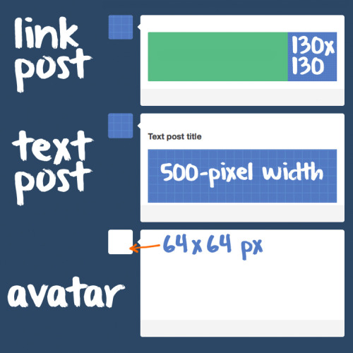
Tumblr Dashboard Image Sizes:
Photo post: 500 by 750 pixels for dashboard view; 1280 by 1920 pixels for high-res version (except for superwide panoramas).
Photoset: 500-pixel width for one image in a photoset row. 245-pixel width for two images in a photoset row. 160-pixel width for three images in a photoset row. Gutters are 10 pixels.
Audio Post: 169 by 169 pixels for album art.
Link Post: 130 by 130 pixels for the thumbnail image grabbed by Tumblr from web link (if available).
Text Post: 125-pixel width for images added to a text post, which expand when clicked. As of July 2014, inline images appear as 500 by 750 pixels for dashboard view.
Avatar: 64-by-64-pixel icon next to posts.


David Stenbeck.
...So Cates, I have questions?
I am waiting until the event is finished to do a super post on Donny Cates Absolute Garbage. Until then, Cates continues to show that he cannot form sequence of events and just throws scenes in for no reason.

In AC #2 and MM: AC #1, we were left with Miles becoming a symbiote host. Cates doesn’t use his pieces well because for one Eddie and Mac were safely away from the Carnage horde at the end of both issues. As soon as this issue picks up, Miles transformation is complete and he is suddenly attacking Eddie and the Carnage Cult is surrounding both again.
This sounds like a nitpick but as I pointed out in that there is a right way to chart action scenes in comics and I refuse to lay the blame at Stegman because he is simply providing the art to Cates’ script. Also it continues to be a problem in the book and it involves a major scene.

Why couldn’t Venom just do this earlier? Why bother with the several page melodrama of Eddie angering over letting Miles down when it was his fault that he got captured in the first place since you want to demand Scorpion to man up for no reason? Why is the Symbiote getting bold and basically putting himself in danger to just kill Osborn or is it Cletus...who the fuck knows anymore.
So Venom takes Carnage back to the warehouse and to safety to find this.

Now Spider-Man explains to Eddie that the Avengers know that he is helping which is okay. But I have questions because it obvious why a certain character is there. If Ben Grimm is there, why not bring in Reed Richards instead of Bruce Banner? Yes, Banner is a genius too but Mr. Fantastic has familiarity with symbiotes and alien biology. Banner’s field has to do with Nuclear Physics, Physics, and energy transference. This is just the writer assuming all geniuses are the same in order to display a pivotal scene that is complete macho bait.
Oh hey, remember when I mentioned Cates lack of sequence of events?


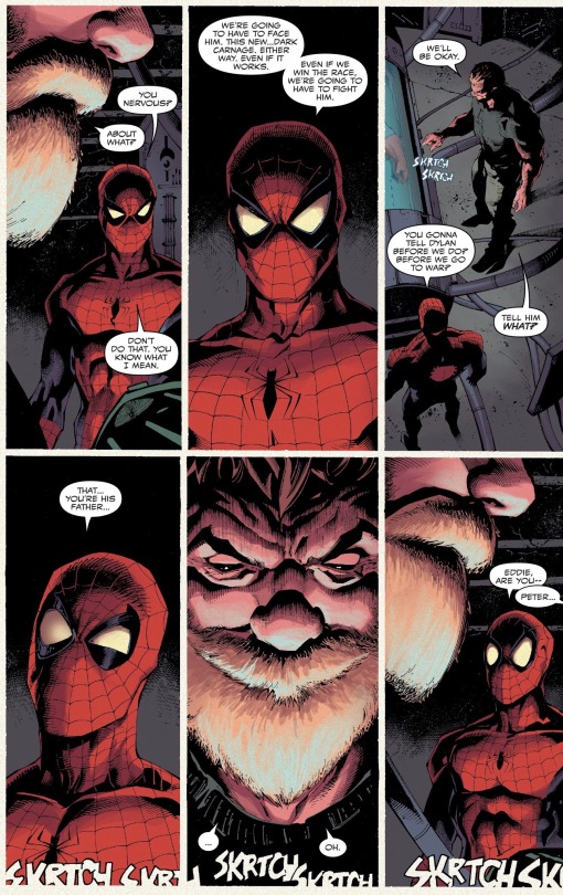

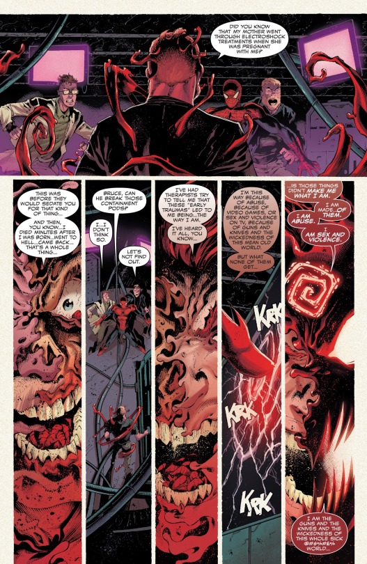
...How did Carnage find their hideout? How did Carnage sneak into the hideout and become a copy of Eddie and how did no one think to realize why there are two Eddies in the same building?
That is the sequence of events, fam. There are no missing pages. Carnage just finds Eddie and Peter(Eddie casually dropping Peter’s name and alias to a serial killer god wannabe) and there is no explanation at all as to how 2 geniuses and Eddie got caught so fucking off guard by something so simple to realize. It makes people look stupid.
And the edgy ass dialogue? “I am sex and violence?” Cringe as fuck(I am aware he is quoting a book but whatever).
I am not a Venom fan. I was roped in this shit show because it involved Miles and Andi. So dealing with Cates, who is being hailed for his ‘writing’, is like one massive disappointment after another.
The issue is that he is desperately trying to exonerate Eddie while making the Symbiote look evil. The Symbiote is bringing the worst of Eddie and it’s never Eddie’s fault ever. Like you see the scene where the Symbiote is trying to relieve Peter of the responsibility of bringing Symbiotes on Earth(a retcon that Cates made btw) only for Eddie to make the same mistake and manipulate Peter’s guilt for his sake. But does the writing ever call Eddie out? No.
The Symbiote is the wild one for wanting to kill Carnage while Eddie wants to protect his own kin as if those two ideas are at odds. All of the sudden, Eddie values human life because he has a kid now? And it’s not even human. Null/Carnage is literally killing swathes of people and taking over people’s bodies while infecting them with a codex. At this point, Null is a parasitic disease.
But Eddie doesn’t trust the Symbiote and feels like it’s trying to control him and manipulate his life so he just does stupid things due to this creator forced drama. And it is creator forced because it was Cates that made the relationship between the two abusive when there was no such tension earlier. You erased the one sole motivator of Eddie, his sister, and claimed that she never existed. You made it seem like it was the Symbiote that was giving Eddie cancer intentionally so Eddie would always need it. You made the Symbiote use Eddie’s DNA and rape and force impregnate his ex-wife because women in this series are only good when they are sex slaves to an alien cult, raped to have children of dubious consent, and just a lie of a manipulation. Honestly, Cates’ Venom run should be held in the same regard as One More Day and I say this as an avid Spider-Man fan.
@ubernegro
-
 princessbees reblogged this · 2 months ago
 -
 beinghumaniac13 liked this · 2 months ago
 -
 gabbydearest liked this · 3 months ago
 -
 fearless-stormclaw liked this · 4 months ago
 -
 aphfroghat liked this · 4 months ago
 -
 dumbdeadhead reblogged this · 4 months ago
 -
dumbdeadhead reblogged this · 4 months ago
-
 door88 liked this · 8 months ago
 -
 throwaway-111 liked this · 9 months ago
 -
 calamitymaiden liked this · 10 months ago
 -
 all-the-beautiful-chaos liked this · 10 months ago
 -
 greattyphoontimemachine liked this · 10 months ago
 -
 anime-to-the-t liked this · 10 months ago
 -
 jasmine-tron liked this · 10 months ago
 -
 kthnxbyeeeee liked this · 11 months ago
 -
 muconflao liked this · 11 months ago
 -
 juniperize liked this · 11 months ago
 -
 ojodebuey liked this · 11 months ago
 -
 shufflet reblogged this · 1 year ago
 -
shufflet liked this · 1 year ago
-
 sparkybestboi liked this · 1 year ago
 -
 raeraesmentality reblogged this · 1 year ago
 -
 handinclaw liked this · 1 year ago
 -
 pinkrangersarah liked this · 1 year ago
 -
 darth-salem-emperor-of-earth reblogged this · 1 year ago
 -
darth-salem-emperor-of-earth liked this · 1 year ago
-
 shadowmellow liked this · 1 year ago
 -
 crazy-grrrl-on-the-computer reblogged this · 1 year ago
 -
 koolkitty9 reblogged this · 1 year ago
 -
 dolliedeer liked this · 1 year ago
 -
 twins-resources reblogged this · 1 year ago
 -
 ionlywannaseeart liked this · 1 year ago
 -
 artking-4 reblogged this · 1 year ago
 -
artking-4 reblogged this · 1 year ago
-
 mrcguy15 reblogged this · 1 year ago
 -
 mjimen19 reblogged this · 1 year ago
 -
 deathlaw reblogged this · 1 year ago
 -
 myfireflyinstardustedskies-blog liked this · 1 year ago
 -
 iusedtohavesixtoes liked this · 1 year ago
 -
 distantoftheland reblogged this · 1 year ago
 -
distantoftheland liked this · 1 year ago
-
 dragonbleps reblogged this · 1 year ago
 -
twins-resources reblogged this · 1 year ago
-
 orange-swordsman liked this · 1 year ago
