Hey! Im Not That Well Versed On All Things Space Bc It's A Relatively New Interest Of Mine. How Come
hey! im not that well versed on all things space bc it's a relatively new interest of mine. how come ive seen so many blogs post about not wanting the other nasa logo? you totally don't have to answer, i just saw that you reblogged a post about it :) hope you have a good day!
By the other NASA logo do you mean the worm or the wormball?
And to answer your question, I’m think the logo arguments are pretty much entirely aesthetic. Some people think the worm is dated and ugly, other people love how sleek it looks. Some people think the wormball is a good compromise, others think the aesthetics are clashy (I’m in that boat.)
For reference, here’s some NASA logos. The ones under the cut are a little rare and honestly you don’t have to care about them, they just look cool.

This is the meatball. It’s the original from the 60′s and it’s still in use today. Detailed yet clean. Gorgeous. The swoosh is a tie in with the aero side of NASA and the stars and orbit with space. The serif lettering manages to look classy rather than dated. Even if this isn’t your preferred logo, you have to respect how it’s got the perfect amount of detail to look interesting while also being ca clean design.
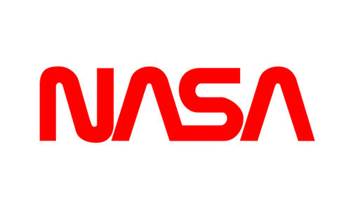
This is the worm. It was an attempt to modernize the logo around the start of the Shuttle/Skylab era. If this was for any other agency, I admit the worm styling would be a little dated. But personally, I think this logo brings back some of the enthusiasm of the early Shuttle era, just like the meatball brings back the energy of the Apollo era. It’s striking, it’s recognizable, and it’s one of my favorite worm stylings. (Compare it to SF MUNI’s worm logo, which was so cluttered I, as a local, didn’t notice it said “muni” until I was a teenager.)

This is the wormball. (Wikimedia was giving me trouble so it’s just a transparent background; I actually don’t have this one saved on my laptop for personal aesthetic reasons lmao.) Some people love it, but you will never convince me to. 100% personal preference, though, so if you love it, that’s fine, just keep it away from me. It’s like pineapple on pizza; you either love it or you hate it, but you’ve definitely got a strong enough opinion to argue about it.

This is NASA’s seal. You’ll only ever see it on official documents and things like that. It’s not something that’s displayed very commonly on, say, the wall of a NASA facility, and even less commonly on spacecraft. I believe this has been in use since the creation of the agency.
And, last but not least, I’d like to leave you with how the insignia is displayed on NASA aircraft, because they all. Look. Sick.

When they display the meatball on the rudder of an aircraft, like on SOFIA here, they omit the meatball and stars and display it like this! It looks cool as hell and it looks even better on aircraft where the rudder frames it nicer. (While I was searching around I saw a mockup for a meatballess wormball and it didn’t look awful.) Maybe we should call this the vegan meatball?
It’s also displayed like this on aircraft that were associated with NASA/USAF’s hypersonic research program in the early 60′s. Some pilots from this program went on to become astronauts.

... Including Neil armstrong who flew the X-15 above.
Aircraft from that program also featured a pretty neat rudder: it has this yellow stripe with NASA in a serif font that's unique to this design, as far as I know.
The first photo is Neil's X-15 again, the other is Dick Scobee's X-24B.


Lastly, the worm was plastered unedited onto aircraft during the worm era. It didn't always look good, but it looked too sexy on the X-29 to not include a pic.

(All photos are mine from NMUSAF!)
More Posts from Genna-ivanovich and Others
AHAHAHH YESS 😍
look at him, holding the earth...🌎
THEM,,,,:,)
![Source/more Posters: [x]](https://64.media.tumblr.com/53d383c86cdb662cc146931da19da747/tumblr_pfwkg0iUTq1rhavdko1_500.png)
![Source/more Posters: [x]](https://64.media.tumblr.com/4c409f77fddfe772b16bda3dba8c72f4/tumblr_pfwkg0iUTq1rhavdko2_500.jpg)
![Source/more Posters: [x]](https://64.media.tumblr.com/59f998a512b69b902fbbb9ddf38bcc20/tumblr_pfwkg0iUTq1rhavdko3_500.jpg)
![Source/more Posters: [x]](https://64.media.tumblr.com/63df097341b58da4841ddfb89a4e8d3b/tumblr_pfwkg0iUTq1rhavdko4_500.jpg)
Source/more posters: [x]
Click HERE for more facts!
Legit im crying- oh al... :,,
![“[At The Funeral] Four Jets Roared Into View, Flying Low And Fast, Wingtip To Wingtip. As The Foursome](https://64.media.tumblr.com/eb433825d7ab6cce23621eea3d39a3d4/tumblr_pie71eeulI1w6s8g7o3_500.jpg)
![“[At The Funeral] Four Jets Roared Into View, Flying Low And Fast, Wingtip To Wingtip. As The Foursome](https://64.media.tumblr.com/0ade0fcec22fd46a0bcfbebcd3474e32/tumblr_pie71eeulI1w6s8g7o6_500.jpg)
![“[At The Funeral] Four Jets Roared Into View, Flying Low And Fast, Wingtip To Wingtip. As The Foursome](https://64.media.tumblr.com/4e12ae479da9023a66c40fb884aec30f/tumblr_pie71eeulI1w6s8g7o7_500.jpg)
![“[At The Funeral] Four Jets Roared Into View, Flying Low And Fast, Wingtip To Wingtip. As The Foursome](https://64.media.tumblr.com/95071ca82523806e8e7e80a67b464287/tumblr_pie71eeulI1w6s8g7o5_500.jpg)
![“[At The Funeral] Four Jets Roared Into View, Flying Low And Fast, Wingtip To Wingtip. As The Foursome](https://64.media.tumblr.com/5cacca4e3bdaf7365bace724763eb182/tumblr_pie71eeulI1w6s8g7o4_500.jpg)
![“[At The Funeral] Four Jets Roared Into View, Flying Low And Fast, Wingtip To Wingtip. As The Foursome](https://64.media.tumblr.com/5091b266dfccc0db2ef2647d2987fa46/tumblr_pie71eeulI1w6s8g7o8_500.jpg)
![“[At The Funeral] Four Jets Roared Into View, Flying Low And Fast, Wingtip To Wingtip. As The Foursome](https://64.media.tumblr.com/81383e461d9254704177d9b0d8731fab/tumblr_pie71eeulI1w6s8g7o1_500.jpg)
![“[At The Funeral] Four Jets Roared Into View, Flying Low And Fast, Wingtip To Wingtip. As The Foursome](https://64.media.tumblr.com/296b01f4ca85c4d4d2544643eff95e03/tumblr_pie71eeulI1w6s8g7o9_500.jpg)
“[At the funeral] four jets roared into view, flying low and fast, wingtip to wingtip. As the foursome approached the cemetery one of the planes pulled up and away from the others–the traditional missing-man formation, which left an empty slot where the fourth plane should be. As the jets disappeared, a volley of rifle shots cracked, followed by the painful notes of taps played by a lone bugler.”
“After the services at Arlington colleagues gathered at the Georgetown Inn for a drink before returning to Houston and Florida. Paul Haney [NASA public information director] recalls that ‘it was the only time I ever saw Al Shepard cry. ‘I hate those empty-slot flyovers,’ Shepard said, brushing tears from his eyes. He couldn’t bring himself to admit that it was Gus he missed.’”


ok so in honour of sergei krikalev’s birthday on august 27th, and also in honour of a nice dream i had involving him, I’m going to be posting photos of this iconic cosmonaut every day until he turns 61!
(1) Sergei Krikalev in orbit aboard the ISS
(2) Sergei Krikalev bundled up in warm clothes and taken to a hospital tent after landing from the ISS in 2005
Russian Posts
These are my main posts I have made about the Russian language.
Learning the Language:
A1 Russian Material
Alphabet: Hard sign (ъ) and soft sign (ь)
How to Use Russian Cases
Imperfective/Perfective Aspect
Improve Your Russian
Russian Alphabet Tips
Russian Cursive Sheets
Russian Grammar Program
Russian Grammar Outline
Russian Pronunciation
Spanish Russian Materials
Telling Time in Russian
Tips to Read & Listen in Russian
TORFL Russian Test Materials
Media and Resources:
Russian Language Apps
Russian Textbooks that I Like
Russian Textbook PDFs
Russian Bookstores
Russian Learning Tools
Russian Movie & TV Shows
Russian Music Playlists
Russian Novels
Russian Podcasts
Russian Poetry
Slavic Folklore + Mythology
Russian Youtubers
Youtube Channels to Learn Russian
Printables:
Russian Declension Worksheets
Russian Declension Reference Sheets
AAAAAAAAAARGJSHFDFHFSDDSHFDJFDSGHSJGK
retweet if youre a hoe for space


I think this is the highest-quality version of this photo I’ve seen. Found here, color correction done by me. Really stunning quality—the freckle’s on Ed’s hands and his red hair, Rog’s cowlick, Gus’ upside-down watch (as usual), the freckle on his cheek, and wow, he was going to be completely gray very soon, wasn’t he? Our beautiful boys.
“I think the public has accepted the possibility that there is a risk. We in the program accept this possibility also… It’s going to be exciting, this conquest of space, and full of a lot of wonderful things, things we haven’t even dreamed about yet.” Ed White
“If we die, do not mourn for us. This is a risky business we’re in, and we accept those risks. The space program is too valuable to this country to be halted for too long if a disaster should ever happen.” Gus Grissom
“I don’t like to say anything’s scary about it. There’s a lot of unknowns, of course, and a lot of problems that could develop, or might develop, and they’ll have to be solved, and that’s what we’re there for. This is our business, to find out if this thing will work for us… I definitely think you’re apprehensive and you’re considering what’s involved there, you’re thinking about it. But you know how to handle it and take care of it and do the job.” Roger Chaffee
moldovaaaaaaa👌👌👌

me? drawing my faves from eurovision? more likely than you think


New Generations
if u feel sad right now look at this bunny eating a flower


Hey. Many of you know I was hospitalized last month. Got the bill today and it’s a little over $4.3k (with insurance).
I hate doing this. Especially now. But I would really, really appreciate your help if you are able to. I’ll draw just about anything provided it’s not NSFW or terribly gory, but you can message me just to be sure. I only accept payment upfront, either via paypal or venmo.
Even if you can’t commission me, I would greatly appreciate any reblogs you can give this and any of my other pieces (seriously, we artists really benefit from reblogs of our art). If you don’t want a commission but still want to donate, I also have a ko-fi and a Redbubble.
As always, DM me to find out more. Thanks everyone, and stay safe. <3
-
 revprov1 liked this · 5 years ago
 -
 apathyneverlandedonthemoon reblogged this · 5 years ago
 -
 idreamilyatomiccollector liked this · 5 years ago
 -
 spaceandstuffidk liked this · 5 years ago
 -
 newholiday liked this · 5 years ago
 -
 justanoldfashiontumblog liked this · 5 years ago
 -
 taiwaneseprick liked this · 5 years ago
 -
 ayiden liked this · 5 years ago
 -
 genna-ivanovich reblogged this · 5 years ago
 -
genna-ivanovich liked this · 5 years ago
-
 avengedbiologist reblogged this · 5 years ago
 -
avengedbiologist liked this · 5 years ago
-
 gusgrissom reblogged this · 5 years ago
 -
 bakaroni liked this · 5 years ago
 -
 footnoteinhistory liked this · 5 years ago
 -
 x-15 reblogged this · 5 years ago

Pamir | 19 | eng/ind | mostly cosmonaut/genshin/language related
228 posts