How To Hit Your Guys With The Crust Rays
how to hit your guys with the crust rays
a friend of mine was having trouble with a character of hers, he was middle-aged but looked too young, so she came to me for help. i'm something of a middle-aged-man-fan so i whipped up this quick thing to help her out. it might be useful to somebody out there so i'll share it here too!

More Posts from Donutdomain and Others

“Welcome to Snackbeard’s Sandbar and Krill And Other DelicaSeas and Delights!”
When snacktime beckons in the deep sea, salmon snailfish wiggle wiggle those little chin-fins (which are actually modified pectoral fins) in the sand—but it’s all in good taste. Those whiskers are covered in tastebuds, and can help them sus out small crustaceans, like amphipods and crabs, hidden in the muck!


NGC 3314
At first glance you'd be forgiven for thinking this was two galaxies merging, but they are actually 23 million light years from one another, and just happen to be overlapping due to our perspective.
The closest galaxy is 117 million light years away with the other 140 in the constellation of Hydra.

Herschel’s view of new stars and molecular clouds by europeanspaceagency
HOW DO YOU SHADE THE GOLD PARTSS???? PSLSPSLPSLPSLS

You don't have to take my word as gospel but these are the things I found that work well: ♡
(Please excuse grammatical errors I wrote this with a headache-...)
In my personal experience and process with gold, I find that these few things help me a lot when tackling it:
-whenever you approach gold it's important to asses the medium in which the material presents itself. The two options are the metal itself and any type of golden fabric.
-the shading process for me begins right from the sketch, when mapping out the gold accessory, object or the accent on a piece of clothing I try to get the shape of it to make sense.


It's most important, with golden fabric, to know and imagine how it falls arround and wraps arround a silhouette or body parts, if you want to figure out shading.
-So, when we speak "golden clothing" it revolves arround very sharp shadows, lights and reflections mainly becouse of fabric wrinkles. Golden clothing is pretty easy once you understand the nature of your material-☆
And the rules apply to any other colour!


Original Yellow hue
♡Same rules apply♡
So if you want you can structure your lights and shadows in black, white and grey! It works well to start off if you're not confident with colours as gold can be tricky in that regard...
GREYSCALE- can help you better understand the intensity of lights and shadows in contrast with one another:

You can then focus on colour later after you set up your values.

You'll notice with gold pieces that are much less clothing and much more metal the shadows alter from soft to sharp depending on the physical structure of the object itself.
If you encounter smooth curves it's soft, when it's sudden cuts or edges it's sharp.
Important to keep in mind:
-Gold is a metal = metals are REFLECTIVE.

Metals will reflect light aswell as colours.
They will especially reflect ☆colorful lights.☆
You must always, always, know where the light source is, and how it hits the object/ material.
That's it for now but if you want a more detailed step by step process just ask ^^☆
-Nix🌙


A friend of mine shared this fantastic resource over Discord, so did a few studies in-between working on homework!


Some people asked how I paint hair, so I made this very simplified explanation, but I hope it helps someone.
The @ is my twitter btw ^~
Your art is amazing!!! I love the stunning use of colour! Do you have a process to pic colours or just mess with them until you get something you like? :)
Thank you, you’re so sweet!! When I draw my own characters I just pick colors I like but for fanart there’s a few things I do. I’ll share my process here in hopes it might help!

Comfort
When working with vibrant colors I like to soften them by warming them up, making them similar to each other, and avoiding pure colors altogether. Our eyes are sensitive so I never want my colors to be too bright or contrasting.

Unique
Tertiary colors are more unique and calming than primary colors so I use them a lot to punch up my art without making things too intense. It also puts a fun twist on designs when we use colors that are close but not exactly like the originals.

Balance
Balancing colors is so important! It’s my final step to completing every color palette I make. There has to be a variety, contrast, and a connection between colors. Adding a little of the same color to all of the others helps to accomplish this. Usually I take a shortcut by adding a color overlay in my painting programs. This is also another reason why I never use pure white or black---those colors will not be affected by color overlays.
There’s also my color post here if anyone wants to know more about color theory and things. Color is a huge deal but it’s really fun!
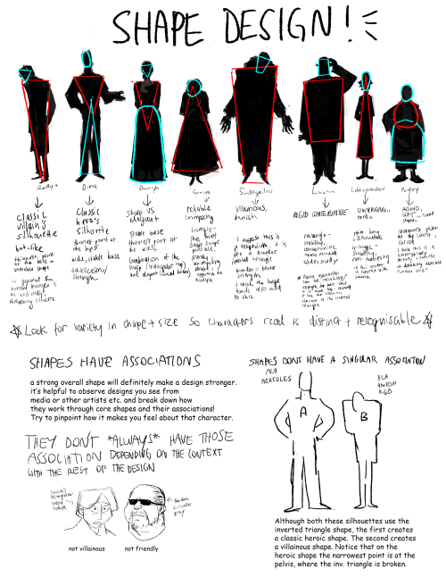
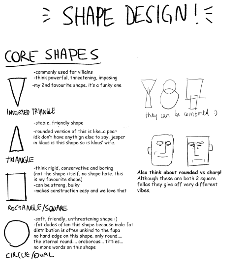
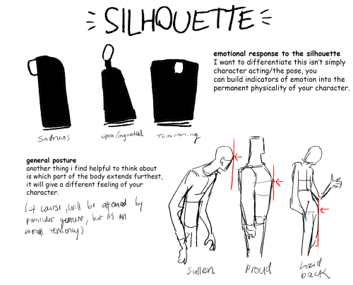
Part 2 of cino art tips is some basic tips on shape and silhouette design which are also principles I think about a lot :)
(also i'm so sorry i chose comic sans to write this in idk what i was thinking but i already flattened the layers)
i don't have any other obvious tips off the top of my head rn but feel free to ask anything you are curious about! i love getting asks uwu

The Cats Eye Nebula in Optical and X-ray : To some it looks like a cat’s eye. To others, perhaps like a giant cosmic conch shell. It is actually one of brightest and most highly detailed planetary nebula known, composed of gas expelled in the brief yet glorious phase near the end of life of a Sun-like star. This nebula’s dying central star may have produced the outer circular concentric shells by shrugging off outer layers in a series of regular convulsions. The formation of the beautiful, complex-yet-symmetric inner structures, however, is not well understood. The featured image is a composite of a digitally sharpened Hubble Space Telescope image with X-ray light captured by the orbiting Chandra Observatory. The exquisite floating space statue spans over half a light-year across. Of course, gazing into this Cat’s Eye, humanity may well be seeing the fate of our sun, destined to enter its own planetary nebula phase of evolution … in about 5 billion years. via NASA
-
 rubyhime liked this · 4 weeks ago
 -
 artref081 reblogged this · 1 month ago
 -
 the-grollican liked this · 1 month ago
 -
 maximates liked this · 1 month ago
 -
 beetle-ze-bub liked this · 1 month ago
 -
 russetfoxfur reblogged this · 1 month ago
 -
 archive-of-sorts reblogged this · 1 month ago
 -
 one-eyed-imp liked this · 1 month ago
 -
 rednub liked this · 1 month ago
 -
 holasoymqri liked this · 2 months ago
 -
 maoyalikestowrite liked this · 2 months ago
 -
 katshi liked this · 2 months ago
 -
 nerdies-exe reblogged this · 2 months ago
 -
nerdies-exe liked this · 2 months ago
-
 murasaki-rose reblogged this · 2 months ago
 -
 freakwhodraws reblogged this · 2 months ago
 -
 kinng-lukaas liked this · 2 months ago
 -
 auau5n reblogged this · 2 months ago
 -
 mephistocated reblogged this · 2 months ago
 -
 strikeofthespacegandalf liked this · 2 months ago
 -
 gratia-illi-puella reblogged this · 2 months ago
 -
 moonlit-loser liked this · 3 months ago
 -
 get-more-bald reblogged this · 3 months ago
 -
 penthepoet reblogged this · 3 months ago
 -
 pressedbetweenthepages reblogged this · 3 months ago
 -
 speakofthescooter liked this · 4 months ago
 -
 thatlethalsoul liked this · 4 months ago
 -
 willowfoxthefox reblogged this · 4 months ago
 -
 is-star-here reblogged this · 4 months ago
 -
 star-ishere liked this · 4 months ago
 -
 strawberry-shortpup liked this · 4 months ago
 -
strawberry-shortpup reblogged this · 4 months ago
-
 catsharky liked this · 4 months ago
 -
 gh0st-moth reblogged this · 4 months ago
 -
 disco-titts liked this · 4 months ago
 -
 acidicleafbat liked this · 4 months ago
 -
 the-alternates-are-in-my-home liked this · 4 months ago
 -
 galacticgalalex liked this · 5 months ago
 -
 monteisdead liked this · 5 months ago
 -
 clovyrr liked this · 5 months ago
 -
 fuckyeahnewhollywood liked this · 5 months ago
 -
 ihaveatromboner reblogged this · 5 months ago
 -
 nicknamerous liked this · 5 months ago
 -
 xxbimboboyxx liked this · 5 months ago
 -
 cryptidincarnate liked this · 5 months ago
 -
 whimsyelderfan liked this · 5 months ago
 -
 thumping-whumper reblogged this · 5 months ago
 -
thumping-whumper liked this · 5 months ago
-
 bleebs-bullion liked this · 5 months ago

I just reblog fun facts/tipsScience, nature, geology facts etc! + art & writing tips!
67 posts