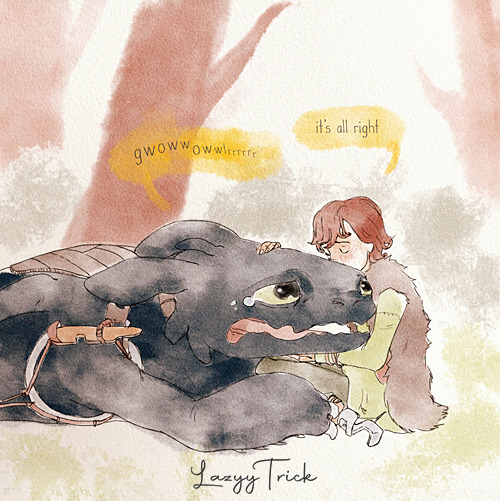
Sound On For This One
Sound on for this one
More Posts from Delightfulgalaxydeer and Others


I found these HERE
Color tips for (I’m not a pro at character design)
Having similar color values can make your art look unfinished and not stand out well. Personally I like to have at least 1 light value 1 dark value and some in between values. This also applies to illustrations
You can see the value of your colors by using the grayscale filter on ibis paint


in drawings and character designs don’t be afraid to use some muted colors sometimes. When used well it can enhance the colors that aren’t muted

If you have trouble picking colors for a character design I suggest looking at your characters personality traits and choosing some colors that respond with those traits, I don’t always do this but I did this with my lirian characters and got some nice color inspiration. Look at already existing color patterns and character designs you like the colors of
Colors can guide the viewers eye to where you want them to look


Dispersing your colors evenly in a character design is important. Yes out of place colors can guide a viewers eyes as stated above but depending on how it’s done it could look bad. If your character has a color palette with more darker colors I suggest using the lighter colors to guide the eyes to where people should look


Hope these tips help anyone who finds coloring difficult
Zodiac meeting


Sonic the Hedgehog & Terios the Hedgehog - Sonic Adventure 2

The eel effect
Commissions 💐
best trope and you can fight me over it (i abuse this so hard with my ocs)
i dont consider myself a 'fashion guru' by any means but one thing i will say is guys you dont need to know the specific brand an item you like is - you need to know what the item is called. very rarely does a brand matter, but knowing that pair of pants is called 'cargo' vs 'boot cut' or the names of dress styles is going to help you find clothes you like WAAAYYYY faster than brand shopping
This is so good!!!
// spotlight on me and I’m ready to break
This is my art of Lorsan from AFK Journey,I tried my best and I think it looks good....enough

-
 youngjellyfishanchor liked this · 3 weeks ago
 -
 dust-bun reblogged this · 4 weeks ago
 -
dust-bun liked this · 4 weeks ago
-
 ultimateog100 reblogged this · 1 month ago
 -
ultimateog100 liked this · 1 month ago
-
 mahead-ithurt reblogged this · 1 month ago
 -
 kaznata liked this · 1 month ago
 -
 frowned-upon-in-most-cultures liked this · 1 month ago
 -
 captainthunderbunny liked this · 2 months ago
 -
 suesseralsbaklava liked this · 2 months ago
 -
 donedeer-bruce liked this · 2 months ago
 -
 wearewritten liked this · 2 months ago
 -
 roserado liked this · 2 months ago
 -
 fernothewise reblogged this · 2 months ago
 -
 aradiamegido reblogged this · 2 months ago
 -
aradiamegido liked this · 2 months ago
-
 theunknowncowboy reblogged this · 2 months ago
 -
theunknowncowboy liked this · 2 months ago
-
 dokiedo reblogged this · 2 months ago
 -
dokiedo liked this · 2 months ago
-
 idkthylocinesareprettydope reblogged this · 2 months ago
 -
 cvntclip liked this · 2 months ago
 -
 savannah43 liked this · 2 months ago
 -
 soothooves liked this · 2 months ago
 -
 rylarathebrave liked this · 3 months ago
 -
 cactus-biter liked this · 3 months ago
 -
 amaltheathelast reblogged this · 3 months ago
 -
 dravirex liked this · 4 months ago
 -
 slut-for-media reblogged this · 4 months ago
 -
 joanwaterhouse liked this · 4 months ago
 -
 petrichors-forest liked this · 4 months ago
 -
 la-people liked this · 4 months ago
 -
 emulsified-blog liked this · 4 months ago
 -
 akuauli liked this · 4 months ago
 -
 handowls reblogged this · 4 months ago
 -
 thepullofy0u liked this · 4 months ago
 -
 belovedgoofball liked this · 4 months ago
 -
 endlesslydev0ted reblogged this · 4 months ago
 -
endlesslydev0ted liked this · 4 months ago
-
handowls liked this · 4 months ago
-
 socalledmixtapelife reblogged this · 4 months ago
 -
socalledmixtapelife liked this · 4 months ago
-
 sweethoneybun reblogged this · 4 months ago
 -
 insaneinthbrian liked this · 4 months ago
 -
 thexie-and-stars liked this · 4 months ago
 -
 seraphim-paws liked this · 4 months ago
 -
 plantsofdeath liked this · 4 months ago
