Collection Of Images And Memes For Anyone Who Doesn’t Know What To Draw
Collection of images and memes for anyone who doesn’t know what to draw


More Posts from Basket-of-references and Others
being a self-taught artist with no formal training is having done art seriously since you were a young teenager and only finding out that you’re supposed to do warm up sketches every time you’re about to work on serious art when you’re fuckin twenty-five


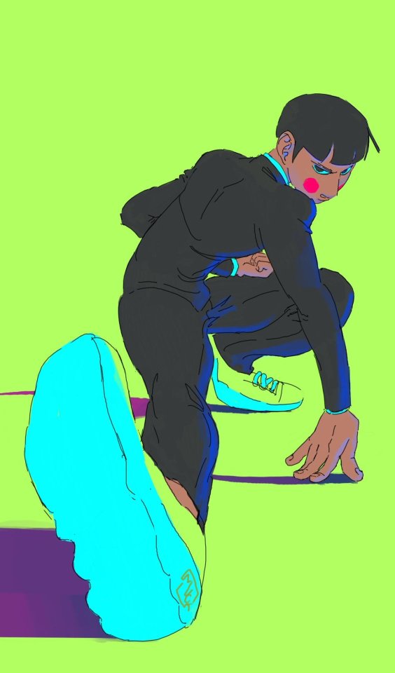
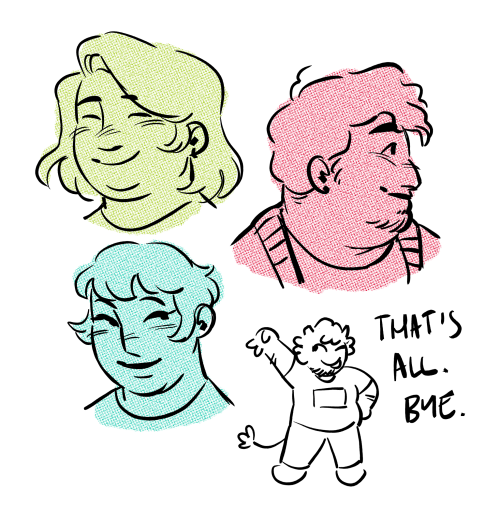
Made this lil thing to celebrate hitting 1500 followers on twitter.
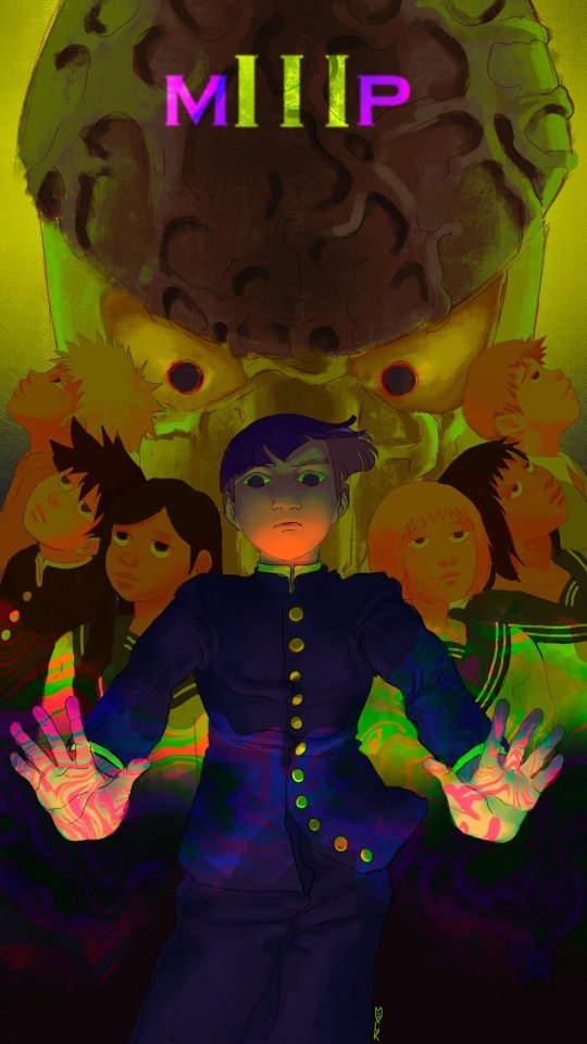
hehe
monkey brain like round number
🌸Describing Scents For Writers 🌸| List of Scents
Describing aromas can add a whole new layer to your storytelling, immersing your readers in the atmosphere of your scenes. Here's a categorized list of different words to help you describe scents in your writing.
🌿 Fresh & Clean Scents
Crisp
Clean
Pure
Refreshing
Invigorating
Bright
Zesty
Airy
Dewy
Herbal
Minty
Oceanic
Morning breeze
Green grass
Rain-kissed
🌼 Floral Scents
Fragrant
Sweet
Floral
Delicate
Perfumed
Lush
Blooming
Petaled
Jasmine
Rose-scented
Lavender
Hibiscus
Gardenia
Lilac
Wildflower
🍏 Fruity Scents
Juicy
Tangy
Sweet
Citrusy
Tropical
Ripe
Pungent
Tart
Berry-like
Melon-scented
Apple-blossom
Peachy
Grape-like
Banana-esque
Citrus burst
🍂 Earthy & Woody Scents
Musky
Earthy
Woody
Grounded
Rich
Smoky
Resinous
Pine-scented
Oak-like
Cedarwood
Amber
Mossy
Soil-rich
Sandalwood
Forest floor
☕ Spicy & Warm Scents
Spiced
Warm
Cozy
Inviting
Cinnamon-like
Clove-scented
Nutmeg
Ginger
Cardamom
Coffee-infused
Chocolatey
Vanilla-sweet
Toasted
Roasted
Hearth-like
🏭 Industrial & Chemical Scents
Metallic
Oily
Chemical
Synthetic
Acrid
Pungent
Foul
Musty
Smoky
Rubber-like
Diesel-scented
Gasoline
Paint-thinner
Industrial
Sharp
🍃 Natural & Herbal Scents
Herbal
Aromatic
Earthy
Leafy
Grass-like
Sage-scented
Basil-like
Thyme-infused
Rosemary
Chamomile
Green tea
Wild mint
Eucalyptus
Cinnamon-bark
Clary sage
🎉 Unique & Uncommon Scents
Antique
Nostalgic
Ethereal
Enigmatic
Exotic
Haunted
Mysterious
Eerie
Poignant
Dreamlike
Surreal
Enveloping
Mesmerizing
Captivating
Transcendent
I hope this list can help you with your writing. 🌷✨
Feel free to share your favorite scent descriptions in the replies below! What scents do you love to incorporate into your stories?
Happy Writing! - Rin T.
Heres a MEGA folder filled with art book pdfs, if anyone has some others that you'd like me to add to it thats missing, please let me know and send me the link
EDIT 1: If you're a bit new to art and you're super overwhelmed by the options and you don't know where to start, I highly recommend the morpho series of books
Edit 2:No more Google Drive, just the MEGA folder now, so don't panic if the stuff on Google ain't there no more, its still up, just in a different location
U use colors in such a enrichening way, how do you do that may I ask??
thank you so much! 💕
this answer is going to be a little long.
the first thing, i think, is that it's very common to think of color as a means to an end, as just another type of information about a drawing: i'm using brown on the hair to show that the hair is brown, i'm using green to show that the characters are standing in grass.
but if color is information, then we can use it to say a lot more than just the basic facts of a drawing!
if you love drawing but want to get better with color, you have to learn to love color, too.
to want to know everything about how color works, to explore what different colors mean to you, to try and try and try again.
because, and this is the kicker:
ALL COLORS ARE RELATED TO EACH OTHER!

[from this post about how to use a color wheel]
i think it's common for people to talk about complementary colors and that's helpful when you're starting out with coloring, but i feel that it can become very limiting when it's treated like a rule and can obscure the fact that all colors are related to each other. it's called a color wheel because there is no beginning or end!

for example, take this drawing:

in this drawing, i'm using colors from all over:

but by just rearranging them slightly and throwing them against a black background like in the drawing, you can see how they're actually relating to each other and not nearly as random as they may seem at first glance!

[these notes are from this post where i break down how muted or "ugly" colors pull an image together] all colors are related to each other in some way, and that means that
YOU MUST DETERMINE WHAT EACH COLOR MEANS TO YOU, AND IT IS YOUR RESPONSIBILITY TO CONVEY THAT MEANING TO YOUR AUDIENCE.


for example, to me green can be uncomfortable and overwhelming, energetic and edgy, calm and natural, or fearful and tense. but no matter how it makes me feel, it's my responsibility to convey my relationship to green to whoever even glances at my drawing.
sure you can use commonly held ideas about colors [red = angry, blue = sad], but this shorthand is also limiting. if everyone used these commonly held ideas about color, there would be no room for experimentation or interesting, wild color choices! and colors mean different things to everyone-- that's what makes everyone's colorful art so different and so cool!!
another thing to note about those green drawings: each one is using a specific type of green.
the one with reigen leans blue-green, which creates a cool-colored image. meanwhile, reigen is warmer tones, which almost makes it seem like he's overheating when he's thrown against such a cool-toned background, which further expresses his discomfort!
the dimple!mob drawing is like a sprite or mountain dew-green, which encourages the feeling of electricity or energy. it's a cool yellowish-green.
the one of mob floating is a warmer yellowish-green, to suggest sunny warmth without drawing sun rays.
the divine tree arc drawing is a lot of reddish-greens, which can suggest a sickliness.
experiment with color combinations and different shades and hues! explore what these different types of colors mean to you!
so now let's get into the nitty gritty of color choice. the following images are from my free pdf about color, composition, and intuitive drawing:


the main takeaways from these pages are:
consider simplifying your colors! more colors does not necessarily equal a better drawing.
see how much a single color can do! can you use it in multiple places on your drawing? what meaning can you ascribe to the colors you're using?
consider creating a concept for your colors and a few rules to guide your piece! a lot of great drawings can fall apart because the coloring concept was too vague or because there weren't enough rules or guidelines to keep the image coherent.
are your colors saturated enough? are the different colors you're using fighting for the viewer's attention? do you have focal points in your art, and if so, are the colors you're using reinforcing those focal points?
use the tools at your disposal! color-picking, color balance, overlay layers. it can feel important to try to prove something by hand-picking every color, but even when i hand-pick my colors i almost always check them with color balance anyway to make sure i'm picking the best colors possible.
YOU DO NOT HAVE TO SUFFER FOR ART. PLEASE use everything that is available to you, and make sure that you are aligned with what brings you joy when you're making art!
i wanted to show an example of a drawing i've done that is doing way too much vs a drawing that is simpler but more balanced:


on the left, the colors are interesting but the background is too strong and is competing with the actual drawing for attention. on the right, the clear background and simple coloring create a cute, easy to read, successful image! this is what i mean when i say that colors can fight for the viewer's attention and mess up a good drawing.
my final secret is that i rarely shade with or use white, black, or grays. i don't think this is a rule that you have to follow, but i like it because it pushes me to figure out what colors will go best with each other, and i think this single tip has strengthened my understanding of color immensely. however, there are a lot of beautiful art styles that shade with and use pure white, black, and gray. you have to decide what you love!
and
STUDY!!!
look at other people's art, color pick it, and make a palette based on their art! look at how they represent values through color, how they shade, etc. study your favorite artists' work!! you will learn so much!!
i hope this was helpful! if you have any more follow-up questions or if there's something that you want to know that i didn't explain here, please don't hesitate to ask!
How to draw Black characters. Because it's way too obvious when you drew a white person and gave them Black skin.
https://www.tiktok.com/t/ZTRg6YsKN/
-fae


I find monthly art challenges exhausting, but also love a little structured kick in the ass, so for the past month and a half I've been setting weekly challenges for myself. First one: fill a sketchbook page a day with quick poses off Pose Maniacs.
It's a redux of my first figure drawing class exercise as a teen: get from the top of the head to the heel of the foot in the allotted time. All the poses above were 10-30 seconds. Never hurts to get back to basics every so often~
(Although, in that first class, the professor made us go outside and grab twigs that we had to dip in ink to draw with, so we wouldn't get precious about our line work. I'm not THAT ascetic this time around, lol.)

These are taken directly from the concept art. May not be the same as what was used in the shows.
I will edit post with hexcodes.
Hey guys, you know about the Same Energy website right? has someone made a post about that? Cuz otherwise im gonna sing its praises to high heaven for its artistic references
-
 lnstallationwizard liked this · 4 weeks ago
 -
 dimensionwarp liked this · 4 weeks ago
 -
 horror-lady00 reblogged this · 4 weeks ago
 -
horror-lady00 liked this · 4 weeks ago
-
 sircoconutty liked this · 4 weeks ago
 -
 lactosefree-milk liked this · 4 weeks ago
 -
 nyhils liked this · 4 weeks ago
 -
 mcdoessomething liked this · 4 weeks ago
 -
 1nkpuddle reblogged this · 4 weeks ago
 -
 fanficrecsandrambles liked this · 4 weeks ago
 -
 sleezypmartini reblogged this · 4 weeks ago
 -
sleezypmartini liked this · 4 weeks ago
-
 g00seg1raffe liked this · 4 weeks ago
 -
 crown-of-everest liked this · 4 weeks ago
 -
 fnafsunandmoon liked this · 4 weeks ago
 -
 fadingheartunknown reblogged this · 4 weeks ago
 -
fadingheartunknown liked this · 4 weeks ago
-
 pink-fangirl liked this · 4 weeks ago
 -
 scrungly420 reblogged this · 1 month ago
 -
 deadly-carp liked this · 1 month ago
 -
 crustaceankill reblogged this · 1 month ago
 -
crustaceankill liked this · 1 month ago
-
 burclaw liked this · 1 month ago
 -
 animalfarmgames liked this · 1 month ago
 -
 stuff536363 reblogged this · 1 month ago
 -
 toomanyfandoms11 liked this · 1 month ago
 -
 hyperfixationswithkat reblogged this · 1 month ago
 -
 mason-the-mosan reblogged this · 1 month ago
 -
mason-the-mosan liked this · 1 month ago
-
 tomaterojo666 liked this · 1 month ago
 -
 lucifer-is-a-bag-of-dicks liked this · 1 month ago
 -
 versailles-walmart-wombocombo liked this · 1 month ago
 -
 r-tposingsunface reblogged this · 1 month ago
 -
 anonymous-red-shades reblogged this · 1 month ago
 -
 the-arcade-doctor reblogged this · 1 month ago
 -
 nokinuart liked this · 1 month ago
 -
nokinuart reblogged this · 1 month ago
-
 hatlordave reblogged this · 1 month ago
 -
 tangeraineee liked this · 1 month ago
 -
 that-one-oddity liked this · 1 month ago
 -
 babababookmark reblogged this · 1 month ago
 -
 wisteria-rainfall reblogged this · 1 month ago
 -
 centurywrites liked this · 1 month ago
 -
 haunted-phantm liked this · 1 month ago
 -
 oysterstewcos liked this · 1 month ago
 -
 voidling-prince liked this · 1 month ago
 -
 palagory reblogged this · 1 month ago
