If People Don't Admit That Alcohol Is A Drug So Help Me God I Will Pour An Entire Bottle Of Wine On Their
If people don't admit that alcohol is a drug so help me God I will pour an entire bottle of wine on their hair.
More Posts from Badfungi and Others

This fit with 23

Legacy of destruction

WHA fandom is like: Here's a great manga that deals with teaching children and respects them as people and has wonderful art and handles delicate topics respectfully and has interesting thoughts about the world and the what and how needs changing as well as a well developed world and deep and complex characters also if all of that doesnt pique your interest here is qifrey he's a slut

Witch hat atelier is good
I just saw a story on AO3 tagged "pet p!ay"
TIK TOK MUST BE STOPPED BEFORE IT DESTROYS LANGUAGE
One little good thing to come out of the latest chapter is Genos appreciation.
-Sorry, a rant-
Despite most of the discourse I have seen about him getting me like this:

‘How can people say the most foolish things with such confidence?’ It’s been explained to us that he doesn’t work like that! And-He-Is-A-Cyborg.
Keep reading
i think “video games aren’t really the violent child-corrupting threat some parents worry they are” and “certain circles of gamer culture are incredibly toxic and can lead people down dangerous/hateful ideological rabbit holes” are ideas that can absolutely coexist
would you consider dropping some tips on how you color? your art always has such a nice feeling to it
Thank you so much, and yes, absolutely!
So... I have been agonizing over how to answer this question for over a week because I tend to make a lot of my major decisions based on what looks and feels good to me in the moment. It’s sort of hard to explain. Then I started getting philosophical with it (“how does one color? How do I explain aesthetic?”), and I started rambling, and had to cut the answer way, way, way down lol.
But here’s what I can help with right now. I think the most important part of how I color is my tools and what they allow me to do. These are currently my favorite brushes to use:

From top to bottom, I use Kyle T’s Gouache for just about everything. A lot of my recent pieces are done entirely in that– I love the chunky texture and how the pressure mimics traditional gouache. It’s great for children’s book illustrations, and filling linework, and realistic portraits. She is my soft wife and I love her.
I practically never use the default hard round. Ignore that.
The roller brush is another one I use for painting. It was my go-to before KT’s gouache, so you’ll find it a lot in my older work (and as a big texture thing in my current works). The “Sampled Tip” below that one I usually use for children’s book styled illustrations. It’s like a really dense, waxy crayon, so it’s fun for textured lines and details.
I always paint in my own shadows and highlights, but I like to use the soft round if I want to blow the shadow or highlight out. It’s for extra large areas.
And finally my pencil. I use it for sketching as well as linework, if I plan on doing a linework-centric piece. I don’t think there’s much of a difference between the two there… one is probably smoother than the other.
______________
The reason why I like textured, pressure-sensitive brushes so much is because they’re important to how I paint. When I blend, I don’t use a blender brush or a smudge tool. What I do is layer two colors– lightly– then use the eyedropper to select the color between them and continue painting with it. That’s probably the key to most of my work. I’ve gotten pretty fast at it, so I’m constantly selecting colors from the painting and reusing it throughout my painting.
I still use the color-wheel to hand-pick what I think will look best, though. This is probably going to be a really frustrating answer, but I choose color palettes based on basic color/lighting theory combined with personal aesthetic preference. It can take some studying (of both theory and other artists’ work). If you’re ever looking for a really great reference on the former subjects, I highly recommend Color and Light by James Gurny. Even if you’re not into watercolor or dinosaurs or realism, the guy is a master at explaining all that different stuff in depth.
Shape and negative space are also pretty important to me, but that's a whole other thing. And as a side-note, I recommend following more children’s book illustrators. Their work may look simple, but a lot of intention goes into how they use color, shape, space, and texture.
Also, on texture, I hand-draw most of mine. I love to add little scratches and drops and splashes when the painting is almost over. It's one of my favorite things to do :')
____
Now, the other most important tip:
Once I’m happy with the sketch/linework, and once I’ve laid down the basic colors of my piece, I do a Really Terrible Thing. I become a graphic designer’s worst nightmare and collapse everything onto one layer.
Then I paint directly on top of it, linework and all.
I do this for a lot of reasons, but mostly because 1) my tiny brain is overwhelmed by the clutter of too many layers, and 2) it forces me to approach a piece as if it was traditional media– a process which I find a lot more comfortable and rewarding. I paint right on top of the base colors, and right on top of the linework, effectively redoing and cleaning up what I already have there. Even if I'm working with a blank background, I'll paint a new blank one on top because it gives the feeling of a more unified piece, if that makes sense.
Basically, I approach my drawings as if I’m using traditional media. I like chunky brushes, utilizing (what I personally think are) interesting color combinations and textures, and smashing everything down onto one page so I can just paint.
Anyway, please let me know if there’s anything specific you’d like me to go into detail on, any pieces of mine you’d like to know how exactly I went about it, etc etc etc. I’m happy to answer ^^
Tokyo Ghoul Fanarts
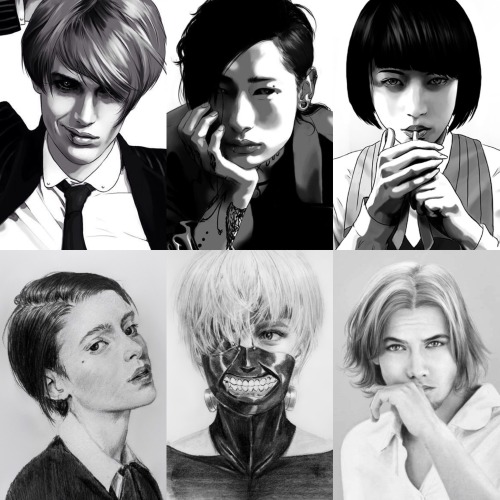
Tsukiyama Shuu
Uta
Koori Ui
Ken Kaneki
Renji Yomo
-
 auroramagpie liked this · 1 month ago
 -
 ignis-et-glacius liked this · 2 months ago
 -
 spilt-ash liked this · 3 months ago
 -
 lovelyalicorn reblogged this · 3 months ago
 -
 blindreblogs2areblog reblogged this · 4 months ago
 -
 annita89toyqw9ih liked this · 6 months ago
 -
 i-cant-swim-i-promise liked this · 7 months ago
 -
 rinsheaven liked this · 8 months ago
 -
 x-choutenchan-x liked this · 8 months ago
 -
 fatalefishmael reblogged this · 8 months ago
 -
fatalefishmael liked this · 8 months ago
-
 cheyandyukisystem-jiraiblog reblogged this · 8 months ago
 -
 cheyandyukisystem liked this · 8 months ago
 -
 sinkingisbetter liked this · 8 months ago
 -
 porcelainguro liked this · 8 months ago
 -
 heartshattering reblogged this · 8 months ago
 -
heartshattering liked this · 8 months ago
-
 amargo-lex liked this · 9 months ago
 -
 crownprinceknut liked this · 10 months ago
 -
 arcaticys liked this · 10 months ago
 -
 parafoxicalk reblogged this · 10 months ago
 -
 puppycrime liked this · 10 months ago
 -
 isthissadculture liked this · 10 months ago
 -
 dinochickennugget reblogged this · 10 months ago
 -
 tiredoflyme reblogged this · 10 months ago
 -
 stupendousqueengiver liked this · 10 months ago
 -
lovelyalicorn liked this · 11 months ago
-
 the-american-writer-from-narnia liked this · 11 months ago
 -
 onethirdofakind liked this · 11 months ago
 -
 timeflieslikeabanana liked this · 11 months ago
 -
 thecatwizardstower reblogged this · 11 months ago
 -
thecatwizardstower liked this · 11 months ago
-
 gerards-blood liked this · 1 year ago
 -
heartshattering reblogged this · 1 year ago
-
 lokidottirblack reblogged this · 1 year ago
 -
 aibhilin-atibeka reblogged this · 1 year ago
 -
aibhilin-atibeka liked this · 1 year ago
-
 ratsconfusion liked this · 1 year ago
 -
 violets-and-tea-leaves reblogged this · 1 year ago
 -
violets-and-tea-leaves liked this · 1 year ago
-
 oncein221b liked this · 1 year ago
 -
 renee561 reblogged this · 1 year ago
 -
 reginacardsong reblogged this · 1 year ago
 -
 a-knight-owls-curse reblogged this · 1 year ago
