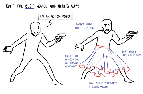
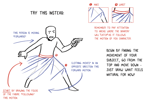
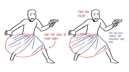
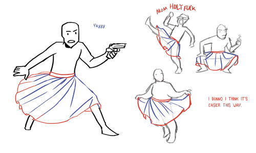
Basic Motorcycle Tutorial

Basic Motorcycle Tutorial
Artist: Florian Lecuyer
More Posts from Arttuti and Others
How to show expression with the mouth!
This was a request and at first I wasn’t sure if I had anything to provide with, but as it turn out it got a little longer than I expected because there were actually things I had to say!! Wow!!
Anyway, this is some guidelines I follow when I try to make the face expressfull, more specifically the mouth! It is often neglected, since it’s actually pretty hard, I’ll admit. But I’m here to help (hopefully…)! A mouth expression tutorial as per request. Enjoy and hopefully it will help some a little. ʕ•ᴥ•ʔ
Draw the teeth at the right angle.
This is super important. The upper jaw follows the angle of the head, and the lower jaw will depend on how open it is. Make sure you have a rough estimate of where the teeth are, and how much of them you’re going to see!
The lips will VERY roughly follow the same angle as the teeth. It really depends on the character, but it gives you a sense at least.

If you DON’T do this, you’re going to lose so much volume and the mouth is going to end up looking unrelatable. I showed this example in this tutorial:

It’s not just the lips!
The cheeks, chin, and tongue play a role too!

Try look at your own mouth or references! I have a very pliable and large mouth, so that’s one reason why my characters have it too lmao.
ASYMMETRYYYYY (ง ͠° ͟ل͜ ͡°)ง
I cannot emphasize how important asymmetry is when drawing expressions. It applies not only to the eyebrows to achieve the Dreamwork Face™, but also the mouth. Seriously if you draw a symmetric mouth I will deliver myself to your mailbox and then shout at you until you fix it.
Look at the difference between these two for example: which one has more “life”?

I think you get the idea.
Push and squish - give it flow
Here’s an old drawing I have but it illustrates how I think when I squish the mouth, and use folding and wrinkles to my advantage.

Look at your own face and see where skin bundles up, where it creases the most and when bumps appear on your chin. Subtle details makes all the difference!
One VERY effective detail is illustrated in the first sketch, where I pull upwards on one side, and downwards on the other. That’s a good detail to use when the character is making a skewed expression, or is extremely frustrated. I encourage you to play around with that concept bc it’s ~super effective~!
EXAMPLES:
Happy: Your entire mouth is pushed upwards, not just the corners of your mouth!

I tend to draw a :3 mouth bc I’ve been drawing Lance too much….. You don’t have to but it’s basically imprinted in my motor memory by now.
Pouting/frowning: corners are pushed down, middle pushed slightly up. Sometimes, there’s a slight dip in the middle too. It can give a sense that the character is biting their lips.

Showing frustration/intimidating/is intimidated: basically showing a lot of teeth. The corners are as open as possible and the middle sorta more squished. An extremely important detail here is showing some of the gums, and open space between the cheeks and teeth. That way it looks like the mouth it open to it’s full potential. Here is also where you basically MUST add folds and bumps, or else it’s not going to look relatable.

(Here I am again with the pulling upwards on one side and downwards on the other, as illustrated on the last sketch)
And then again, here’s just another doodle showing how important it is to show the gums. It’s the same face twice, but the second one looks slightly more frustrated doesn’t it?

(from my other tutorial on how to draw facial expressions)
As you can see, this last one is very versatile and I draw it a lot. Play around with the basic shape and see how much subtle details makes a lot of difference!
That’s it!
I hope that cleared some things up and was somewhat helpful! Enjoy drawing ✨


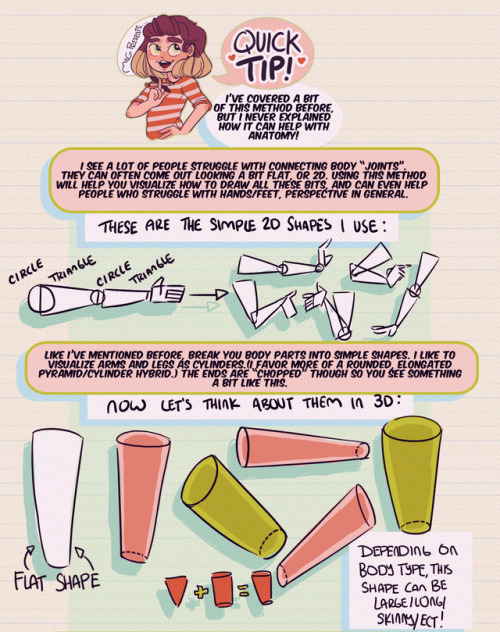
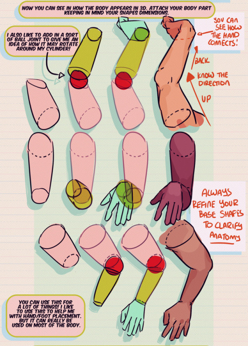
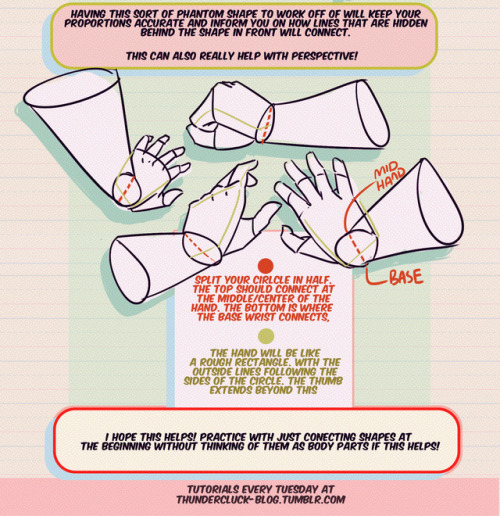
Hey friends!
Meg here for this week’s TUTOR TUESDAY! This week I go over just a little trick that I like to use when drawing and connecting arms/hands/legs/feet ect. This helps me with foreshortening as well. I hope it helps you folks as well! I have tutorials that talk more specifically about hand/foot/leg anatomy here. If you have any tutorial recommendations send ‘em in here or my personal. Now go forth and I’ll see you next week!
your art are amazing and you're so talented! I would like to ask how to draw Castiel's wild chaotic sex hair:)
LMAO umm I think it’s easiest to part it on one side and then have it fan out from there with the front flipping up.

thank you!!
Hands
As I do with most things, I draw hands from a series of gesture strokes that insinuate the pose and shape I want. Something I personally find very appealing about hands are all the joints, bends, and crooked bits so I start with those and build the rounder, meaty bits from there.

In the first two steps here if you just look at the individual strokes I’ve drawn, you can see they’re just some curves, really, that sketch out the shape of the hand, and I’m focusing on the joints and knuckles. (The fingertips in the second one are actually rly unnecessary and ugly to me haha – that’s usually the kind of thing I’d just throw down in step 3.)
And again below, just starting w/ some curves and squigglies to show the joints and knuckles:


These hands are by no means realistic or fully proportional but drawing’s supposed to be fun and these are really fun! I’m like, really not about that whole “draw a box and then the little tubes and those are the fingers” thing. It’s too technical and so much life gets lost when you sketch that way. Maybe it’s helpful for a pose you’re uncertain about but then just look at a photo or your own hand to see how things work, y’know?
Something else I’m really about is using shading and line to emphasize the bends and stuff even after I’ve got the hand down:

The first image here you can tell the fingers are bent, but they also look lumpy imo. To stylize further, I add some thin lines for the joints and fingernails, and then shade for some extra depth + to pronounce the foreshortening etc. (Fingers are so ugly from this angle! But we gotta draw them like this sometimes…)
Some examples where these extra lines assist in conveying the shape:

And shading:

(Bottom right is the same pose as a previous example which I didn’t realize till now sorry haha)
Some general tips:
- Use asymmetry!!! When the joints don’t line up exactly right, or you’ve drawn two hands doing the same thing but idk one’s curled a little bit more or the right pinky sticks out but the left doesn’t – these little touches make the drawing more dynamic, even if the general pose/concept is flat.
- Thumbs are really cool? They’re like trapezoidal. The same tapering thing kinda happens where the hand meets the wrist. A hand is like a big thumb
- Two things that a lot of beginner artists get wrong: which side the thumb is on (…always double-check…I still double-check sometimes too), and drawing the fingers straight instead of slightly bent when trying to draw a relaxed hand. Relaxed fingers curl! And this is much easier to draw imo than perfectly tense fingers
- Study your own hands and think about their shape. Part of developing a style + comfort with drawing a particular thing is how you choose to simplify the form thru line. I explained above that I focus on the joints and knuckles and seek to simplify those with curves and squiggles but maybe you’re more interested in a different aspect. (Like, you can see I don’t draw palms v much…that’s cuz I like knuckles haha)
Hope this is helpful/feel free to ask followup questions!

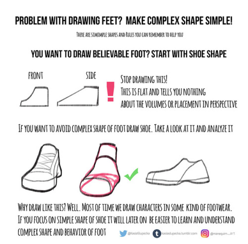
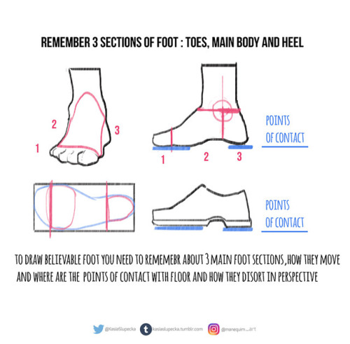
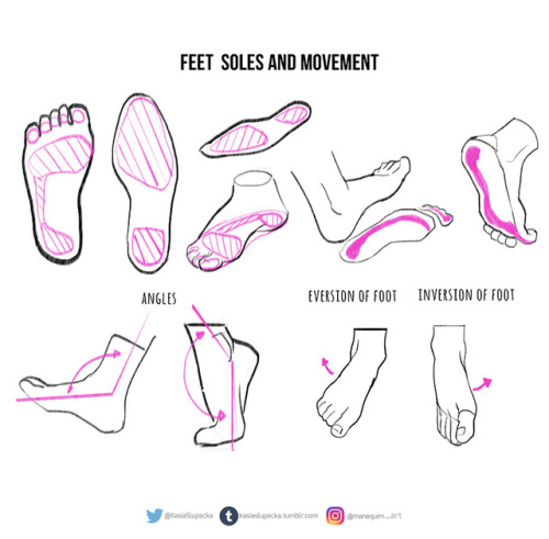
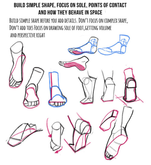
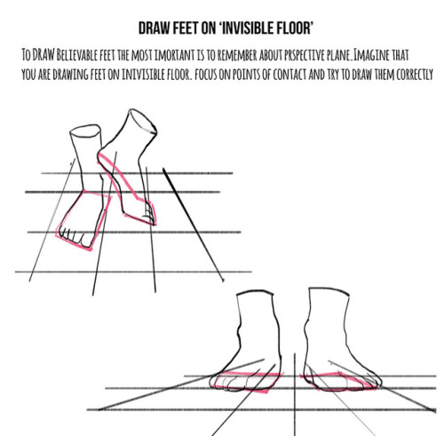
Weekly anatomy tip!
This week I tackle feet. I know how many of you asked for it.
It is hard topic indeed. It’s hard to draw nice looking character with feet that doesn’t look believable.
A lot practice is needed. I just presented few ideas and now you have to put it to practice.
Hope this helps !

Finally I got around to this. =ヮ=
Since there are so many different possibilities, this one was hard to make.
It’s hard to want to show a little bit of everything, but keep the sheet small as well orz.
Sorry there is only one shaded example lol (shading folds is a different story I think)
-
 hiimsuperawkwarddontmindme liked this · 10 months ago
 -
 balmungkriemhild liked this · 2 years ago
 -
 penguin2paradise liked this · 5 years ago
 -
 passivelocat liked this · 6 years ago
 -
 statisticshock liked this · 6 years ago
 -
 ninjafox-love liked this · 6 years ago
 -
 fuchsialunar liked this · 7 years ago
 -
 screaminglamps liked this · 7 years ago
 -
 wingedwolfgirl reblogged this · 7 years ago
 -
 tanpoyo liked this · 7 years ago
 -
 zilodak liked this · 7 years ago
 -
 archimedaes liked this · 7 years ago
 -
 jg2758 liked this · 7 years ago
 -
 spawnofhades liked this · 7 years ago
 -
 thefangirlingtimes liked this · 7 years ago
 -
 fal-tulta-daga liked this · 7 years ago
 -
 radiant-spark-art-dump-blog reblogged this · 7 years ago
 -
radiant-spark-art-dump-blog liked this · 7 years ago
-
 besuzes liked this · 7 years ago
 -
 rubixpsyche liked this · 7 years ago
 -
 weirdpiratekid liked this · 7 years ago
 -
 ariaofsorrows liked this · 7 years ago
 -
 that-loser-with-a-blog liked this · 7 years ago
 -
 arttuti reblogged this · 7 years ago
 -
 meglayn liked this · 7 years ago
 -
 thedearestalicorn liked this · 7 years ago
 -
 imisschoso liked this · 8 years ago
 -
 awkwarddazedpotato liked this · 8 years ago
 -
 toon-torial reblogged this · 8 years ago
 -
 chessbunny liked this · 8 years ago
 -
 galacticpunk00 liked this · 8 years ago
 -
 spaceman-marlene-blog liked this · 8 years ago
 -
 stardust-speedway6 liked this · 8 years ago
 -
 seedafuturemusic liked this · 8 years ago
 -
 giga-men liked this · 8 years ago
 -
shabutar0 liked this · 8 years ago
-
 digiartreferences reblogged this · 8 years ago
 -
 mizukitsunesblog reblogged this · 8 years ago
 -
 tomanloyle liked this · 8 years ago
 -
 raspberry-merbutlers liked this · 8 years ago
 -
 the-nai liked this · 8 years ago
 -
 kaiser-author-san-iii liked this · 8 years ago
 -
 thundes-alled liked this · 8 years ago
