More Mini Tutorial Gifsets :) For The Video Version Check Out https://www.instagram.com/p/BGZfej3R_OM/?taken-by=loisvb
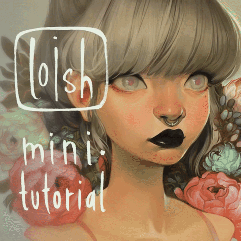
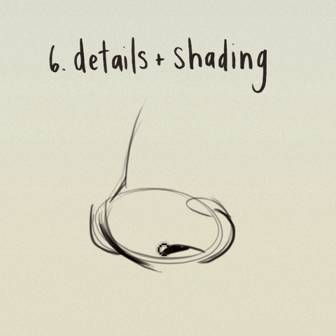

more mini tutorial gifsets :) for the video version check out https://www.instagram.com/p/BGZfej3R_OM/?taken-by=loisvb
More Posts from Arttuti and Others


Obviously, I’m not the best with drawing hands. But that basic shape helped me with drawing hands best. (Circle works for me too but not as good as that ‘fan shape’ my professor taught our class).
Don’t forget to keep practicing and using real life references–It’s the best way to draw good hands! Take your time drawing them! Don’t rush (unless you really wanna) It’s not a competition.
Got questions? Feel free to ask!


Cuddles reference sheet by *Kibbitzer
Cuddles for everybody! If you’re interested on Patreon you can find the complete series and all the normal and special reference sheets for 5$ per month! use it for your exercises if you need it XD Patrons or not, thanks for supporting me! ^A^/ <3 Facebook Deviantart
How to do “extra” facial expressions!
Drawing basic facial expressions is not the hardest. Most people can draw a sad face, a happy face, angry etc., but making more multidimensional expressions is more of a challenge. I have gotten a lot of compliments on how I draw facial expressions, (specifically “angsty ones”) telling me that they are very dramatic and well… expressive! And there are actually only a few things I think about when I draw faces that take them to the next level, so I thought i’d illustrate them all here!
SUPER IMPORTANT TIP BEFORE WE START: Look at your own face when you draw faces. Even making the face when you are drawing (you don’t even have to look at it), will give you some sense of how the face muscles pull and where things fold and stretch, because you can feel it. You are the best reference when it comes to facial expressions!
Angles
Draw the head in an angle that matches the expressions you want to make. It is not a requirement, but is going to add to the effect.

Symmetry vs asymmetry
A face is rarely symmetric. Unless the face the character is making is 100 % relaxed or even dissociating, the eyebrows, mouth and facial muscles will have different placements of their respective side. This image shows the dramatic impact asymmetry has on a face:

That’s the difference between a smile and a smirk!

The first one’s like “oh yeah?” and the second is like “oH YEAH??”
The “balloon squishing principle”
This is something I did subconsciously, and I didn’t know about until I made this tutorial. And this principle goes hand in hand with an asymmetric face. Basically, if you squish one part of the face, you need to even out the empty space by “inflating” the other part of the face so that it doesn’t appear shrunken. The picture hopefully explains it:

Teeth
Don’t forget to add the gum when the mouth is open to its full potential!

Squinting and folding
Adding folds around the eyes when a character is squinting makes a HUGE difference. It makes a smile more genuine and a growl more intimidating. Adding folds to the face in general makes your characters more lifelike and ‘visually relatable’. Like, they look human, and less plastic or fake.


and so on..
Pupils and irises
The placement of the iris and pupil in relation to the eyelids is very important! The less of the white you see, the more relaxed the character is.

And then of course eyebrows and eyes go hand in hand!


Gestures, spitting, sweating…
Adding more elements than just a face is key to making the character actually look like they are feeling what you want them to feel. Just the tiniest sweat drop adds to their anxiety, spitting adds frustration to their rage, slouching shoulders, waving hands, a double chin, extreme angles, the list goes on! Add whatever and see what kind of impact it makes! Does it do the trick? Great! Add it!
Over exaggeration!!
Remember that you can almost always exaggerate more. Don’t be afraid to do draw “too much” because you’re just experimenting. See what works and what doesn’t. What do you like to exaggerate?


Now that you know some theory, it’s time to practice!
Practicing!!
The 25 Essential Expressions (a classic! I’ve done it multiple times)

And the one I do when I’m bored:
Fill a page with circles and fill them in with different expressions. Try and exaggerate as much as you can!


This is mostly for experimenting. They are quicker to draw than complete faces, but the same rules should apply!
And that’s about it!
I don’t know if I covered everything in this tutorial, since some things might be obvious for me, and this post perhaps only scratches the surface. So feel free to send me a message if you want an explanation about something more in depth! Thank you for reading! And now DRAW!!! ✨🎨


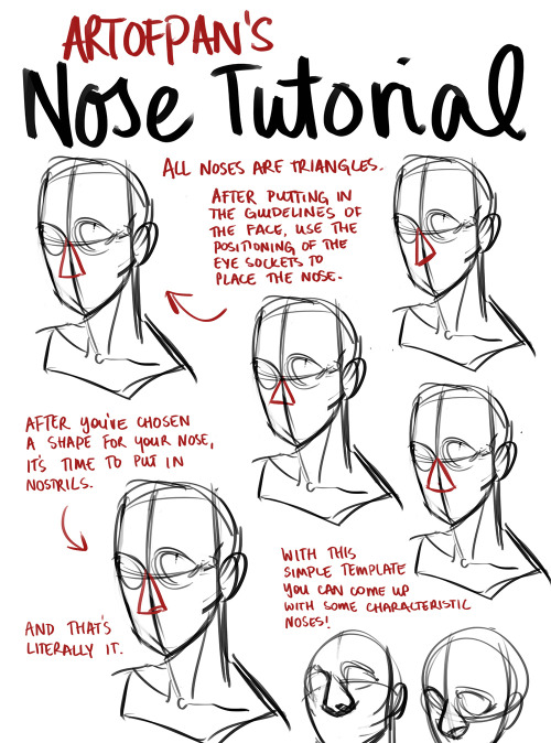


Whoo, super long nose tutorial! I’m sure there’s heaps I didn’t mention in this but this is generally how I approach it - the main thing is to check out references and try and draw different noses, it’ll help you create more diverse characters and have fun with it without being afraid of drawing the nose (since it’s genuinely one of my favourite things to draw).
Other tutorials: X

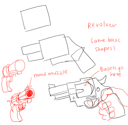
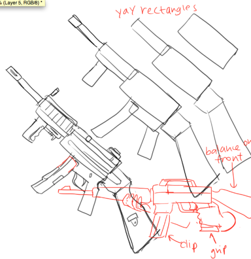
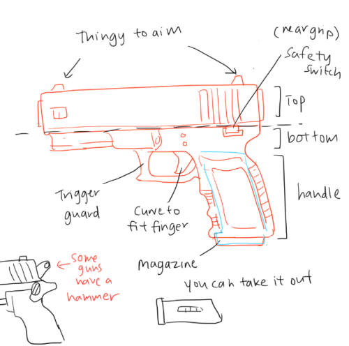
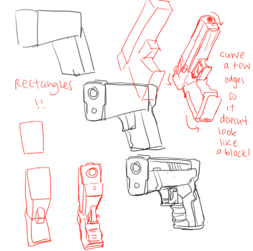
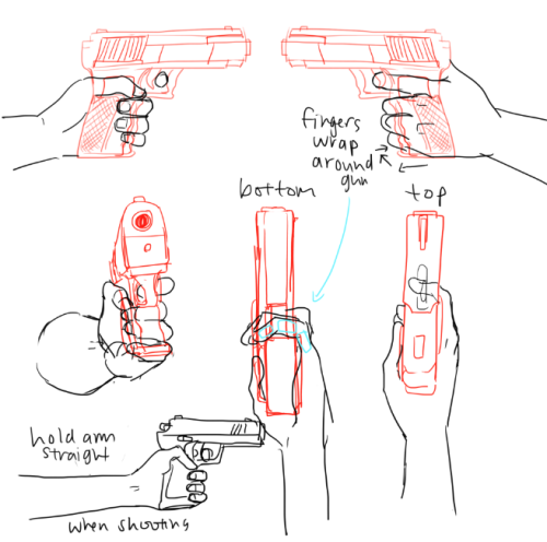
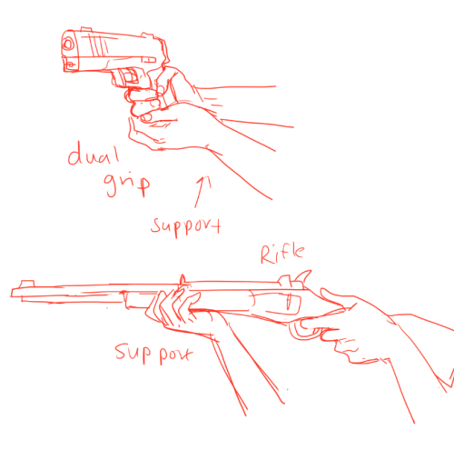
GGGUNS AND STUF i forgot who asked for it , as usual look up different refs to ;earn how to draw the amny differnt varieties of guns!!
EDIT: SORRY THIS WAS DONE W HILE AGO so there are a few mistakes
THE DUAL GRIP IS WRONG U SHOULRN"G BE DRAWING THAT U SHOULD LOOKA T THIS ALSO YOUR FINGER shouldn’t be on the trigger unless you’re about to shoot!! AND the labelling in the fourth pic isn’t very accurate so don’t rely on that for naming gun parts!


So I got a lot of messages after my first post asking me to explain layers, so I have put together a cheat sheet of the different layer types. The quickest way to become awesome with layers is to know exactly what each one does. Once again, I’m no expert, and these are just my personal definitions, so please try these out for yourself! LONG POST BELOWWW THE LAYERS CHEAT SHEET PART ONE: 1. NORMAL: Aw yeah you know all about this layer its just your average layer 2 DISSOLVE: This mode “dissolves” some pixels, allowing the lower layer to show through. very pixel-y. Reducing opacity makes it dissolve more. ________ 3. DARKEN: Now the difference between darken and multiply are a little confusing, so I will explain them together. MULTIPLY is more of a glaze, while DARKEN favors the darks on all layers. So if you have a darken layer on, it tend to reduce/remove the lighter tones on the layer if there are darker tones below it, while darkening the darks. 4. MULTIPLY: A glaze that darkens the color of the layer below. It is great for shading. Reduces whites. 5. COLOR BURN: “Burns” the lower layer favoring a more saturated look. Marks made over white are not preserved. 6. LINEAR BURN: “Burns” the lower layer, with a little less saturation than color Burn. Also will preserve colors over white. 7. DARKER COLOR: I tend to avoid this puppy cause it does not darken on the RGB channel. (feel free to try him though!) ______ 8. LIGHTEN: Lightens the colors below. Favors lighter colors on lower layers. 9. SCREEN: Lightens the colors below, but much closer to the “glaze” analogy as above. Reduces blacks. 10. COLOR DODGE: Often used for magic-y effects, color dodge bumps up saturation and is very bright. 11. LINEAR DODGE: Much like color dodge, but less saturation. 12. LIGHTER COLOR: Once again, this is an outside RGB channel layer, so I don’t really use this. As you probably have noticed, the second two groups are opposites, so if you have a good handle on one, you probably know exactly what the second group does! I will do the remaining groups next week as they do not follow this pattern. Thanks! drawmaevedraw.tumblr.com EDIT: Part two here: Photoshop Layers Part Two!!


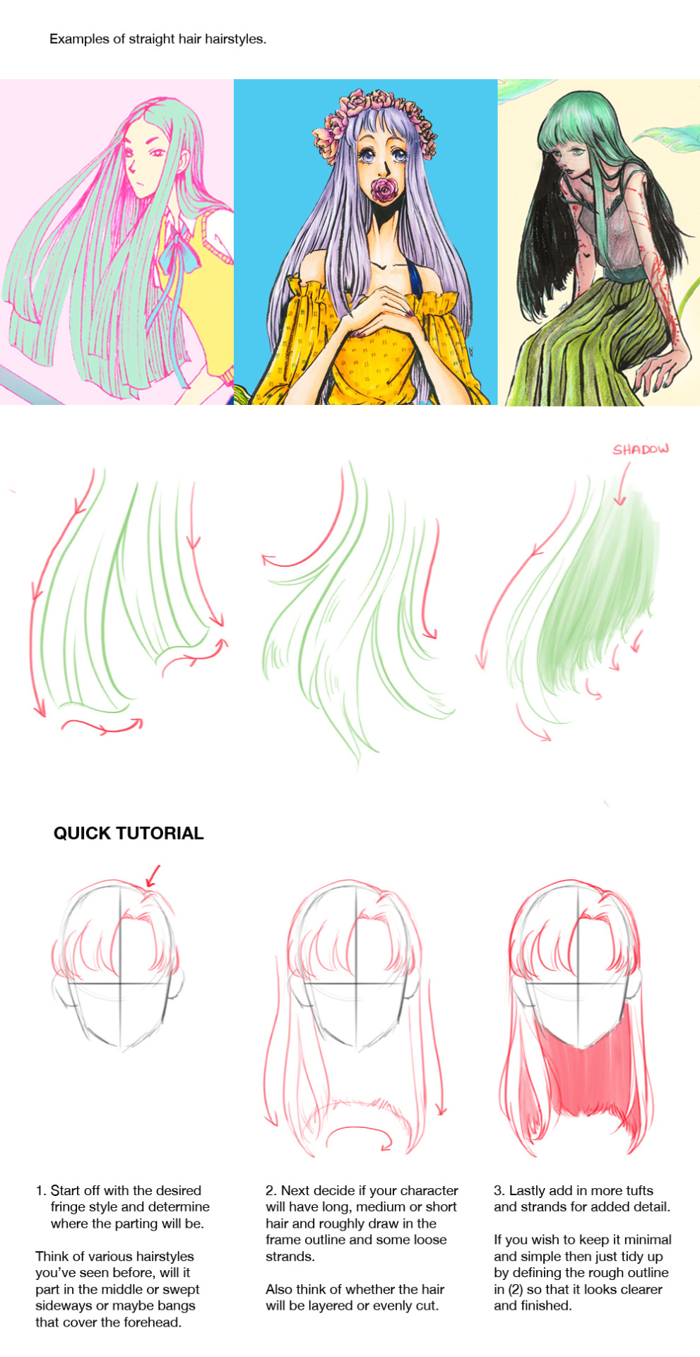


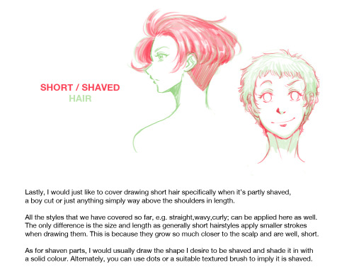


How to Draw : Hairstyles Pt. 2
Finally sat down and completed part 2 of the hair tutorial. Here I discuss how to draw hairstyles for female characters, although I think it can be applied for male characters as well. I mean..hair is hair xD I didn’t cover how to draw hairstyles that are tied or braided or styled in a special way as I thought the post would be way too long. So I’ll be saving that for another day. If you have any questions just drop me a message or leave a reply and I’ll do my best to get back to you. Hope everyone has fun learning to draw hair as much as I did putting this together :D And I just want to say a big thank you to all of those who checked out part 1. I’ll leave a link in case anyone needs it How to Draw : Hairstyles Pt. 1
-
 misssickn liked this · 1 month ago
 -
 crazycreative425 liked this · 2 months ago
 -
 darkot liked this · 4 months ago
 -
 twilightnightstar liked this · 5 months ago
 -
 nezjazz reblogged this · 6 months ago
 -
 notexactlyanartblog liked this · 7 months ago
 -
 thebrofriends liked this · 7 months ago
 -
 glxssygal liked this · 8 months ago
 -
notexactlyanartblog reblogged this · 9 months ago
-
 animalisticrage reblogged this · 11 months ago
 -
 ihaveapproximately4bones reblogged this · 1 year ago
 -
 unabashedpoliceninja liked this · 1 year ago
 -
 pumpkinmochitea liked this · 1 year ago
 -
 tinkertechie liked this · 1 year ago
 -
 generalluxun liked this · 1 year ago
 -
 theblackcatgf liked this · 1 year ago
 -
 amyelisaa liked this · 1 year ago
 -
 artrefsntutos reblogged this · 1 year ago
 -
 icecream1527 liked this · 1 year ago
 -
jorgxeo liked this · 1 year ago
-
 himitsutsubasa reblogged this · 1 year ago
 -
 bisopod liked this · 1 year ago
 -
 theharlotofferelden reblogged this · 1 year ago
 -
himitsutsubasa liked this · 2 years ago
-
 lynxpawpads liked this · 2 years ago
 -
 evil-child-osha liked this · 2 years ago
 -
modarthelp reblogged this · 2 years ago
-
modarthelp liked this · 2 years ago
-
 imarileina liked this · 2 years ago
 -
 kilvalmer liked this · 2 years ago
 -
 punkcake666 reblogged this · 2 years ago
 -
chromacholy liked this · 2 years ago
-
 morgueselfie liked this · 2 years ago
 -
 fr00t-snacc liked this · 2 years ago
 -
 blueberryshots liked this · 2 years ago
 -
 tess-adness liked this · 2 years ago
 -
 bloodyellenlost liked this · 2 years ago
 -
 synlia liked this · 2 years ago
 -
 nuxtamara liked this · 2 years ago
 -
 art-emissss liked this · 2 years ago
 -
 pencil-prophet liked this · 2 years ago
