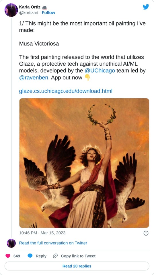
Glaze Is Out!
Glaze is out!
Tired of having your artwork used for AI training but find watermarks dismaying and ineffective?
Well check this out! Software that makes your Art look messed up to training AIs and unusable in a data set but nearly unchanged to human eyes.
I just learned about this. It's in Beta. Please read all the information before using.
More Posts from Artrefforsteph and Others
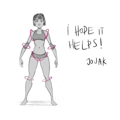
hi! umm pls pls PLS if you have the time, do a thingy on arms when you get the chance, they are so hard i could almost cry aslkdjaskjsas, i keep forgetting how many curves an arm should have/how long it should be (in diff positions/when it's not resting at the hips) etc etc etc ahhh omg please!! thank you sosososo much, i l♡ve all of your art and i hope you have a nice day!! ✧ ㅠㅠ ✧


I don’t want to go into detail in terms of muscles, but I’m sure you can find them if you google arm muscles! Hope this helps u out a little!
Watercolor Tutorial
As promised a step by step guide, which hopefully will help you understand how I work with watercolors. If you have more questions I’m glad answer them.

Materials: Pencil (2H), Daler Rowney Fine Grain - Heavy weight paper (A5, 200g/m2), Windsor & Newton watercolors, Ink and drawing pen, colored pencils, white paper, tissue

Keep reading
Copic Marker Walkthrough
Lately many people have been asking me how to create a space nebula effect with markers. The process is relatively simple, but it’s not easy to explain simply with words alone. So in this walkthrough I’m going to show step by step how it’s done.

First things first. This is the list of supplies I used. -Strathmore Mixed Media 5.5 x 8.5 sketchbook-Pink and White Colored Pencil-White Gel Pen-13 Copic Marlers (12 colors and a colorless blender, which I’ll explain how to use later.) I should point out now that you aren’t required to use the exact brands I used to create the drawing. I use these materials because they’re what I’m most accustomed to.The techniques I demonstrate can be done with whatever markers and paper you’re comfortable using. What matters is that you understand the technique because when you do you can apply it to anything.

I begin by making some abstract cloud-like shapes with E50 (Eggshell), which is a very faint yellow. There’s no pencil sketch here because space nebula (as well as atmospheres and natural landscapes) can be easily created by layering abstract shapes on top of each other.

Using Y21 (Buttercup Yellow) and G20 (Wax White) I basically repeat the first step. Still working very light. I realized after the fact that Buttercup Yellow was a bit too intense for this drawing so I stopped using it there. This is why it’s important to have a sheet of scratch paper nearby to test out colors before you apply them. Because once they’re down, they’re DOWN.

Next I use R20 (Blush) to start defining the shapes of the gases in the nebula. Then I go back to Eggshell. It’s probably hard to see what I did here, but I used the brush tip end (on its side) to swipe inward, from all sides, towards the center of the nebula. The reason being is that the brush tip is more saturated than the chisel tip. This helps intensify the lighter shade of yellow that’s already on the paper. If also makes crossfading colors easier because the sideways swipe motion creates a soft gradient that tapers towards the edge. I’ll use this technique multiple times throughout the drawing..

Now with B000 (Pale Porcelain Blue) I layer over the gases in the center while working my way outwards. Again I’m pulling my strokes inward because I know the surrounding space will be deep blue and I want the transition to be a smooth one.

With E04 (Lipstick Natural) I’m finally beginning to put in some of the darker colors. At this point the drawing sill looks like a random mess. Sometimes you’ll get the urge to rush and make the drawing look like something, but you have to be patient and take your time.

Using B32 (Pale Blue) and R20 again, I’m going around the nebula detailing and adding layers of color. I’m also leaving some white spaces which will later become stars. My Pale Blue is actually beginning to dry out, but here in able to make that work to my advantage because it streaks from the chisel end create a dry brush effect which helps add to the glow. The nebula portion of the drawing is beginning to take shape.

Working my way around the perimeter with Pale Blue. From here you can see the importance of working light to dark. Build your colors gradually and avoid the urge to go too dark too early. You want to have room for error and you don’t want create more work for yourself.

With B04 (Tahitian Blue) I fill the surrounding space completely. I’m not too concerned with trying to get an even layer because I know that I’m going to add darker shades of blue next.

Here I used B00 (Frost Blue) to start cleaning up some of the edges around the nebula. I also used BG15 (Aqua) to add some pockets of color in the surrounding space.

Adding darker layers to surrounding space with B14 (Light Blue), which surprisingly a pretty dark shade of blue. Then I used B97 (Night Blue) to add the last layer, which is the darkest layer in this drawing.

Now it’s time for the final details. 0 is the Colorless Blender. But it’s not necessarily used to blend. Instead it almost acts like an eraser because the ink pushes colors away when you put it down. Because of this I generally don’t use it. But it works great for things like water, landscapes and atmospheres. Or in this case, space in which I used it to pull out highlights in and around the nebula. The colorless blender is odd, but it occasionally has its uses.

This is the final step and my personal favorite. Highlights and small details. I used the pink and white pencils to color around the edges of the brightest stars to make them look as if they’re glowing. Then I used the a white gel pen to color inside those stars to make them shine and pop off the page.

And here’s the finished drawing. This was hastily put together, but hope y'all found this to be informative and easy to follow. I’ll try to do more marker walkthroughs on different subjects in the future. Until then thanks for all your support and encouragement!


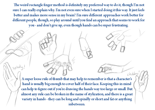
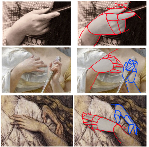
Thanks for the ask! The truth is, I’m still really shaky on how to draw hands. But here’s a really short and simple tutorial on my approach.
Need some better/more in-depth hand tutorials? Check these ones out, they are all amazing: (link) (link) (link) (link)
shading colour tips
hey yall its me the Art Mom™ to help you shade pretty
rule 1: DO NOT SHADE WITH BLACK. EVER. IT NEVER LOOKS GOOD.
red- shade with a slightly darker shade of purple
orange- slightly darker and more saturated shade of red
yellow- i think like..a peach could work but make it a really light peach
green- shade with darker and less saturated shade of blue or teal
blue- shade with purple
purple- a shade thats darker than the purple you’re using and maybe a little pink (MAYBE blue)
pink- darker shade of red
white- a really light lavender or blue..or i guess any really light colour??
black- okay listen dont use pure black to colour anything unless you want to leave it with flat colours because you cant really shade black lol
grey- a slightly darker shade of purple or blue (less saturated)
brown- slightly darker and less saturated shade of purple or red
aaaaand thats all i got lol. let me know if there is anything i should add to this list!!
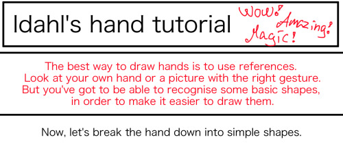
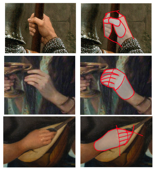
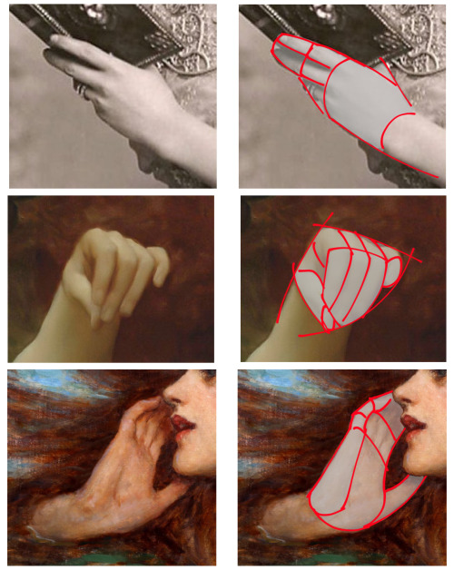
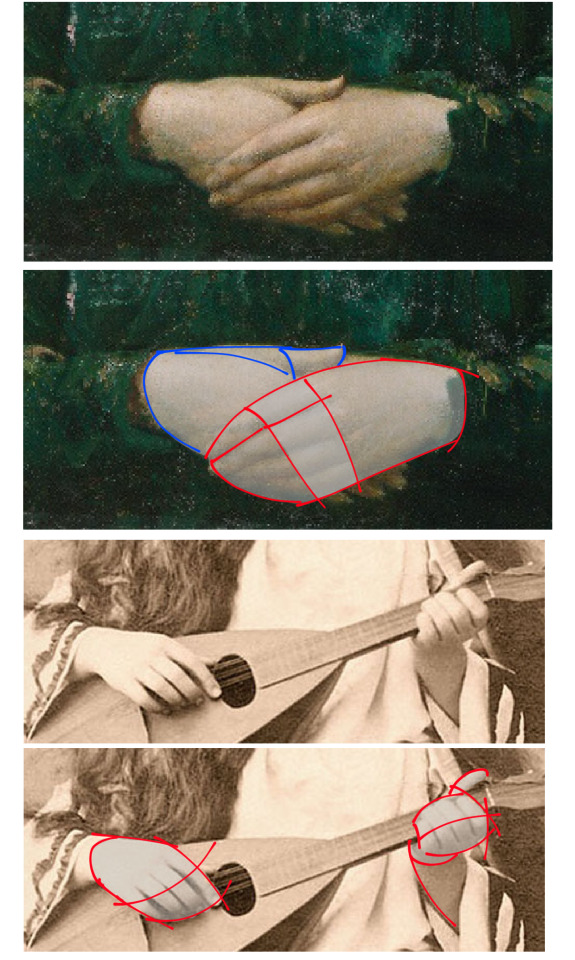

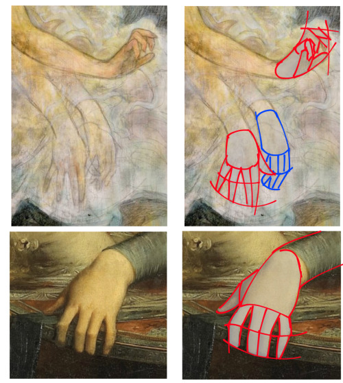
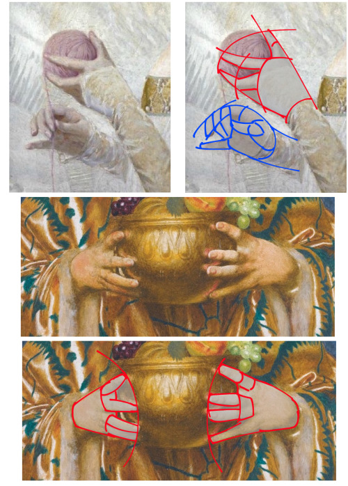
This is how I draw hands. I simplify the shape and then later I will add the necessary details. It makes it easier to get them right. But the only way to learn how to draw hands is to just keep drawing them.
how do you draw hair in your syle?
how do i draw hair in my style* i think thats what you mean right? Okay hair is seriously my favorite things to draw because its super fun and its really not that difficult once you get the hang of it. You need to understand how hair works though, that is very important!!!
you need to know the ‘flow’ of the hair. seriosuly. understanding how this works makes your life so much easier because then you dont need to copy EXACTLY how the characters hair looks like (if you are drawing fanart or something) and you can just make up your own way of drawing the persons hair (following the flow) and it still looks great! Yes even the crazy bedheads like kuroo has flow and parting. i hope i made sense, im terrible at explaining.

now that you know the flow, did you notice that the arrows all come from one point? That is where the hair is parted usually. I often start off where it parts and follow along the ‘arrows’.
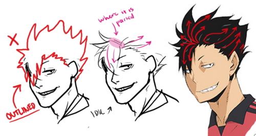
dont draw the ‘outline’ of the hair only (meaning you dont draw what is happenig inside of the hair), there is no flow and it looks really choppy and its super difficult (unless you are really good at it go ahead idk). see how in the middle kuroo, I start with where it is parted? SO MUCH EASIER TRUST ME!!! So remember, always always always know the flow and the where the hair parts!!!
as for my style, i dont know i just draw hair and boom. style? here are a bunch of habits i do when i draw hair:

look at the very left side where it shows how I draw hair strands. remember to start with simple lines or big shapes and then gradually break it down smaller and smaller and you should be good! hope it this was helpful in some way :)
-
 saraisanamazingcow liked this · 1 month ago
 -
 art-of-a-ghostie liked this · 1 month ago
 -
 laikasfriend liked this · 1 month ago
 -
 emmanemoni reblogged this · 1 month ago
 -
emmanemoni liked this · 1 month ago
-
 frayazicat reblogged this · 1 month ago
 -
frayazicat liked this · 1 month ago
-
 alonleybutlovelyrose reblogged this · 1 month ago
 -
alonleybutlovelyrose liked this · 1 month ago
-
 raynewolferune reblogged this · 1 month ago
 -
raynewolferune liked this · 1 month ago
-
 almostpsyche liked this · 1 month ago
 -
 nope-astrology-nope reblogged this · 1 month ago
 -
 wifesuguru liked this · 1 month ago
 -
 reinedeselfes reblogged this · 1 month ago
 -
reinedeselfes liked this · 1 month ago
-
 summer-skye-64 reblogged this · 1 month ago
 -
 radioriseblogs reblogged this · 1 month ago
 -
 fractoluminescence reblogged this · 1 month ago
 -
fractoluminescence liked this · 1 month ago
-
 merrberry reblogged this · 1 month ago
 -
 gnomelovers69 liked this · 1 month ago
 -
 painga1 liked this · 1 month ago
 -
 miami-shell reblogged this · 1 month ago
 -
miami-shell liked this · 1 month ago
-
 touchstarvedloser reblogged this · 1 month ago
 -
 rdqt reblogged this · 1 month ago
 -
 katya-goncharov reblogged this · 1 month ago
 -
rdqt reblogged this · 1 month ago
-
 septemberreading reblogged this · 1 month ago
 -
 haruka89 reblogged this · 1 month ago
 -
haruka89 reblogged this · 1 month ago
-
 cosmicjellyfinch liked this · 1 month ago
 -
 owlinatowel liked this · 1 month ago
 -
 mimocrocodilelol liked this · 1 month ago
 -
 phantom-at-the-library reblogged this · 1 month ago
 -
 call-me-tears reblogged this · 1 month ago
 -
 abaecchios liked this · 1 month ago
 -
 pokemoncha reblogged this · 2 months ago
 -
 cozy-clutter-pile liked this · 2 months ago
 -
 gwachaedir reblogged this · 2 months ago
 -
 biichama reblogged this · 2 months ago
 -
biichama liked this · 2 months ago
-
 brigid-inghean-sheainn reblogged this · 2 months ago
 -
brigid-inghean-sheainn liked this · 2 months ago
-
 morgynleri reblogged this · 2 months ago
 -
morgynleri liked this · 2 months ago
-
 minkhollow42 reblogged this · 2 months ago
 -
 the-vagabond-tabby reblogged this · 2 months ago
NSFW because there will probably be nude refs | this is a side blog to sort all of the art stuff I need | none of it is mine
151 posts