SenshiStock’s Gallery Consists Of Millions Of Pictures That Are Free To Use As Reference.
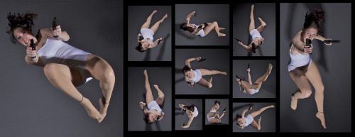
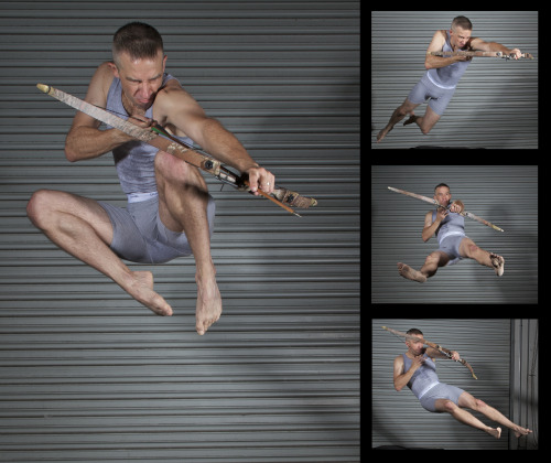
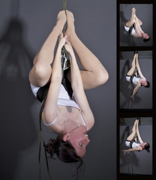
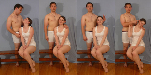
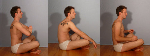
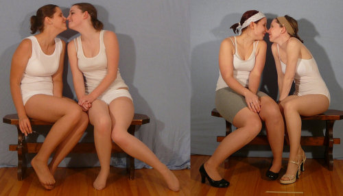
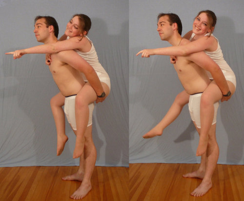
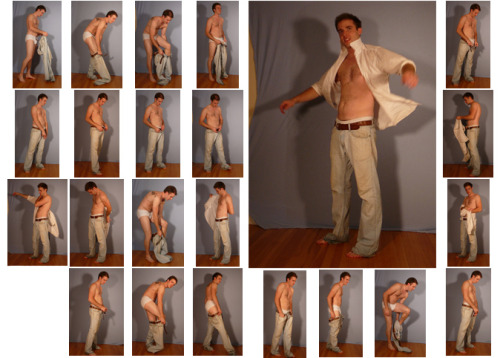
SenshiStock’s gallery consists of millions of pictures that are free to use as reference.
General Drawing Poses Sit and Kneel Dramatic and Reaching Drawing Poses Magic and Hogwarts Drawing Poses Staff Weapon Pose Reference Hammer, Axe and Bat Pose Reference Sword Weapon Drawing Reference Small Bladed Weapon Pose Reference Gun Weapon Pose Reference Bow and Arrow Archery Stock Foreshortening and Perspective Poses Dynamic Flying Falling Action Poses Deafeated or Laying Drawing Poses Magic Crystal Magical Girl Wand Weapon Transformations and Dance Cards Back Pose Reference Pin Up Inspired Poses for Drawing Performances Poses Life in General Poses Fights and Fighting Pose Reference Leaning Poses Classic Sailor Senshi Poses Wings Sailor Moon Villains Pairs Romance or Couples Pose Reference All the Male Stock Hanging Stock Drawing Reference Three or More Groups Instruments Mirrors Whip Technobabble
More Posts from Artrefforsteph and Others
create your own home!
i found this great site that lets you create 3d models and floor plans of custom homes! you can even put in furniture and customize wallpapers/floors!! it has everything you could ask for!! you can use it make ref pictures of your oc homes or just make your dream house!
this is what i manged to make


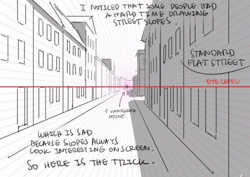
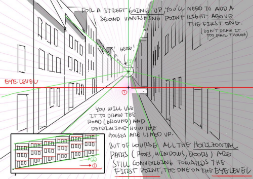
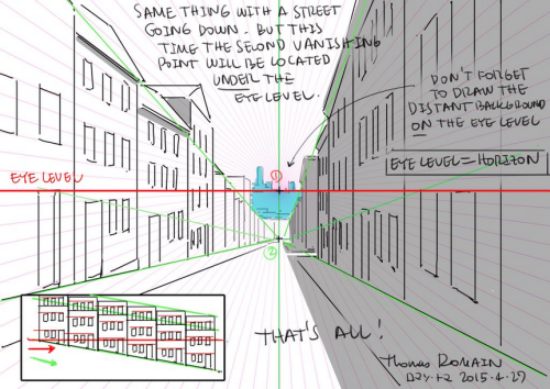
How to draw street going up & down without losing your mind.
by Thomas Romain (Space Dandy, Code Lyoko, Basquash!, E.P. Kiss Dum, Cannon Busters). Another one…
Genice, can you give me some advice with hands? The hands i draw sometimes end stiff and ugly. Also hands in perspective, because sometimes they end too big or small. Thanks!
i mostly got better at drawing hands by just practicing how to draw them a lot!what i would do is draw a pose or two over and over again (maybe at slightly different angles and stuff) first with reference, and then draw them again without looking at anything to see how much i can draw from my mind, and then go back and forth between the two until i get enough of a “feel” to draw a certain pose decently without relying on reference. i think after a while you kind of develop patterns in the way you draw hands and from there it becomes easier to draw different hand poses and stuff from scratch
to make the hands you draw look less awkward/stiff, i think it helps to focus more on the overall flow of the composition and silhouette of the hand rather than getting all the details in and anatomy right and stuff in the initial stages


when drawing hands in perspective i think it helps to visualize them as 3d shapes

to get the foreshortening right (aside from using perspective guides and whatnot) i like to just draw the hand first, and then eyeball the perspective and adjust its size and position until it looks right

(select with lasso tool > ctrl+t to transform +right click for more transform options)

another thing i do is take reference pictures with my ipod (any camera works tbh. i just find using a mobile device to be more convenient)by holding the camera close to my hand i can get a really exaggerated perspective like this:

it’s nice because i can get the ref for the exact pose and angle i’m looking for without having to do a lot of internet fishing


Webcomic tips
In the conclusion for now, some things I’d really recommend doing if you’re seriously considering making a webcomic (or really a comic in general). Some of these don’t really apply to strips or gag-a-day type of comics, but I’m not talking about those here.
1. Write down ideas\sketch stuff, LEGIBLY. “I’m gonna remember it later” NEVER works. And if you scribble it somewhere on a piece of paper, you’d better scan it or retype in one doc later, because tiny notes always get lost among other doodles in my skethbooks.

(i know it’s hard to keep everything clean and organized, but this mess is just not productive)
If your project is a collaboration, save your conversations. If you’re working alone, make a blog for your ramblings. You have no clue what tears of relief I cry when I open that blog and rememeber I don’t have to painstakingly look through my heaps of sketchbooks and folders for a tiny idea I’m not even sure I wrote down a few months ago.
2. Inspiration folders, or even better, inspo blog with tags also help with collecting and remembering ideas. Color schemes, landscapes, style inspirations, atmospheric stuff, maybe some photo references, all those neat things.

3. Basic tier: character design sheets. Top tier: common poses, expressions. God tier: outfits they wear throughout the comic. Holy cow tier: turnaround sheets for all those outfits.

(I’d die trying to find good pages for references without these)
4. If you haven’t finished detailing the plot, don’t even think about moving on to drawing the comic. You’re gonna regret it when you come up with a really cool plot element that can’t be incorporated anymore because you’ve already drawn all the parts you could’ve tweaked.
5. Don’t just define the plot, make a script. Writing down the lines and the brief description of the actions serves me fine:

(notice that I approximately divided the pages & the text that’d go to each panel on a page)
6. Hard mode: make thumbnails for all the pages, if possible. At least whenever a new chapter starts.
7. If your story involves some convoluted chronology shenanigans, you’d better write down the events of your timeline in the chronological order.
8. Backgrounds. You can’t avoid them, bro. Like half of the comics are backgrounds, especially if your story involves a lot of adventuring and looking around. I know it hurts, but you’ll have to become friends with them. Read some tutorials, practice on photos, go out and sketch some streets, use 3d programs (like Google Sketch) to understand the perspective, use sites like houseplans to visualize your buildings better, I don’t know. Just be prepared for their imminent evil.
9. If you’re drawing digitally, pick a brush size for the lines and stick with it. You don’t want your lines and detail levels to look all wonky and inconsistent in different panels. And I don’t mean the cool stylistic varying lines, I mean this:

Also, things on the background should have thinner and/or lighter lines to avoid distraction. Usually less details too, unless you’re making a busy background with a simple foreground to help it pop out. Or wanna draw the attention to an object on the bg.

10. Readable fonts. Even if you chose to ignore people with poor sight or dyslexia, the majority of your readers aren’t gonna be excited about struggling to decypher this:

Also, as much as I love my black speech bubbles, colorful text on black still kinda hurts the eyes. I wouldn’t recommend doing that for all the characters. Black speech bubbles are usually used for creepy, inhuman voices. And yes, having a colorful outline in this case helps.
11. Probably newsflash, but did you know that panels have their place, order and functions? They do! My favourite thing ever is how I used panels when I was like 12:

(comics ain’t rocket science, but this one is)
The composition of the panels and word balloons always serve for a better reading experience. They guide your eyes over the page, so that you never feel lost or confused. The images in the comic equal frames in a movie, so it’s pretty damn important in what order you look at things and how quickly you can understand what’s going on!

(Eric Shanower & Scottie Young’s Wizard of Oz)
12. One update a week is fine for testing waters. Don’t overestimate yourself, especially if you have a pretty busy life outside it. A stable comic that updates slowly, but regularly is better than an unpredictable erratic one. You can always pick up the pace later, if you feel confident enough.
13. Try to always have a buffer - a couple of pages in reserve. If you’re making the pages much faster than you’re updating, this shouldn’t be a problem. But if those paces are equally the same, it’s goddamn HARD. But on the other hand, if something happens and you skip an update, those come in handy.
If you’re looking at this list and thinking “wow that’s a LOT of work”, you’re totally right. And it’s okay to be intimidated at first! But that’s why it’s important to start with something small. Once you get the formula down, these things will be natural to you.

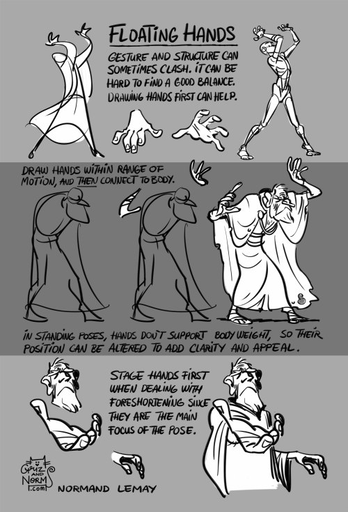
Tuesday Tips - Floating Hands I use this a lot when storyboarding a first pass of a sequence. Placing hands in the right, most appealing position can be tricky. In order to create a clear silhouette for the hands, I often draw them “floating in the air”. Then, using my general knowledge of anatomy, I just “fill in the arms”. This way I can create a much more expressive and clear pose than if I was just radiating out of the torso. That’s when structure and anatomy can get in the way of a clear message. And hands carry a lot of meaning, so I want to make them as clear as possible for my audience to see them. I would say the same applies to life drawing. Since they often don’t carry the body weight (legs most often do), I feel like i can take the freedom of changing their position slightly to make a better visual statement. -n
Hi! I love your art of various fanlands and i was wondering, would you ever do a tutorial on how you draw them or the process of how you draw them? Or perhaps have any tip or tricks?
sure.
there are certain things/tricks I do almost every time, so here we go.
pick colors for the sky and the ground.

Keep reading
-
 destroya1441 liked this · 4 weeks ago
 -
 doutrireblogs reblogged this · 4 weeks ago
 -
 llixulia liked this · 1 month ago
 -
 wingedfable liked this · 1 month ago
 -
 sullencrab liked this · 1 month ago
 -
 xx-leech liked this · 1 month ago
 -
 antagonisttendencies reblogged this · 1 month ago
 -
 ajolote-mexicano liked this · 1 month ago
 -
 artking-4 reblogged this · 1 month ago
 -
 newdawnhorizon liked this · 1 month ago
 -
 jam-n-jay liked this · 1 month ago
 -
 starlingmation liked this · 1 month ago
 -
 glitter3fiction liked this · 1 month ago
 -
 callme-mys-tical liked this · 1 month ago
 -
 squidzgirl liked this · 1 month ago
 -
 beesofink reblogged this · 1 month ago
 -
beesofink liked this · 1 month ago
-
 curi0uscreature reblogged this · 1 month ago
 -
mrbrinedfish liked this · 1 month ago
-
 mysticmiracles liked this · 1 month ago
 -
 scribbleycactus reblogged this · 1 month ago
 -
 v1xv4p0rub reblogged this · 1 month ago
 -
 daengeli liked this · 1 month ago
 -
 xxcringecake69xx liked this · 1 month ago
 -
 bulletedandunderlined liked this · 1 month ago
 -
 jikapu-2-0 liked this · 2 months ago
 -
 illustration-inspo reblogged this · 2 months ago
 -
 tobysbadhorns liked this · 2 months ago
 -
 stonerwizardsandwitch reblogged this · 2 months ago
 -
stonerwizardsandwitch liked this · 2 months ago
-
 alokiasaltwater liked this · 2 months ago
 -
 stitched-rabbit00 reblogged this · 2 months ago
 -
stitched-rabbit00 liked this · 2 months ago
-
 the-bonclave liked this · 2 months ago
 -
 deepfriedgod liked this · 2 months ago
 -
 woerm liked this · 2 months ago
 -
 zanyunknownnacho liked this · 2 months ago
 -
 boldlyscentedbarbarian liked this · 2 months ago
 -
 chrisrue15 reblogged this · 2 months ago
 -
 wearethesensum liked this · 2 months ago
 -
 tiffillustrates liked this · 2 months ago
 -
 adventurekatexp liked this · 2 months ago
 -
 ebiru-zeru liked this · 2 months ago
 -
 seemshelpful reblogged this · 2 months ago
 -
 tigerakemi1 liked this · 2 months ago
 -
 healercharm liked this · 2 months ago
NSFW because there will probably be nude refs | this is a side blog to sort all of the art stuff I need | none of it is mine
151 posts