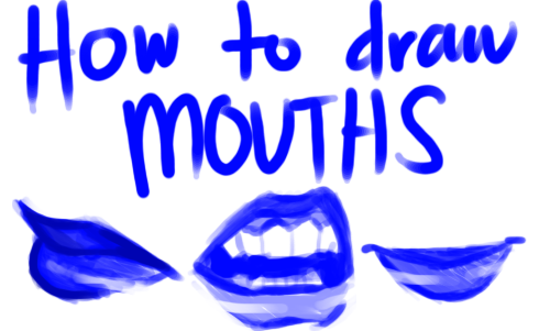
:) Hope You Like It!

:) hope you like it!
my current brushes i used a lot here: painting brush(speckles), the ones i called sim
https://dl.dropboxusercontent.com/u/12795238/sim2014_23_08.abr
enlarged tutorial images:
https://dl.dropboxusercontent.com/u/12795238/wald%20tut%20large%20images.jpg
More Posts from Artrefforsteph and Others


i rr like ur art and i was wonderin how you pick out your color schemes when you draw? like do u just kind of yolo it or do u have like a thing u do lol
thank u !!! actually i already tried to explain one way i pick colors here , tho thats pretty old and only refers to analogous color schemes so… im gonna try to update it a lil bit! (btw everything ill say from this point on is just based on my own experience, im no art student and im sry if anything i explain makes no sense….!! ANYWAY moving on)
1) probably the thing i use the most are analogous color schemes bc theyre easy to do and look very calm and harmonous:

the two colors i show on the color pick thing are the ones farthest to the left and right, every other color is somewhere between them! bc of this the drawing looks calm and natural. most of the different colors u can see are created by playing around with the saturation!
2a) something i only recently started using frequently is the analogous color scheme with a highlight:

the most part of the drawing is done in analogous colors, but i added a highlight to kinda of… “break open” the closed off feeling that analogous schemes usually have! for that highlight i tend to use a higher saturated color on the other side of the color wheel, or at least one that doesnt “match” the other colors.
2b) most of the time i do the highlight not like this tho, but in the lineart:

thats a lot more subtle !
3) and sometimes i just do…..whatever lmao

HOLY FREE ART PROGRAMS BATMAN
I’ve had this list sitting around for a while (in case I ever want to try something new) and I thought I’d share it, because why the hell not, everybody loves free stuff. I’ve only used a couple, so for all I know these could be complete shit. BUT YOU NEVER KNOW, RIGHT?
*= available for both windows and mac os
GIMP * - Does a lot of the same stuff as Photoshop.
FireAlpaca * - Similar to Paint Tool Sai, so it’s a good alternative for Mac users.
Autodesk Sketchbook Copic Edition * - Simulates the look of copic markers.
MyPaint * - Basic stuff, nothing fancy.
Pinta * - Drawing program modeled after paint.NET.
Inkscape * - Vector/drawing program meant to be similar to Illustrator.
ArtRage * - Digital painting program; you can get the trimmed down version for free or buy the full version with more features.
Sumo Paint * - In-browser drawing app.
DAZ Studio * - Some sort of 3D model poser thing.
Pencil * - Software for animating.
SketchUp * - Tool for making 3D models. Looks handy for stuff like architectural drawings.
Blender * - Pretty popular 3D software.
escape motions * - Some browser apps, fun to fiddle with when you’re bored (the fluid fire simulation is pretty cool imo).
Twistedbrush (Pixarra) - Seems to be meant for replicating the look of traditional media.
Pixia/Phierha - A popular program in Japan, according to the website.
Krita - This was originally made for Linux and it looks like the developers haven’t ironed out all of the kinks in the Windows installer.
Artweaver - Another trimmed down free thing if you don’t want to buy the full program.
paint.NET - Pretty basic kit, probably good for simple stuff.
Project Dogwaffle - I’m not sure what this one is all about because I couldn’t stop laughing at the terrible website.
Speedy Painter - Lightweight digital painting program.
mtPaint - Originally made for pixel art; simple enough to run on older computers.
Chasys Draw IES - Supposed to be some sort of drawing+image editor thing.
PaintRibbon - Seems to be another plain old basic image editor.
DrawPlus - Looks like it’s made for graphic design and vector stuff.
SmoothDraw - I’m guessing this is a basic thing for people who don’t want to bother with complicated stuff.
Aaaa your art is so good, if you don't mind me asking, how do you draw grass like that? Whenever I try it looks like a big blob ;-; thank you :D
thanks. i feel like i do it differently every time, but i made a little tutorial here that hopefully gives you a good idea of how it usually goes


hope this helps!!!!!!!!!!!!!!!!!
Problem with drawing your OC?
There is a 3D program where you can set everything.. i mean EVERYTHING on your character! And it’s free!
It’s called FUSE
http://store.steampowered.com/app/257400


you can pick between realistic and anime style… But most important: you can ANIMATE THEM!
Text tricks.
<sup> makes words go like thiiiiis.
<sub> makes them do thiiiiis.
<small> makes words go little. The more <small> you have the smaller the word.
Same thing applies with <big>.
<u> makes underlines.
Go here for Full Width.
̛̰̖̲̰͑ͨ͒̌͑̍̿̈͘Z̨̜̲̥̯̮̭͍̳ͧͣ͋̊̋͗Ȁ̪̼̠͎͒ͨ́̚͘͢͞L̸͉̬̻͌̒͑̊̽͡Ğ̝̮̝̗̲ͧ͝Ȍ͍̪̪̖͕̟͈̝̰̆͋̾̀ is found here.
Go here if you want some uʍop əpısdn.
_______
Of course these are just basic things. You can also look at the HTML button for the codes if youre not up for searching through Google for them.
The button is here:


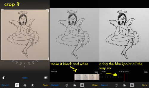
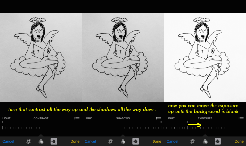
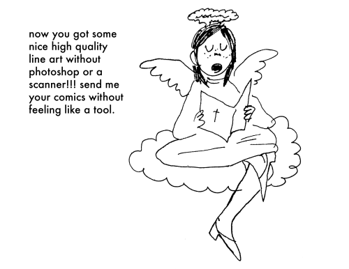
get some nice black and white line art without a scanner or computer just on your (i)phone! this is how i upload all my comix hope this is helpful
REFERENCE MASTERPOST WOAH
text tricks; click the <html> button in the corner

<small> makes things smaller. the more <small> you use, the smaller it gets.
<big> same applies with big
<sup> makes things go up up up up
<sub> makes things go down down down down
<u> makes underlines (only seen on blog pages)
go here for spacy wacey words
z̗̟̻̫̼͓͂ã̤̬͓̼͓̔̐̇͑ͩ̀l̯̜̰͐̒ͪg̺͎͈̍o͍̫̬̤ͭ ͍ͩͤ̈́a͇̘͙̼̠̪̣ͨ̾̍̿k̼ͣa̯̮͇̟ͫ̑ͤͭ̔̊ͣͅ ͌͆s̮̫̼͖̫̖̐̆ͦc̎ͪÃ͔̬̘̫̣̮̮̂̉͗R̈́Ẏ̖͕͚̱̩̠ ̫̝͎̞͖̄T͔̎͊̍ͪ̔E̲̞̽ͨ̿̑X͓̜̩̖̜ͦ͊T̹̥̰̊̎͂ found here
here and here for ƒαηcу/սռﻨƈօժε †εχ† (☞ here for unicode symbols ☜)
upside down text? oɯəlqoɹd ou
of course, those are the basics. <code> makes things monospaced and <pre> puts your text in a grey box.
other;
need themes? NEED THEMES? HERE’S A THEME REC W/ 4000+ THEMES AHHHHHH
japanese emoticons? (◕△◕✿)
things that look like japanese emoticons but are cute lil gifs?
anything else you need help with? a blog full of tutorials just for all the sweeties out there!!!!!
how do i learn how to storyboard comics
1. set the panels

the first version is the easier but also boring for the eye, the sequence rectangular-square-square and repetitive, try to use diagonal cut, open space and vertical cut to help the movement of the story and action.2. use movement to tell the story

3. Pose, Perspective and Line density
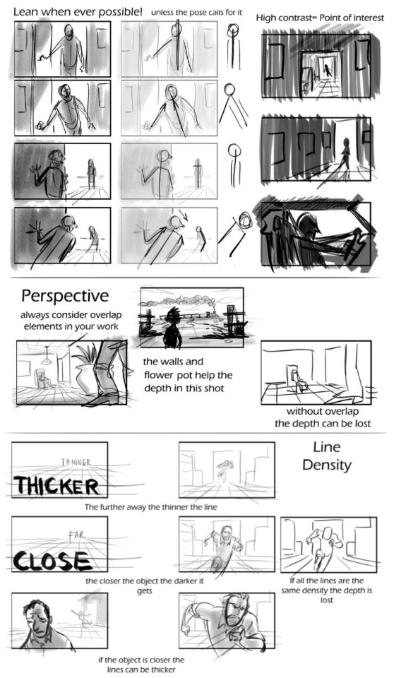
4. Framing and Silhouettebeing the file too big it’s a link format
In my opinion, those are the main rules to make a good storyboard. If you need more help ask awayMOD.gif
-
 cericreatively liked this · 1 month ago
 -
 have-a-g00d-day liked this · 1 month ago
 -
 mysteryvoidscientist liked this · 1 month ago
 -
 potato-mole reblogged this · 1 month ago
 -
 mandaisamonster liked this · 1 month ago
 -
 floofypan liked this · 1 month ago
 -
 novolunos liked this · 1 month ago
 -
 marie111 liked this · 1 month ago
 -
 serenafisher liked this · 1 month ago
 -
 roro2701 liked this · 1 month ago
 -
 winndycakes reblogged this · 1 month ago
 -
 cherriizumi liked this · 1 month ago
 -
 krowspiracyanon reblogged this · 1 month ago
 -
 ezras-starry-bridges liked this · 1 month ago
 -
 theinhumanbody liked this · 1 month ago
 -
 friendlyment4u liked this · 1 month ago
 -
 horrastorie reblogged this · 1 month ago
 -
horrastorie liked this · 1 month ago
-
 layle liked this · 1 month ago
 -
 lethal-eloquence reblogged this · 1 month ago
 -
 simplementeblue reblogged this · 1 month ago
 -
simplementeblue liked this · 1 month ago
-
 azdock liked this · 1 month ago
 -
 da-sinnamon-roll liked this · 1 month ago
 -
 kobkiet liked this · 1 month ago
 -
 crunchyspositivybubble liked this · 1 month ago
 -
 crimson-dripping-fangs liked this · 1 month ago
 -
 rdqt reblogged this · 1 month ago
 -
rdqt liked this · 1 month ago
-
 artofmintea liked this · 1 month ago
 -
 steamdragonsoul liked this · 1 month ago
 -
 sonicfan8967 liked this · 1 month ago
 -
 snampa reblogged this · 1 month ago
 -
 wallobbanana liked this · 1 month ago
 -
 unrepentantheathen liked this · 1 month ago
 -
 mazarus-does-stuff liked this · 1 month ago
 -
 blade-liger-4ever liked this · 1 month ago
 -
 accurine liked this · 1 month ago
 -
 kiru-senpai liked this · 1 month ago
 -
 messwithasideofgravey liked this · 1 month ago
 -
 umbrasolaris reblogged this · 1 month ago
 -
 goldentail1 liked this · 1 month ago
 -
 trilmalirox reblogged this · 1 month ago
 -
 luluism liked this · 1 month ago
 -
 thehaypile reblogged this · 1 month ago
 -
 thatchilledcat liked this · 1 month ago
 -
 chibmib liked this · 1 month ago
 -
 tamdam41 liked this · 1 month ago
NSFW because there will probably be nude refs | this is a side blog to sort all of the art stuff I need | none of it is mine
151 posts